Blog by Beebe Cline, PREC*

<< back to article list

Houzz Tour: Minimal and Soothing in Austin

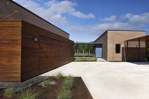
Smack-dab in the middle of a more traditional-style housing development outside of Austin, this modern home might look a little out of place at first. The clients purchased the property because they loved the north Austin location, but they weren't aware of the strict set of codes and restrictions that a homeowners review board could place on their property.

When Austin architecture firm Alterstudio pitched the project to the board, they convinced them this home would actually add to the neighborhood. "The house works very well," says architect Kevin Alter. "The beauty of this building isn't just in its shape, but how it serves as a canvas. It inspires a different way to live and it makes experiences more lovely."
The house has a single-story design in the front, but there are two stories in the back as it spreads out across a steep incline.

"The building is modest, but it unfolds like a geode when you go inside," says Alter. He — along with partner Ernesto Cragnolino and architects Tim Whitehill, Russel Krepart, Matt Slusarek and Jessica Connolly — designed the house to avoid blocking the views or light of any other houses in the development.
by Alterstudio
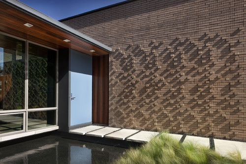
"Each material was used in its own nature," says Alter. While brick was used to enclose certain parts of the home, it was also used decoratively. Here, brickwork on the front entryway plays with light and shadows.
by Alterstudio
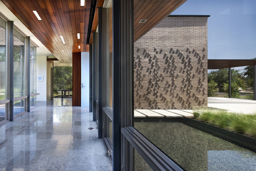
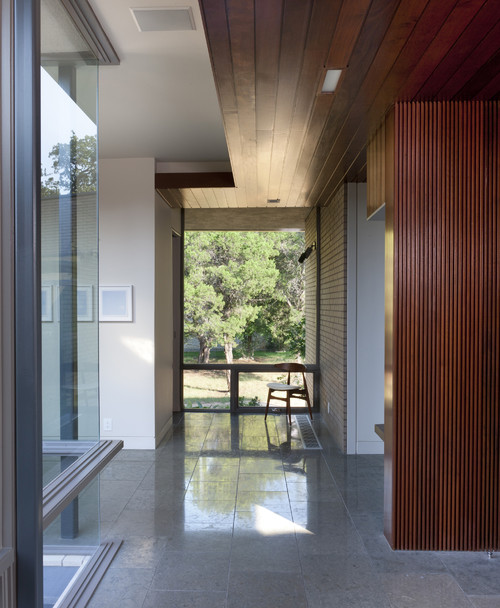
The steel and glass lining the front entry hall contrasts with the exterior brickwork. The use of steel throughout the home adds lightness and allowed for expansive windows.
by Alterstudio
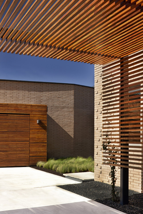
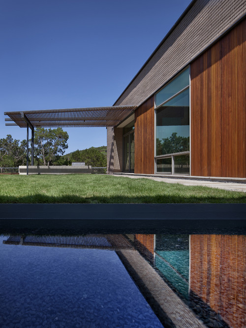
Ipe wood accents on the garage door and a trellis in front of the house bring warmth to the home's rather stark brick exterior.
by Alterstudio
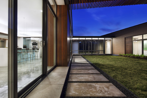
A central courtyard, just visible through the glass entryway, allows the home to center in on nature.

"The house was built as an enclave," says Alter. It's its own special world, he says, so that once you leave the neighborhood and walk across the pool of water into this home, "everything outside is left behind you."
by Alterstudio
The clients had planned to put koi in the pond, but they soon learned of a red-tailed hawk that had made its home in a nearby tree and had already swiped some koi from a neighbor's pond. The plan for koi was abandoned, but the soothing effect of the water remains.
by Alterstudio
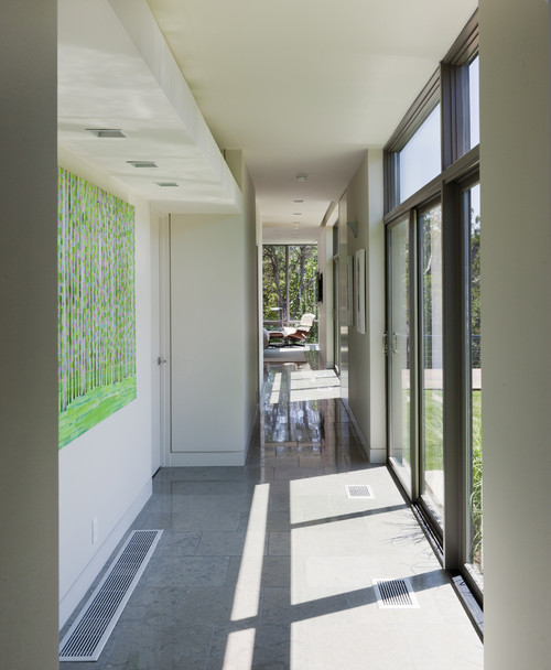
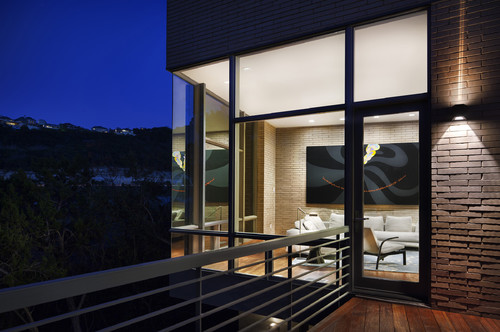
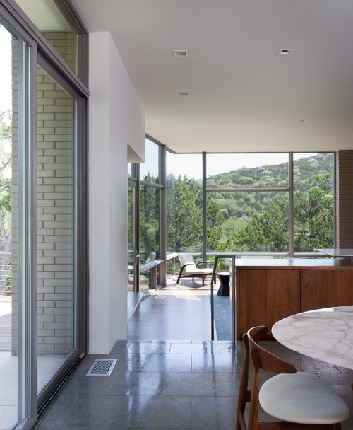
The use of corner glazing throughout the home allows for rooms to extend out beyond their allotted space and draws the eye out to the home's beautiful views. While the home's design is clean, there's still a fine level of detail throughout the house. "The detail lets the more interesting qualities of the grain of stone or the pattern of light and shadow play out without distraction," says Alter.
by Alterstudio
The flow of the house feels natural and effortless. After entering through the front door, the house leads you from room to room on a path surrounding the courtyard. Each room has a different view of the courtyard, forest, and the rest of the house.
by Alterstudio
Part of the reason the clients purchased this home was because of its fantastic view. From this vantage point, it's clear that the house drops off very steeply in the back. The land drops straight down to the river, and you can see across the treetops to the cliff face on the other side.
by Alterstudio
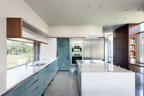
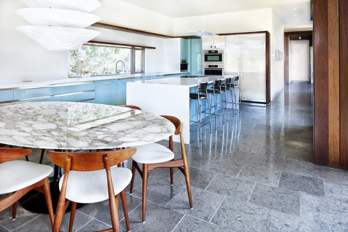
The kitchen was designed with no upper cabinets to keep the space open and clean, but lower cabinets offer plenty of storage. The kitchen island is made with Caesarstone's Blizzard, and the stone floors are Israeli Blue.

The clients had a moderate budget and wanted to get a crisp and clean look while still using off-the-shelf materials. "Working with commonplace materials can make it more difficult to create a certain result," says Alter. "You have to make sure to articulate the materials in a certain way."
by Alterstudio  
While the style of the home is certainly inspired by mid-century modern architecture, it also drew inspiration from the Case Study Houses on the West Coast. In many ways, these homes were less about the buildings themselves, and more about the way they inspired people to live. Alter and Cragnolino wanted to create a home that simply made the clients' lives better.
by Alterstudio  
The house is built so that when inside, none of the other houses in the development are visible. The views out from the living room are gorgeous — but a wall to the right blocks the house on the adjacent lot. "When I build a home, I look for what is best about a place and try to maximize those qualities," says Alter.
by Alterstudio
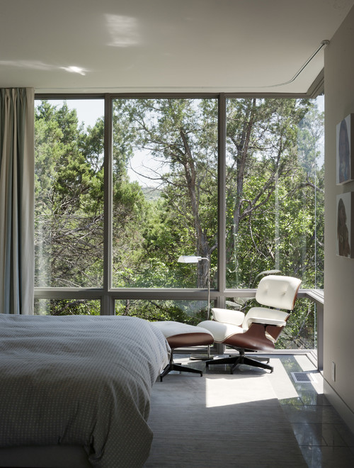
Set above the property's steep embankment, the master bedroom almost feels like a tree house. The corner glazing provides a clear view, and allows the room to be enveloped by trees. "I want to be modest enough to know that the building itself — the object — isn't the end result," says Alter. "It's about creating a compelling environment."
by Alterstudio
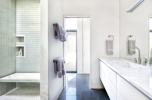
The master bathroom is open and full of natural light. An open shower lined in a subtle glass tile, built-in cabinetry, and a marble countertop in Calcutta Gold maintain the streamlined aesthetic of the rest of the home.

Archives