Skinny Windows: Exclamation Points of Light
Ribbon Windows: Openness, Privacy and Cool Modern Design
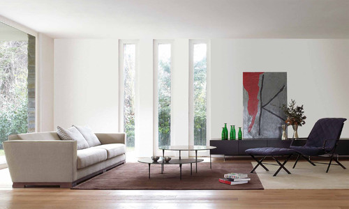
Grouping skinny windows seems to be a fairly common tactic. This stems from concerns on both sides of the wall: the exterior may benefit from the repetition of windows, and, depending on the size of a room, one window may not be enough. The latter is certainly the case here, where a trio of skinny windows help frame anchor the seating area in the large living room.
by usona
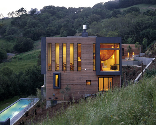
In this house a grouping of five windows adds to a variety of other openings (large/projected, square, small) to make the elevation a composition in wood and glass. See the windows from inside the dining room next.
by House + House Architects
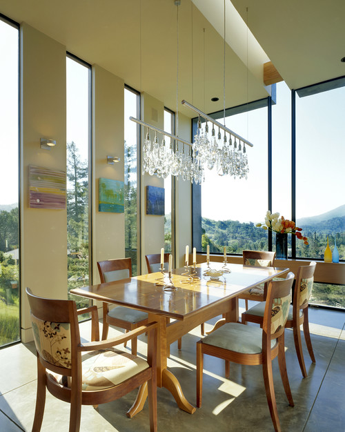
These skinny windows are reiterated in the skylight overhead and the mullions that extend down the center of the large window to the side. The five windows by themselves might not be enough for this space, but combined with the rest there is plenty of light for meals.
by House + House Architects
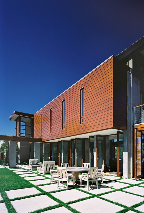
Here a grouping of four windows defines the second floor above a primarily open first floor, which uses a series of doors to connect inside and outside. Upstairs the narrow openings help to make the space more private and to cut down on direct sunlight entering the large space.
by modern house architects
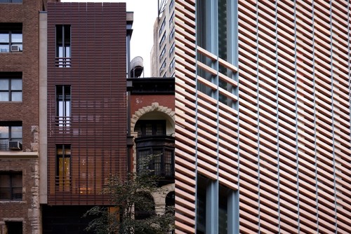
This townhouse on Manhattan's Upper West Side is a variation on a theme. What look like three skinny windows stacked on one side of the street facade are actually just openings in the terracotta screen the sits in front of the floor-to-ceiling glass the spans from side to side. Privacy and filtered views give way at the skinny "windows."
by Workshop/apd
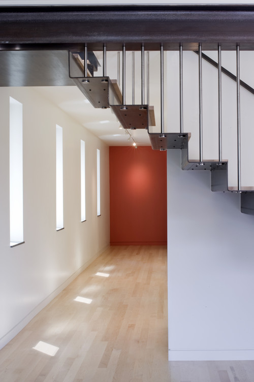
These narrow windows create a rhythm in a hallway. In a sense they are an abstraction of the footsteps that traverse the narrow space.
by John Lum Architecture, Inc. AIA
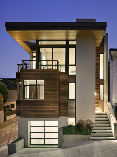
Where is the skinny window here? The one to note is atop the stairs on the right. Inside we see ...
by Bruce Wright
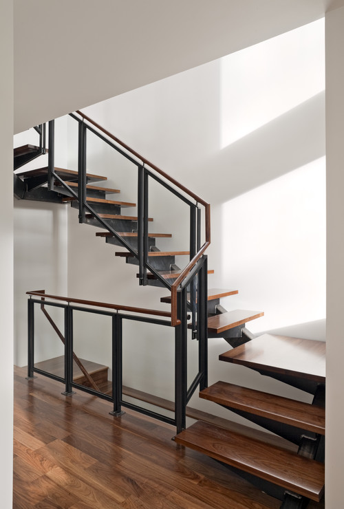
.. the stair is illuminated by a skinny window on two floors. The window brings light to this vertical space and acts as a sundial, tracking the sun through part of the day.
by Bruce Wright
![modern entry by Zack|de Vito Architecture [DesignBuild], AIA](http://st.houzz.com/simages/59458_0_8-1288-modern-entry.jpg)
Skinny windows can also be used to frame views. Words aren't needed here to explain the function and appeal of this window.
by Zack|de Vito Architecture [DesignBuild], AIA
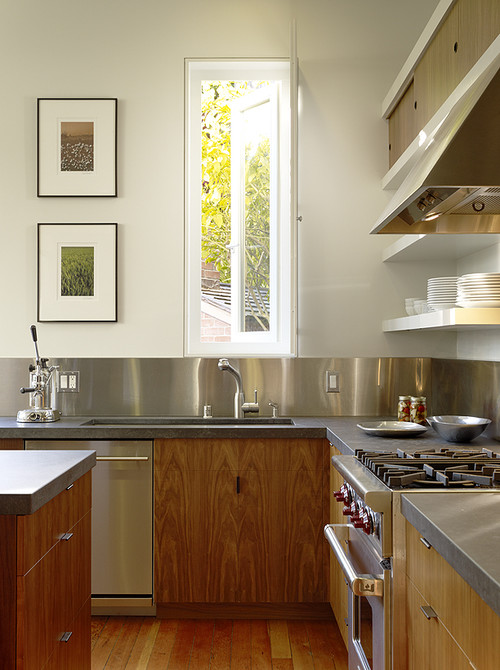
by Schwartz and Architecture
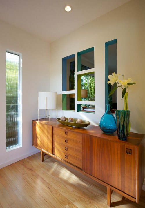
Here is a reconfigured entry (formerly a closet) that uses a narrow window with a gauzy glass that provides privacy. The geometric windows between the entry and living room is also a nice touch.
by David Lauer Photography
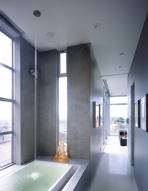
Bathrooms are an ideal place for solitary skinny windows. They require a certain level of privacy, and expansive views are not really necessary. I'm not sure here if they window is for the owner, or the buddha?
by John Lum Architecture, Inc. AIA
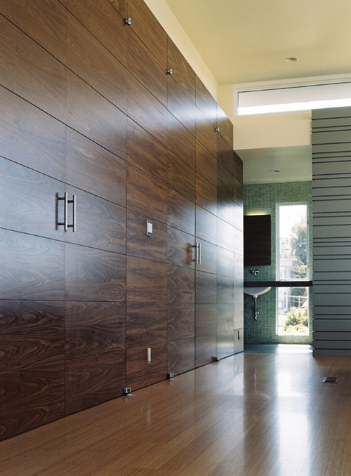
Interestingly, this bathroom doesn't let the countertop place a restriction on the size of the window. The intersect each other to let more light come into the bathroom.
by Schwartz and Architecture
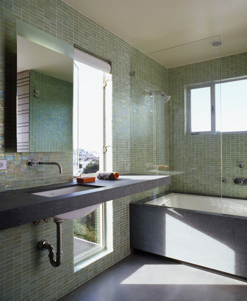
A closer look at the same bathroom shows one potential benefit: Someone taking a bath can stare out the lower portion while relaxing.
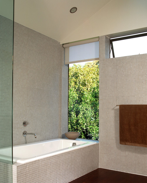
The same can be said about this strategically placed window that exists only to frame a view of the trees for someone taking a bath.