Blog by Beebe Cline, PREC*

<< back to article list

Mid-century Modern on Cape Cod

What worked for 1948 society does not necessarily lend itself well to modern life, so when architect Mark Hammer was hired to add on to this International Style home, he had some serious rearranging to do. "The home had a very formal arrangement with absolutely no connection to modern family living," he says. His intervention needed to provide a new heart for the sprawling home and gathering spaces for an active family, with more private areas spinning from this center.

Hammer also wanted to honor the architecture of the home, located on property that was originally an extended part of architect Nathaniel Saltonstall's design for The Colony. The Colony has a star-studded and literati-laden history; it became a very private spot for creative types and celebrities to retreat and relax in peace, while mingling with one another.

It was originally developed by Saltonstall and his partner Oliver Morton as a private club for contemporary art collectors in Wellfleet, Massachusetts. This town and the larger area around it on the tip of Cape Cod (also known as "the outer Cape") have a long tradition of regional mid-century modernism. Hammer has studied this style, honored it when working on projects, fought to preserve it, brought it to the public via an annual house tour, and shared it via an exhibition he curated (running now through September 11, 2011). This project is an excellent example of how to preserve the original architecture, make it work for a modern family, and add to it in a way that not only respects its history, but enhances it.
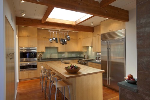
Let's dive right into the new heart of the home and spin out from there, as Hammer's addition/reassembly does. This family room has a strong connection to the outdoors. It shows the original structural system of extended fir post-and-beam construction, and the ceilings throughout the house are crafted of fir decking. Hammer left the ceilings in the original part of the home painted white, while the ceilings in the new addition are natural.
by Hammer Architects  
Look closely at this rendering — see the chimney in red toward the center? It will help orient you as we take this tour together. That is where the heart of the home is — between the kitchen shown above and the living room shown below.

The best way to take in this home is to jump between inside and out; the house is very transparent and blurs this line with wide expanses of glass, covered outdoor areas, views through the house from outside, and transom windows that get rid of the hot air (more on that later).
by Hammer Architects
This new center encompasses the common areas of the home, while private wings (one for kids, one for parents, and one for guests), branch off in different directions. "The kitchen is the hub of everything, and everything else spins off of that," Hammer says.

This is a very active home with several generations and visitors staying together during the summers.

On the right side of this image, you'll see the large Italian tiles that cover the fireplace. These tiles have a metallic finish to them, and their scale stands up to the size of the fireplace and large, open rooms.
by Hammer Architects  
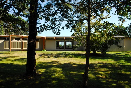
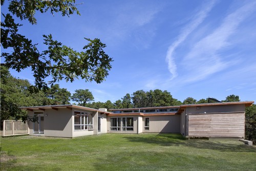
The center windows in the front facade are 9-foot sliding doors saved from the original house. The modern trellis on the left side leads to the front door.
by Hammer Architects
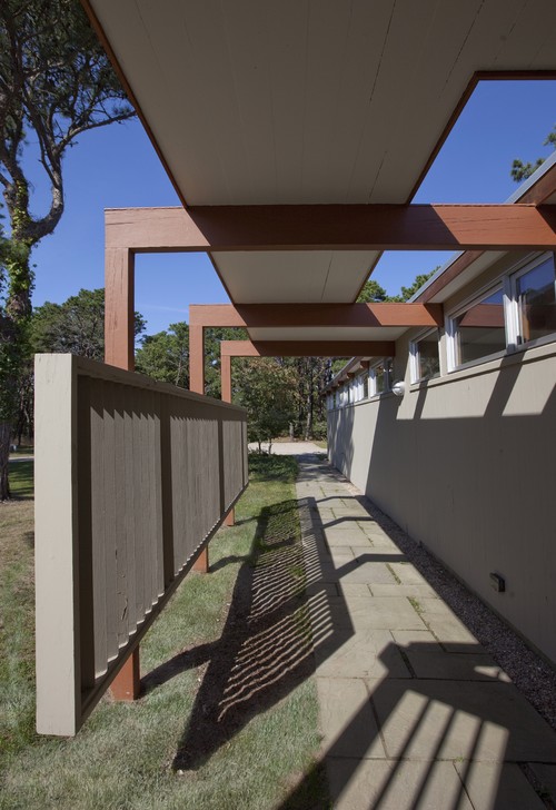
Here is a closeup of the entry walkway and trellis, showing how those beams extend from indoors to out.
by Hammer Architects
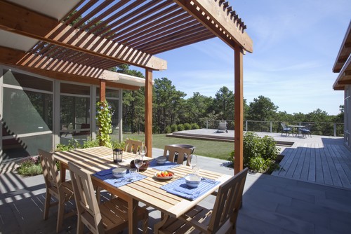
A new outdoor eating area off the dining room and next to the existing screened-in porch is partially covered by a new trellis. "The new trellis clipped on to the existing beams, and is a take off on the original entry walkway," Hammer says.
by Hammer Architects
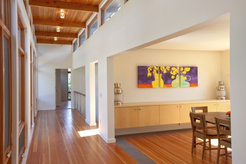
Right off the kitchen, the dining room presents a more formal spot for gathering and eating. Other choices for dining include the screened-in porch and the new outdoor eating area seen in the previous shot.

The cantilevered built-in buffet is an efficient space space saver and continues the nice clean horizontal lines. It also provides a connection to the other rooms in the house, as it is crafted from the same ash wood as the kitchen cabinets, dressers and other cabinets in the bedrooms.
by Hammer Architects
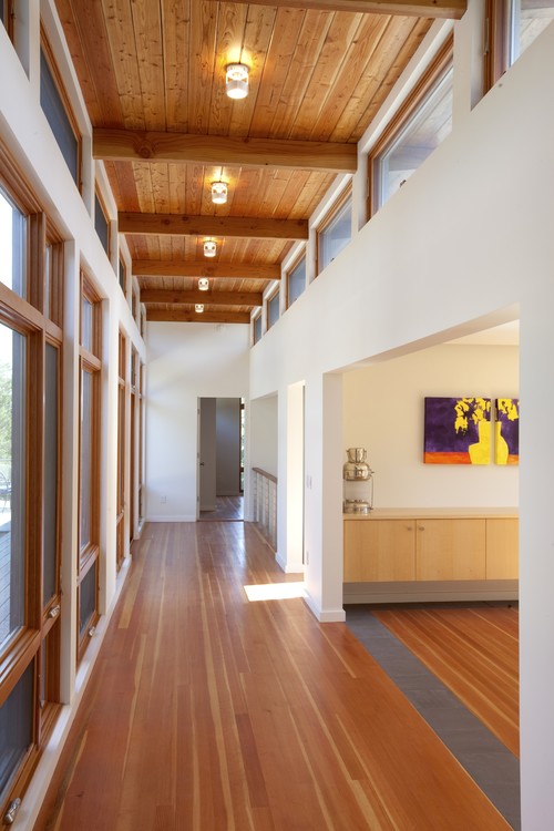
Another important connector in the sprawling house is this long hallway, which connects the public areas to the master suite and contains a staircase down to the indoor pool.

The dramatic length of the new hallway is enhanced by the narrow planks on the floors. The tile demarcates the seam between the new addition and the original house.
by Hammer Architects
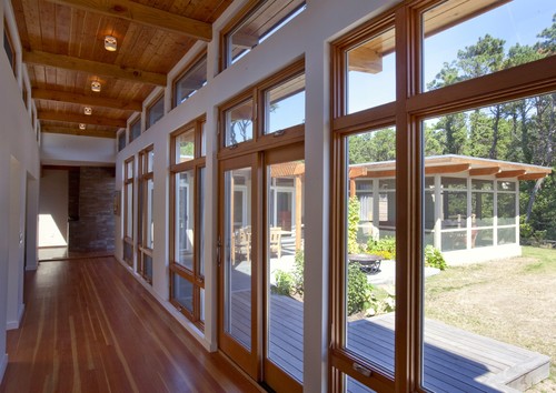
This hallway uses transom windows to cool the house. Hammer is a big proponent of the benefits of these windows, and even raised the roof here to accommodate them. "We use these in a lot of our projects," Hammer says. "They open up all the way and allow the hot air to flow out of the house, keeping it well-ventilated and very cool."

Wondering how to get those windows open without stilts? There is a pole system that makes it easy, and an electronic option is available as well (though it will cost you).
by Hammer Architects
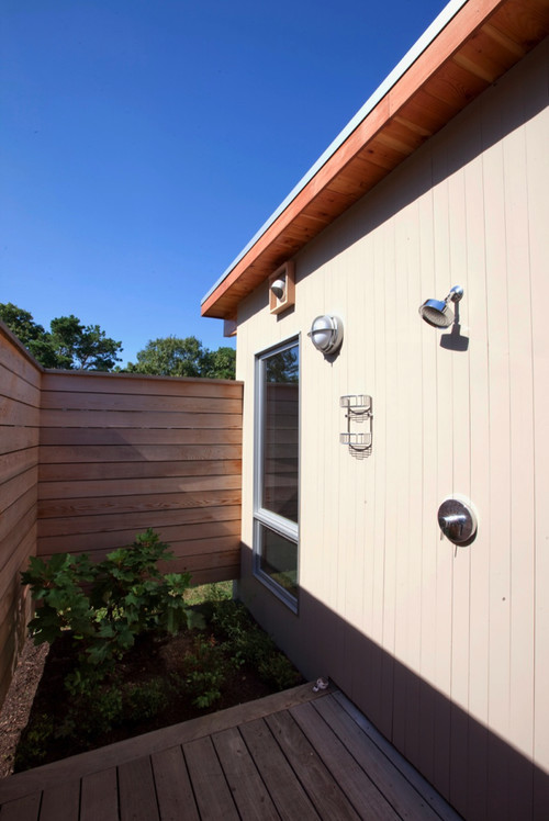
The right side of this image shows you where the the new master suite is. The wood wall encloses the outdoor shower and its adjacent garden.
by Hammer Architects
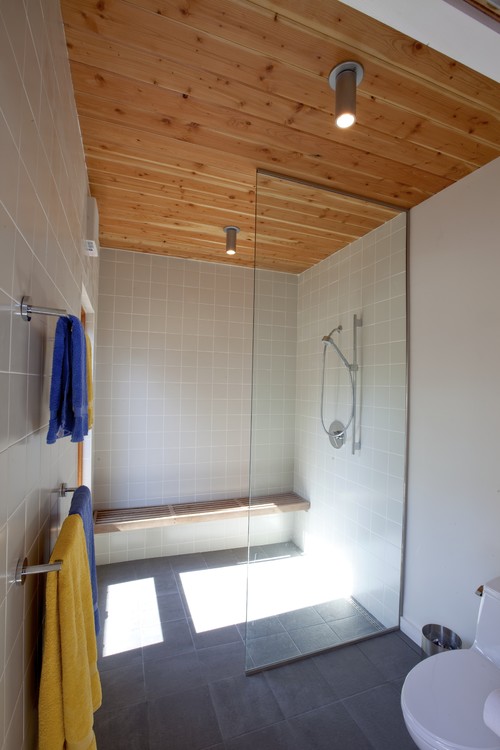
Here's a peek on the other side of the wood wall. The outdoor shower has its own little garden as a focal point. The window offers a view from the garden from the indoor shower.
The master bathroom's shower connects to the outdoor shower's garden through the window on the left.

The floor tile is from Royal Mosa.
by Hammer Architects
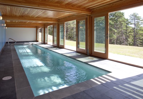
In their original Cape Cod house search, the family was looking for something on the water. But when they came across this house, they decided to bring the water to the house and had this indoor pool installed. The husband is a triathlete and puts in a lot of time here.

Large glass doors allow the pool to open up to the outdoors. The pool is immediately surrounded in a stone coping, with slate covering the expanse beyond the pool's edge.
by Hammer Architects
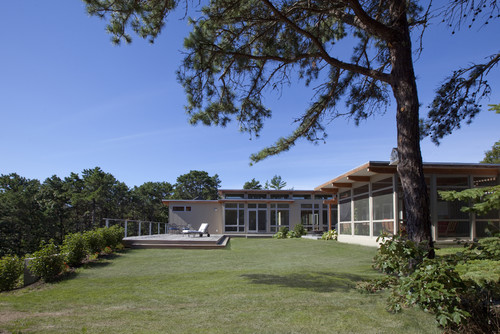
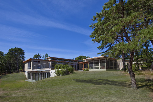
Often, adding an indoor pool means adding another large wing onto the main floor of the house. Not in this case. "We were able to nestle the indoor pool into the landscape," Hammer says. From this angle, you would never know it was there.
by Hammer Architects
Ah, but there it is, hidden within the topography of the site, providing a sunning deck off the master suite overhead.

Another major change since 1948: "At the time the house was built, the Cape Cod landscape was quite barren," Hammer explains. The beautiful forest around the site, full of the typical scrubby pines found in the area, is a relatively new part of the ecosystem. The house, like the landscape, has evolved and grown over time.
Archives