Blog by Beebe Cline, PREC*

<< back to article list

Small Kitchen, Big View

The owners of this Victorian-style home loved its traditional style and period details — except when it came to the kitchen. Set in the back of the house, the small kitchen was tucked into a 12-foot wide space, had little storage and room to move around in. The couple hired Hanson General Contractingand Kevin Rasmussen and Vivian Su of Rasmussen-Su in Philadelphia to give them a kitchen that was functional, clean, elegant and open. 

By installing a large bay window, the contractors and architects extended the length of the kitchen, creating room for an eat-in space and a view to the private back patio. Clever cabinetry configurations make for plenty of storage while keeping the kitchen feeling open and bright. 

Browse small kitchens | Micro-Additions: When You Just Need a Little More Room
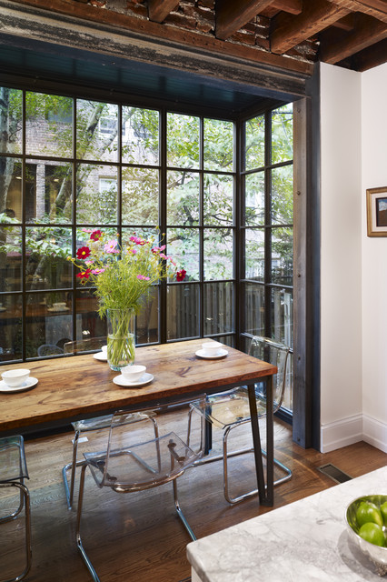
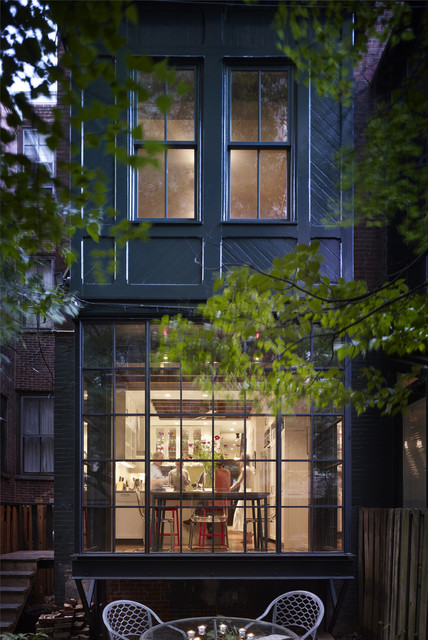
The bay window opens the kitchen to the back patio, and floods the space with natural light. Because the home is on a historical block, the exterior changes — including this window — had to be approved by the Philadelphia Historical Commission. This patio is fenced in and shaded by trees for ultimate privacy, but still gets plenty of sunshine during the day. 

The clients wanted an eat-in kitchen; the little nook created by the bay window was the perfect place for a dining table and chairs.

Table: Custom 
Charis: Ikea Tobias chairs
Re-designing this kitchen was difficult because the space was so confined, but the kitchen's original place at the back of the first floor was really the only feasible spot for it. 

The bay window not only accommodates a more modern sensibility for an eat-in and entertainment-ready kitchen, but it was also styled to complement the original Victorian wood bay window on the second floor.
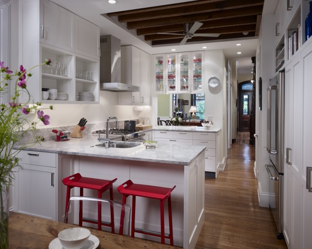
The designers opted for a C-shaped kitchen layout (a.k.a. U-shape). This arrangement is a great solution for kitchens tight on space, because they keep the work areas separate from main traffic routes. 

The kitchen also opens up to the dining and living room in the house, so the style had to be compatible with the more traditional look of these rooms. Sticking with a clean and simple design countered the more ornate Victorian detailing, and natural materials enhanced the exposed wood ceiling. 

Faucet: Grohe Minta; sink: Franke; flooring: white oak; barstools: Ikea; hood: Zephyr
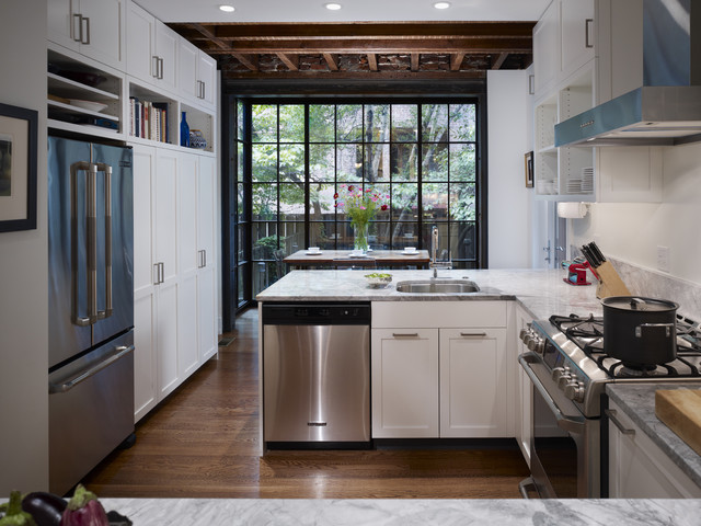
Storage space was a priority, so the architects and contractors consolidated the tall cabinets against one wall, adding a good amount of shelving while allowing the rest of the kitchen to feel open. 

Custom pull-outs below the sink hold trash and recycling containers. Hafele LeMans pull-outs in corner cabinets take full advantage of every available cabinet. 

Archives