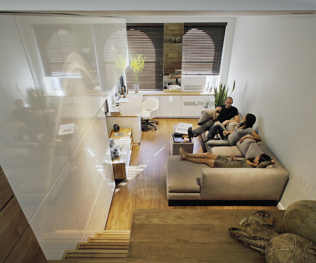
Elegant, Efficient Manhattan Studio
Houzz at a Glance
Who lives here: Michael Pozner
Location: East Village neighborhood of Manhattan, New York
Size: Almost 500 square feet
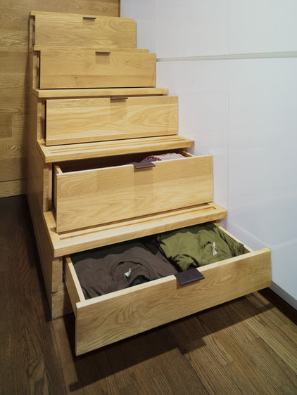
That's interesting: Secret drawers for clothing storage hide in the stair risers to the loft.
|
When Pozner, the head of retail development for American Apparel, approached Borowski and his team for a consultation, everyone thought that Pozner's needs would be fairly standard: sourcing for basic furniture, giving advice on paint colors and working on floor refinishing. But after discussing Pozner's needs for his combined work and personal space, Borowski knew that a more comprehensive renovation was needed.
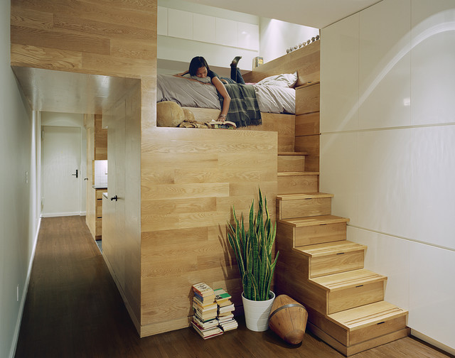
Pozner had been pushing the limits of his apartment before Borowski and his team were in the picture: Not only did he use the studio as an office space and sleeping quarters, but he also used it as a holding area for his toys and art pieces. Borowski says, "The resulting sculptural volume appears to have been dropped into an otherwise clean white box, creating a focal object and organizing the space into public and private areas." |
|
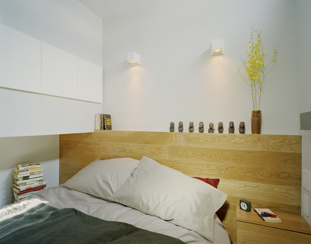
Building the bed platform as part of the loft structure allowed for the walk-in closet below; it can accommodate Pozner's full height of over 6 feet. A roller shade lowers to separate the sleeping loft from the living space.
|
|
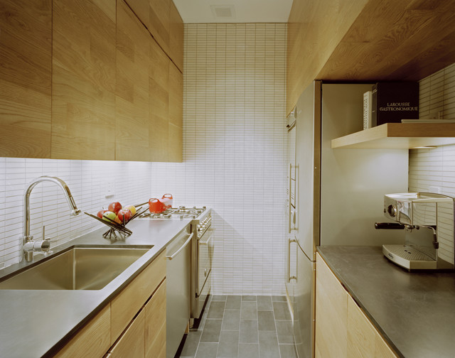
The kitchen countertops are thin slabs of ebony marble from Ann Sacks. The appliances are all stainless and mostly European. Pozner's studio contains two appliances that every city dweller would love to have: a stacked washer and dryer next to the fridge.
|
|
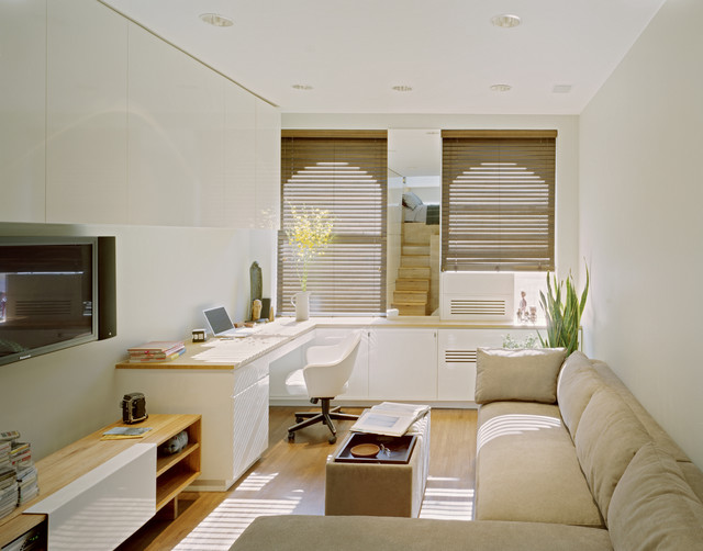
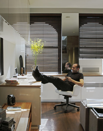
Borowski and his team clearly defined each space. This is the living room and work area. Once each space in the unit was assigned a specific function, the effect was a sense of visual clarity in the overall apartment.
|
|
... and personal lifestyle. The finished apartment has an air of openness — "and Mike didn't have to move apartments!" says Borowski.
|
