Blog by Beebe Cline, PREC*

<< back to article list

Modern, Entertaining Home in Florida

When a couple with three boys bought this house, it was a typical Mediterranean-style Miami home, with closed-off rooms, windows covered in panes and lots of clutter (see "before" pictures here). "My clients wanted to open up the home," says Karina Donadel, lead designer at DKOR Interiors. "The wife loves very minimal modern, while the husband wanted to make sure it still had warmth."

Meeting the couple's needs meant a gut renovation that involved tearing down walls, using clear and translucent glass to increase the natural light and adding natural textures and finishes to add warmth to whitewashed walls. At the same time, the designers and the clients had to create a home that could stand up to boys ages 2, 4 and 6 and grow with the family. Now, "people are shocked when they walk through the door and see how modern the interiors are," says Donadel.

Houzz at a Glance
Who lives here: A couple and three boys
Location: Aventura, Florida
Size: 4,500 square feet; 5 bedrooms, 5.5 bathrooms
That's interesting: A dining table custom made to accommodate extended family was so long, the house had to be enlarged.
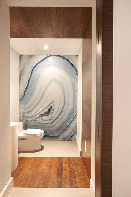
This striking wall is actually not a slab of stone, but rather a large photograph covered in acrylic, created by artistAlex Turco. "You can order these in any size, and they are completely waterproof, so you can use them in the shower or as a backsplash as well," explains Donadel.

The warm wood is a green product called Havana Strand by Plyboo, and it wraps up over the ceiling, providing a warm contrast to the porcelain floors, which continue throughout the first floor.
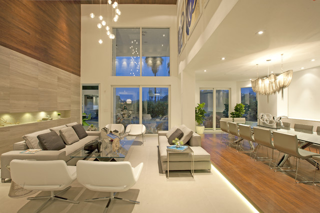
The design moved some rooms around and opened up the floor plan. Past the front foyer, the home opens up into this living and dining space. It was extended out the back beyond the column as part of the renovation, because the clients needed a dining table that would seat 14 people. 

"The clients entertain all the time," says Donadel. "My client is like Martha Stewart; she always has a beautifully set table." Donadel differentiated the two spaces with a dramatic change in floor texture. The dining room floor is elevated and has lighting underneath the platform. 

Stone wall: Vena Grigio limestone; chandelier: Atlantis Suspension Light, Tarzani
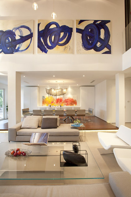
The artwork draws the eye upward and fits the space perfectly. "We needed something bold that could stand up to the scale of the wall," says Donadel. "Each panel of this triptych is 60 inches by 60 inches."

Floors throughout the home are covered inKerlite, which is a very thin porcelain. "This is a great product that comes in 48-inch by 48-inch by one-sixteenth-inch pieces. Though we didn't do it here, it can be laid atop existing flooring," says Donadel. "It's very durable, easy to maintain and it has a seamless look." 

Art: Blue Movement, commissioned via Art Design Resources; dining table: two bases by Minotti with custom glass top
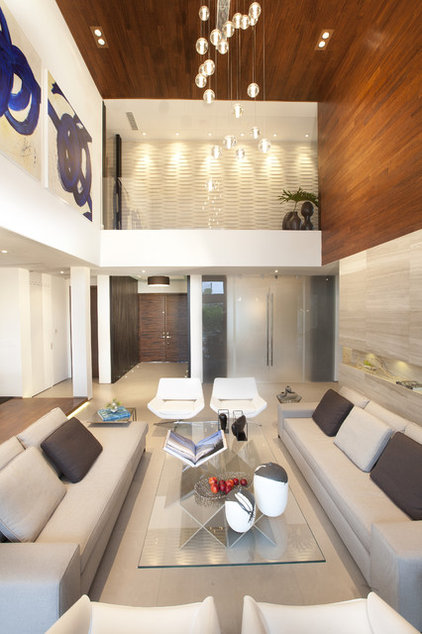
Once the more open plan brought in a modern feel, Donadel needed to add in the warmth. "We cozied up the space with a careful balance of materials," says Donadel. "Using very clean sharp lines keeps things from looking cluttered." Case in point: To keep it as clean lined as possible, the glass railing you see upstairs has a support system hidden within the floor. 

Here, a sharp line between a limestone wall and more Plyboo wood differentiates the two floors. The wood continues up the wall and across the ceiling. "The element of wrapping is an important one we carried throughout the house, to give things continuity," explains Donadel.
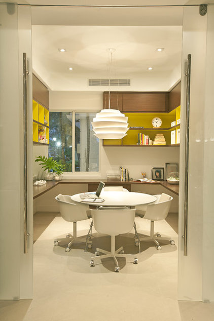
The previous photo shows the translucent doors that mark the entry to this office. Donadel added them to provide privacy yet still let in light from the living room. She also designed custom cabinetry to make sure the room worked for everyone, as the entire family uses this room for work, crafts and homework.

Pops of yellow inside the shelves and cubbies add some bright color to the space. Dashes of color like this are also used in many of the other rooms.
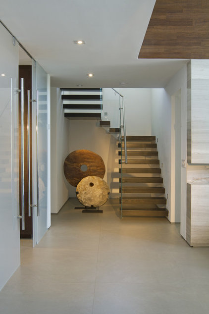
This staircase was once closed off and contained a closet they didn't need, so it was gutted and opened up. The wall was reinforced to support the floating risers. A glass railing and the open risers continue the open theme, and the circular stone sculptures create a strong contrast to all the straight lines.

Stairs: Bella Stairs; sculptures: Michael Dawkins Home
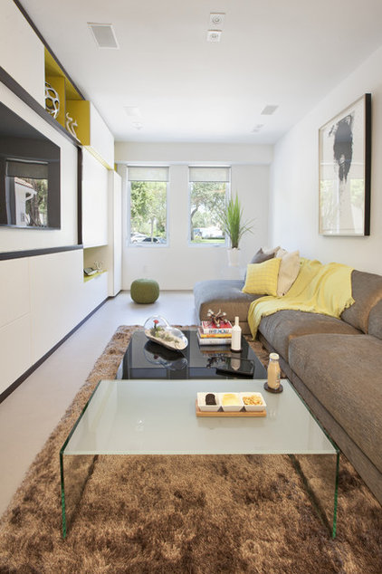
This former bedroom now serves as a comfortable family gathering spot. The entire wall on the left is covered by a custom built-in storage system that holds movies, games and media equipment. It also has a full-service bar including storage for wine and wineglasses and a refrigerator. 

"It was very important to my client to have a place for everything, so we planned out the storage very carefully," says Donadel. Similar to the office, pops of chartreuse break up the long storage wall.

Sofa: Arravanti; coffee table: Pool Coffee Table
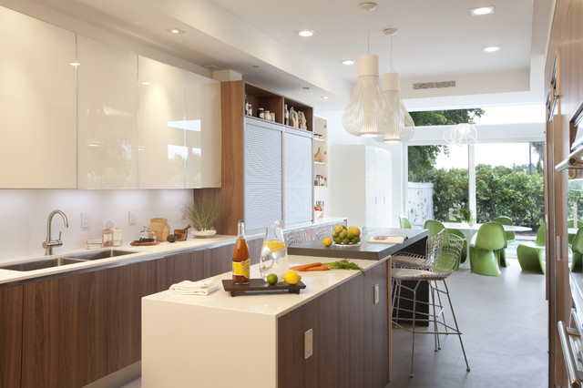
The kitchen used to end where the first group of cabinets ends, and the breakfast room had a big wall unit blocking the windows. A pop of green is provided by the Panton chairs and plays off the vibrant foliage seen in the backyard. "We designed the house to bring in as much of the outdoors as possible, from enlarging windows and bringing in plants," explains Donadel.

The cabinets continue the theme of mixing natural textures, in this case walnut and glass, and the backsplash is white back-painted glass. "The pendant lamps were the very first thing my client and I picked out on our first shopping trip together," says Donadel. "We didn't know where we were going to use them, but we knew we had to have them."

Kitchen crafted by Mia Cucina; Bertoia counter stools: Knoll; Saarinen kitchen table: Knoll; Panton kitchen chairs: Vitra
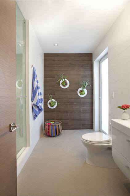
Donadel took this downstairs bathroom and turned it into a cabana bathroom by replacing an existing window with a door that leads to the yard. "This space is transitional between the landscape and the house, so I used porcelain tile that looks like wood, pool towels and those fun ferns," she says.
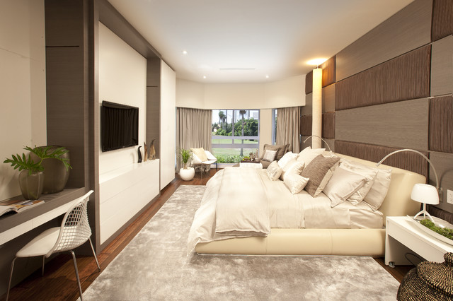
The extension in the dining room below meant that the master bedrooms gained some length. "We needed to break up the long walls and add some softness, so we created three sections down the side the bed is on," Donadel says. The wall composition alternates between wood veneer and fabric-upholstered panels. 

The storage system on the opposite wall mirrors the three sections as well and includes a desk, a media center, dresser storage and even a refrigerator.
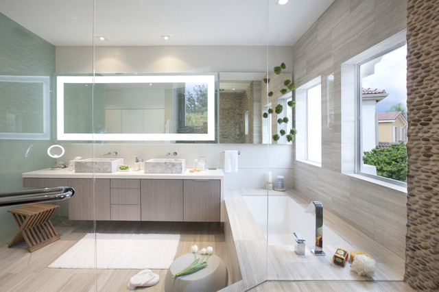
This bathroom continues a wrapping theme, with the Vena Grigio stone extending across the floor, around the tub, up the wall and into the shower stall (look closely; this picture was taken from inside the shower stall, which is covered in a pebbled tile). 

The stone contrasts with a porcelain backsplash behind the vanity. "The backsplash is a ceramic matrix that has a slight shimmer that adds just a little glitz," says Donadel. This is representative of the subtle glamour that is woven throughout the house. 

In keeping with having a place for everything, the custom vanities have built-in hampers. Even some of the lighting is built in. "We chose a mirror with integrated lighting for a very clean look. We didn't want to clutter up the wall with separate sconces," she says.
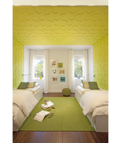
This bedroom is shared by the two youngest boys, and making it fun was the most important thing to Donadel. While function was brought in by lining beds and desks along opposite walls, fun was brought in via brightly colored and patterned MDF panels, which continue the wrapping element seen throughout the home. 

She also added an area rug composed of Flor tiles, which can be individually replaced in case of any damage.
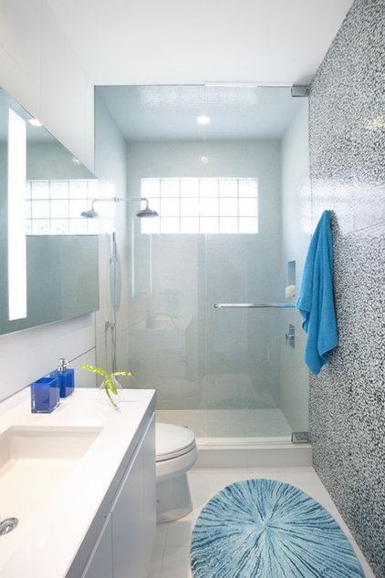
"We wanted to keep this bath minimal and clean, but not institutional," explains Donadel. A unique wall composed of white stones embedded in gray resin adds natural texture, interest and gloss. 

Natural light streams in thanks to the clear glass shower enclosure. "We extended the glass to the ceiling so that it didn't create an extraneous line," she says. 

Tile: Riverstone, Artistic Tile
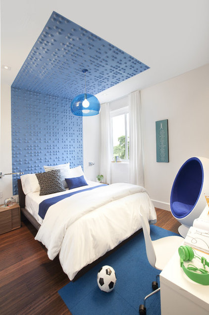
The eldest boy's room is futuristic, cool and fun. It gets a loads of bright blue color from painted Inhabit textured wall flats, an FL/Y pendant lamp and an Eero Arnio Ball Chair. The wrapping theme is continued from the floor up the wall and across part of the ceiling. The occupant's favorite thing? The bright green headphones. 

"My clients were very scared, but their complete trust let us accomplish this project together," says Donadel. Their leaps of faith resulted in a unique and beautiful home that works for their family. Donadel is now working on transforming the yard. We look forward to seeing it when it's done.

Archives