Blog by Beebe Cline, PREC*

<< back to article list

A Manhattan Studio Gets a Bright Future

 A Manhattan Studio Gets a Bright Future

Sunny citrine walls bring zest to a young singleton's newly redesigned West Village apartment

Staff Writer, Houzz.com More »
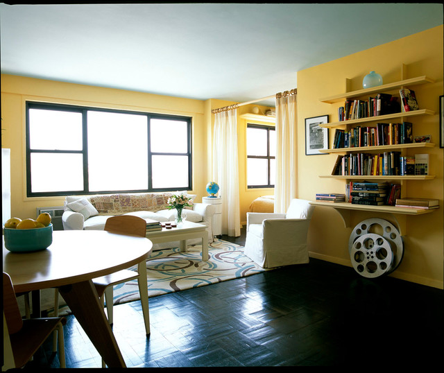
This Manhattan pad welcomes you with bright yellow walls and plenty of natural light streaming in from unadorned windows. But the compact space didn't always have such a cheerful disposition. In the home's previous life, guests walked into a studio filled with a hodgepodge of pine furniture and first saw ... a desk. "It wasn't a messy desk, but a desk with stacks of papers. But no matter how organized it is, it isn't what you want to see when you walk into a space," says interior designer Leslie Banker.

Although the space can't accommodate fancy dinner parties for 50, her client now entertains small groups with ease. The designer says, "Like many people in the city, my client orders out a lot. But she also loves having people over for drinks. Entertaining in a space that's under 500 square feet is a bonus for a single gal in Manhattan."

Houzz at a Glance
Who lives here: A young, single professional in her 30s
Location: West Village neighborhood of Manhattan, New York City
Size: 490 square feet
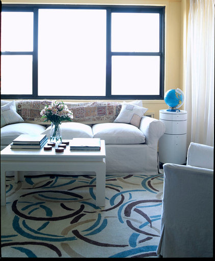
Natural light streams in from the living room windows running across the street-side wall. The windows open out to views of the Meatpacking District and the Hudson River.

Banker admits that the walls' yellow hue makes a bold statement — and required a bit of a commitment from her client. "She lived with a big test patch in her bedroom for a few days and came out really liking the color and its uplifting effect on the space — and on her," she says.

Ceiling paint: Fountain Spout, Benjamin Moore; wall paint: Morning Sunshine, Benjamin Moore; wood floor stain: ebony
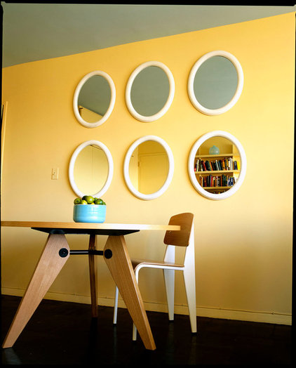
Initially, the designer toyed with the idea of finding different pieces of artwork for the wall space behind the dining table. But acquiring a massive piece of art for the wall seemed like an impractical choice and a big investment for a young professional's first home, so Banker opted for a series of six vintage mirrors from Jonathan Adler's SoHo store. The mirrors' symmetrical arrangement and even number tie the area together.

Dining table, chairs: Vitra
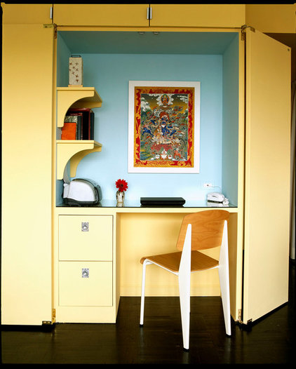
Banker designed a built-in desk unit, which the client has the option of concealing or revealing.

A tiny kitchen lies on the other side of the wall. Baker and her client discussed the idea of tearing down the wall separating the kitchen from the main room and converting the apartment to an open plan. "But tearing down the wall and opening up the kitchen would have lost a lot of storage space, so we left it as is. Also, we would have lost the chance to build in the desk, which is now such a lovely part of the studio's redesign," she says.
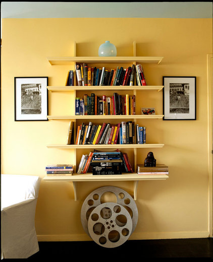
A book display gets a dose of symmetry and balance with a pair of framed photographs flanking the unit; the vase on the topmost shelf and the pair of empty film spools on the ground heighten the symmetry.
Banker threw the studio many curves in the main areas, with a round dining table (not shown), the vintage mirrors, a circle-patterned area rug and other decor complementing the liveliness and jovial quality of the walls. They also soften the sharp angles of the coffee table and windows.

Area rug: Nina Campbell, The Rug Company
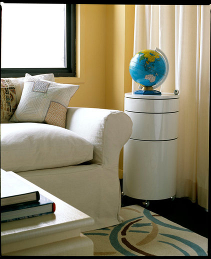
Custom sofa slipcovers in off-white and playfully patterned John Robshaw throw pillows lend the seating a cozy, lived-in appeal.
Verner Panton's iconic Barboy occupies the space between the sofa and a curtain partition. The curvy decor piece serves as both an end table and an essential entertaining system for Banker's client, who filled each drawer with glasses, liquor bottles and other bar accoutrements.
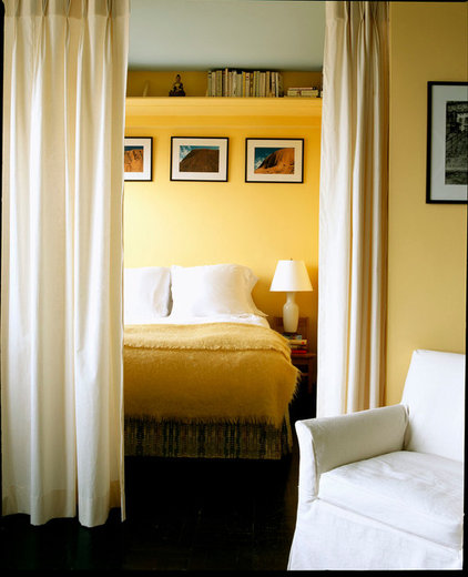
Curtains gently divide the bedroom from the living room area. "The entire space works hard for the client, even if it's just an open space in the middle of the living room floor or a high custom shelving unit in the bedroom," says Banker.

Archives