Lively Meets Thrifty in Southern California
Lively Meets Thrifty in Southern California
A complete interior gutting, thrift store finds and an artistic eye give a photographer's home more space and a modern cottage look
Houzz at a Glance
Who lives here: Stephanie Wiley and her 2 young sons
Location: Near Los Angeles
Size: 1,650 square feet; 3 bedrooms, 2 bathrooms
|
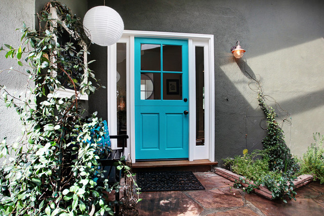
The cheerful entry is one of
Wiley's favorite parts of the remodel. A bold turquoise doorway echoes
the home's bright interior, and an outdoor chalkboard provides space to
greet houseguests. "Turquoise just improves my mood," says Wiley. "And I
love being able to leave messages for family and friends on the
chalkboard."
Outdoor bench: Orchard Supply Hardware, painted black; front door paint: Cool Aqua, Benjamin Moore; sconce: Lowe's |
|
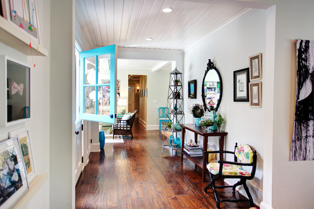
Wiley used furniture and
accessories she already owned; some had been passed down to her, and
some she'd found at thrift stores.
The elegant mirror in the entry hallway belonged to her great-grandmother. A coat of black paint gave it an edgier feel. The small chair in the entry is a favorite piece — it was once filthy and covered in a maroon velvet, but she painstakingly cleaned, painted and reupholstered it, making it an adorable addition to her entry. Console: Pottery Barn; chair upholstery: Calico Corners; étagère: Wisteria |
|
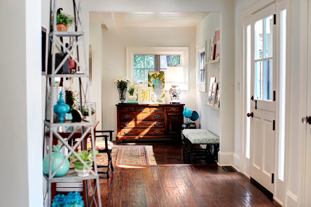
Hand-distressed floors provide the
look Wiley was going for, and their practicality for a house with young
children is hard to beat.
|
|
A tight layout originally limited
the flow between the main living spaces. Wiley had the walls opened up,
and she reconfigured the interior without adding any square footage.
Figuring out the right layout was a challenge, and she had to compromise
in some spaces — including in the slightly narrow living room and
kitchen.
|
|
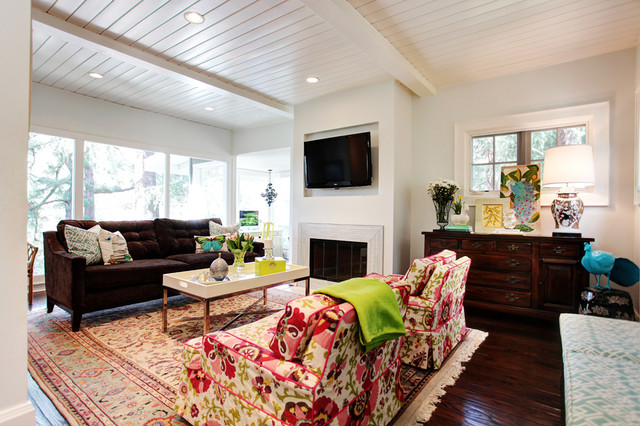
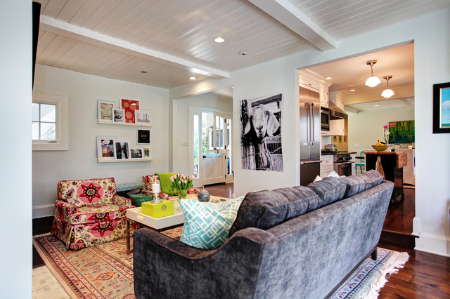
Glossy white ceilings and a mix of
playfully bright textiles combine beautifully in this happy living
room. "I love color and prefer to use a little humor and personality in
decorating — hence the huge goat canvas," says Wiley.
Couch: Dwell Furniture Store; armchairs: vintage; coffee table: Joss & Main |
|
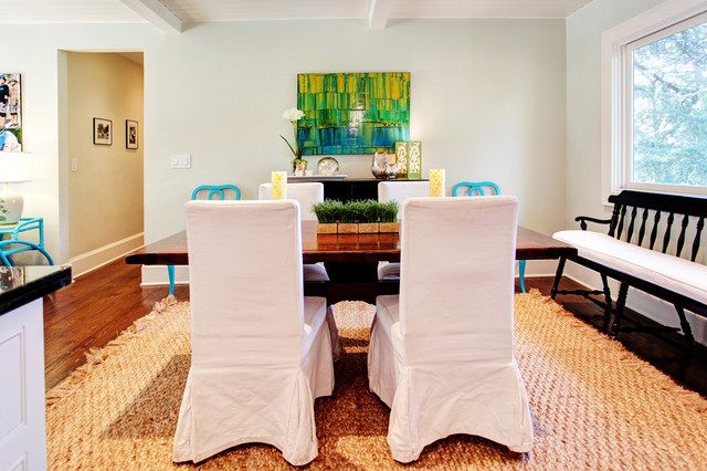
A vintage table and bench add
character to the bright dining room. Connected to the living room, the
dining space gets definition from a jute rug found on Overstock.com.
|
|
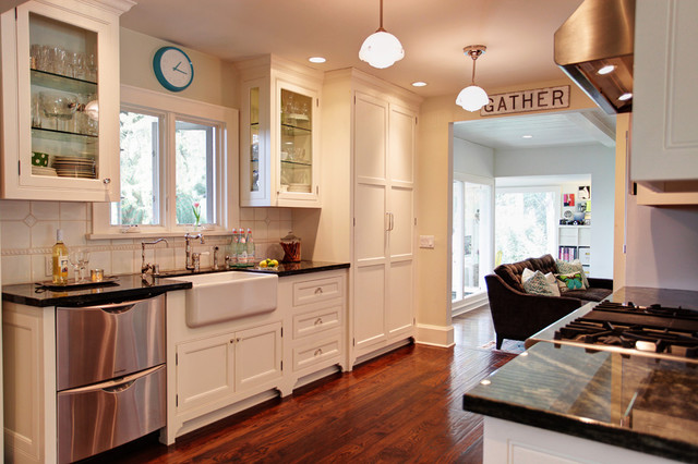
The new floor plan also demanded a
galley-style kitchen. "It's wide enough to need an island but not wide
enough to build one in," says Wiley. Classic white backsplash tile
contrasts with the home's interior wall color — a very pale green
(Distant Horizon, by Dunn Edwards) that looks almost white in some rooms.
Backsplash tile: Foothill Tile & Stone; pendants: Restoration Hardware; sink: Shaws Original; blue clock: Target |
|
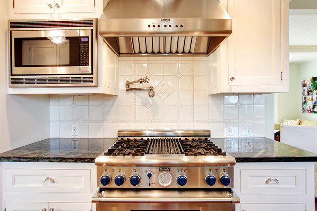
Wiley wanted her kitchen to feel
classic and beautiful, with a design that wouldn't date easily. She
chose backsplash tile with minimal detailing and a very dark green
granite to draw in the pine trees outside her home.
|
|
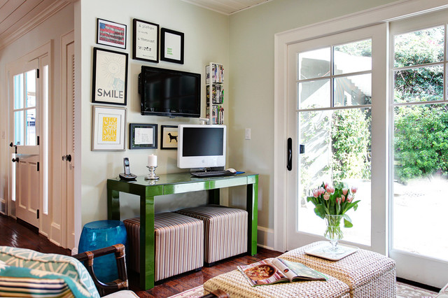
A small computer and TV space near
the back of the house serves as a hangout spot for the kids. Although
Wiley would love to add a bigger play area, this nook works perfectly
and offers easy access to the outdoors.
|
|
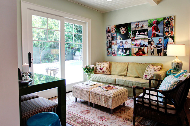
The kids' space has a simple Ikea couch that Wiley covered with a custom slipcover.
|
|
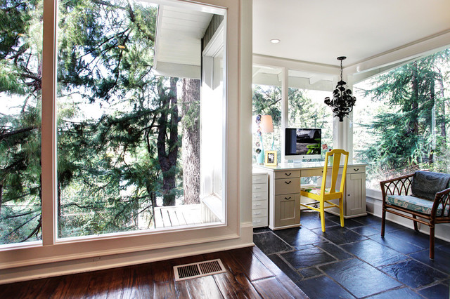
Wiley's home office has a
panoramic view of the woods surrounding her Southern California home. A
vintage chandelier, painted black, contrasts the repainted vintage
chair.
Desk: Ikea |
|
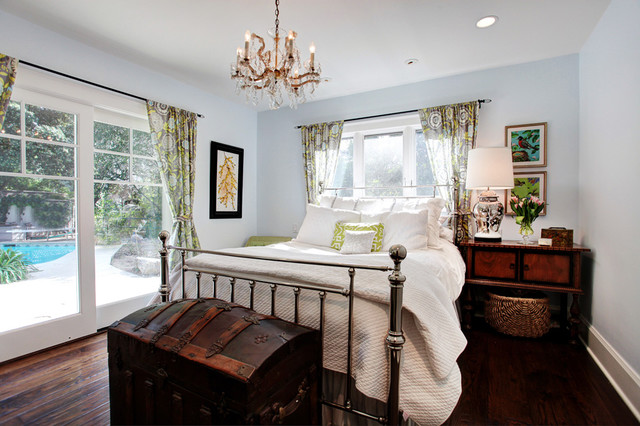
The master bedroom is Wiley's getaway. Custom curtains made out of Amy Butler
fabric provide its only source of pattern. Wiley used the same base
paint color here as in the rest of the house, but added 20 percent more
white to give it a boost.
Nightstand, table lamp, chandelier: vintage; wall color: Distant Horizon, Dunn Edwards; bed frame: Restoration Hardware |
|
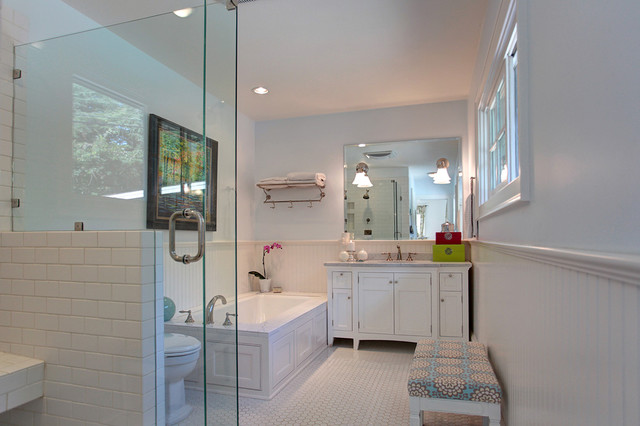
An all-white master bathroom fits
into the home's new interior cottage scheme. Art found on eBay and a
reupholstered bench add color to the classic white vanity and Daltile
floors and shower.
|
|
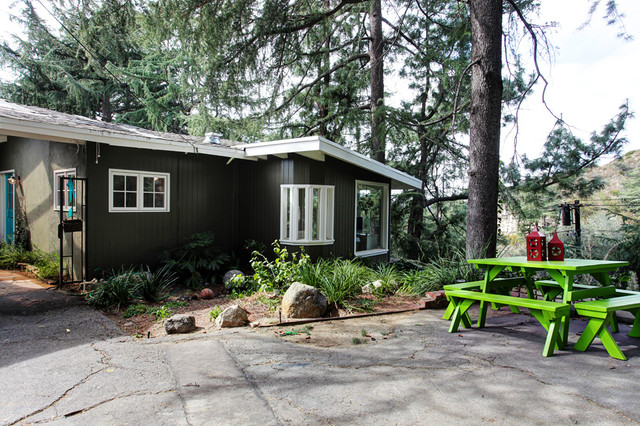
Wiley left the outside pretty much
as is. The midcentury exterior was simply updated with a new neutral
color and fresh, white trim.
|

