Sunken and Raised Areas Take Gardens Up a Notch
Nowadays the mod sunken living room seems relegated to hotel lobbies and ski lodges; it's not usually inside our homes. But outdoors that sunken space has its benefits. Even if you have a 100 percent flat parcel of land, you can create excitement and energy in your garden by creating one or more levels.
Like a courtyard that gets its definition from the walls that surround it, a garden space that is lower than (or elevated above) the main grade gains instant cachet. It's set apart from the rest.
Any time the grade is changed, even with a single riser, the dynamic is also changed. Here are some clever ways designers have changed the grade. I give them an A-plus.
Step it down. At the lowest point of this narrow, steep backyard, there was plenty of room for a patio. But this is no ordinary patio. It's a dreamy destination for anyone who walks outside the back door.
The elements are perfect. First, the designer has done a superb job of breaking up the slab into bands and squares, further defined by crushed stone. The treatment ensures good drainage and suggests a patterned carpet.
As you descend a few concrete steps to enter the sunken outdoor living room, you're drawn to the generously scaled U-shape bench. Made of a sustainable hardwood, it embraces three edges of the patio and has a gas fire bowl at its center.
Twenty could sit here easily. Just add a few cushions and you've got a party.
|
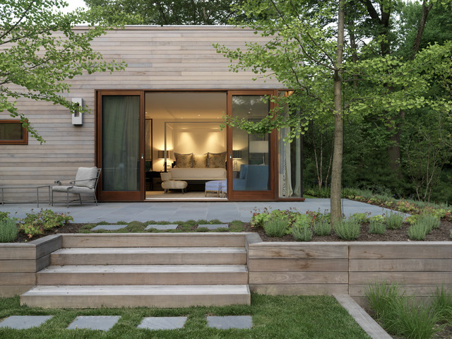
Make it grand. There is an
obvious difference between the level of this home and the level of the
garden. Rather than having a tiny porch with a few spindly steps just
outside the master bedroom's beautiful sliding doors, the design
connects home and garden with a bold solution.
Here the garden is essentially elevated to meet the doorway. What could have been a tiny porch has been enlarged into a spacious bluestone patio retained by steps and a low wall. I really admire how the horizontal cladding on the step risers and retaining wall echoes the home's exterior finish. The addition of a planting margin around the patio's perimeter — and the presence of large trees — underscores the significance of the new space. The rest of the property can be observed from the elevated patio or enjoyed up close. All one has to do is descend the graceful steps into the lower garden. |
Together, plants (golden bamboo) and materials (poured concrete and stone) make a visual connection between the levels. A staircase physically links the two spaces.
Viewed from above, the extended runnels draw the eye beyond this component toward the play lawn, patio and outdoor gathering spaces. This sunken garden is well thought out and separate from the entry, although accessible from the home's lower rooms.
The stained hardwood decking warms up this space — and there's plenty of luxurious outdoor seating. Together, these elements makes this sunken garden space feel as cozy as an indoor room.
|
Gain impact in a pocket-size nook. This
wedge of space behind a city townhouse looks like a sculptural
installation, thanks to the perfect placement of furniture and plants.
This room may not be officially sunken, but when it's viewed from above
there's the pleasing illusion of a change in grade.
Tile flooring creates a bold rhythm, while a trio of planters emphasizes each corner. Seating is aligned along the diagonal, creating a strong point of view. As pretty to look at as it is pleasant to sit and eat a meal on, the mint-green seating — a Lutyens bench and two midcentury wire armchairs — is lovely and lighthearted. The scalloped petal table looks like a flower from above. Can you say "sweet retreat"? |
|
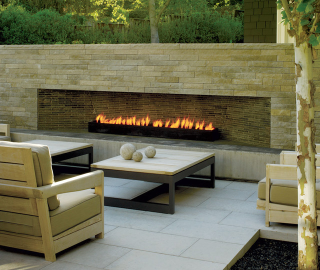
Float the patio. Only a
subtle grade change was needed to give the impression that this outdoor
seating area hovers above the rest of the garden.
The beautiful cast-stone patio does just that, relying on thick slabs to form the floor, including a cutout niche to accommodate a nearby tree. The contemporary cut-stone fireplace wall is the focal point, with the furniture oriented around the heat source. Teak armchairs, piled with deep, comfy cushions, add an organic counterpoint to the stone and metal used elsewhere. Step into this room and escape the world's distractions. |
|
Make the lawn sunken. Two "area rugs" of lush, green grass feel like sunken, private rooms. The overall effect may be a trick of the eye (trompe l'oeil) created by the clipped boxwood
that frames and defines each carpet of grass. Notice how the boxwood
balls punctuate the doorways and create the visual sensation of entering
a sunken space.
The elevated fire pit at the center of the pathway is unexpected, changing the levels used elsewhere in this setting. Altogether pleasing, these spaces are private and inviting. |
The sides of this structure may be open to the rest of the garden, but the emotional mood created by the horizontal and vertical lines makes it feel private and apart.


