Splashy, Colorful Fun for a Family of 5
Freng got to work and transformed the home's 1980s interiors into splashy, functional and fun spaces that reflect her love of color and salvaged materials. "Sometimes when you walk into someone's home, there's a real disconnect between the house and those living in it," she says. "I'm happy to say that every room in this house has our stamp on it. It's not perfect, but it's ours."
Houzz at a Glance
Who lives here: Mindi Freng and her family of 5
Location: Grand Rapids, Michigan
Size: 3,500 square feet
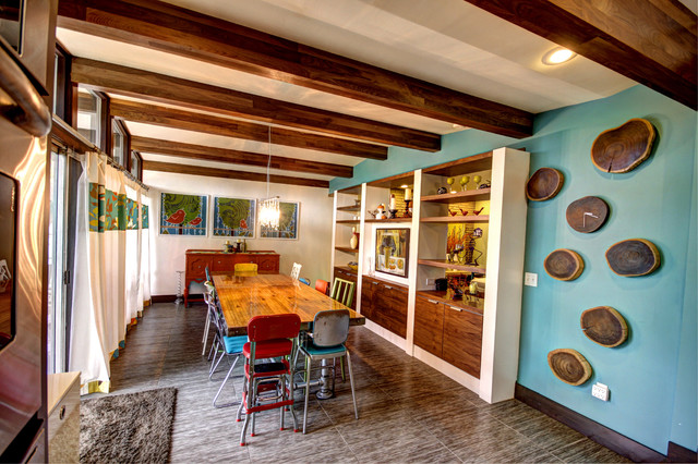
That's interesting: The dining table is made from a reclaimed bowling lane.
|
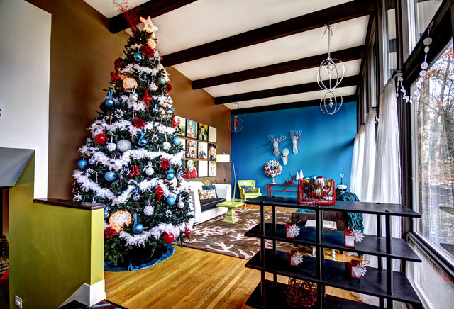
A 12-foot artificial tree — a
Craigslist find — is just the right scale for the living room. Sheer
curtains and windows along an entire wall let in plenty of natural
light. Hopper windows let in fresh air. Accent walls in a chocolate
brown and bright blue celebrate Freng's love of color. "It's a cheerful
room, and the colors are pretty atypical for Michigan," says Freng. "But
I don't really care. I'm not one to play by the rules."
Brown paint: Craft Paper, Sherwin-Williams; blue paint: Caribbean Blue Water, Benjamin Moore; floors: oak, original to the house |
|
|
Freng learned a lot about how bowling alleys were made in the process of converting the piece into a dining table. "It weighs a ton, so as my husband always says, it's never leaving this house," she says. Plumbing pipes make up the table legs, throwing an industrial touch to the piece. Mismatched chairs surround the table, all picked up from vintage shops and flea markets in the area.
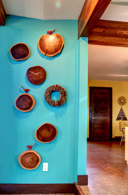
An accent wall in Benjamin Moore's Peacock Blue enlivens the space and makes a warm, happy background to the organic wood chunks.
|
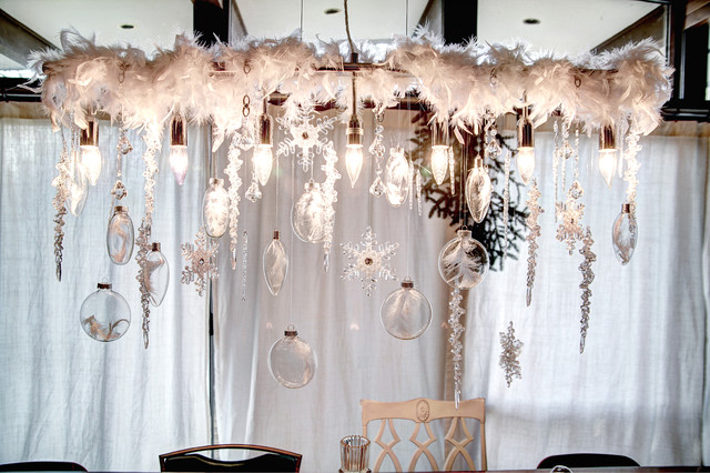
The designer glams up the dining area's chandelier for the holidays with glass ornaments and feathers.
|
|
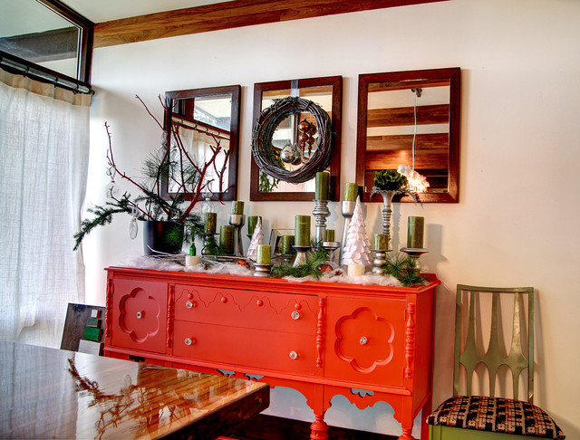
"I painted my grandma's buffet a
bold orange and filled the buffet top with pillars, branches and other
holiday accessories," Freng says.
|
|
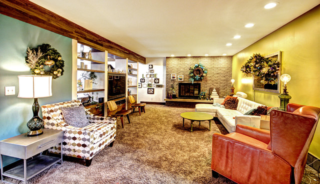
The family room has wall-to-wall
carpeting. "We have young kids, and they spend quite a bit of time
there. It just made sense to have something soft underfoot," says Freng.
Built-in shelves separate the dining room from the family room and let light in from the back of the house. |
|
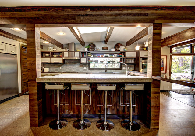
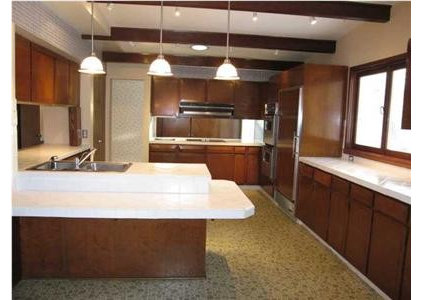
The kitchen shows Freng's love of
walnut. She had her construction team wrap the structural beams in
reclaimed walnut (previously used as flooring), giving the space
movement and interest.
"In case you can't tell, I love walnut. I also feel like it works with the midcentury architecture of the house," she says. A skylight bathes the space with light. |
|
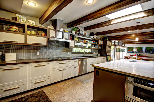
AFTER: She matched the
back concrete countertops with the shelving unit's Branchport Brown
stain. The island countertop is also concrete but looks a lot like
Ceasarstone or Cambria. Off-white cabinet doors, plus layered lighting
from the skylight and recessed fixtures, keep the space feeling
expansive and bright.
|
|
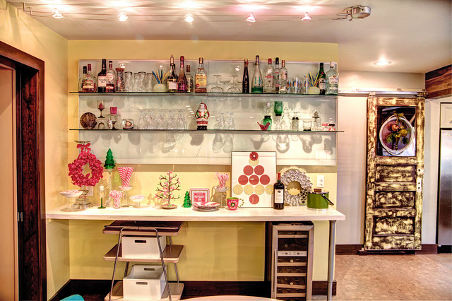
For the holidays, vintage finds
and ornaments share the space with bottles and glasses on the bar's
upper shelves. The more accessible level of the bar showcases more
family-friendly fare, like sweets and holiday candy.
|
"We quickly realized how much work actually went into just a small remodeling project, so we hired a team for the rest of the house — and we're so happy we did," she says.
|
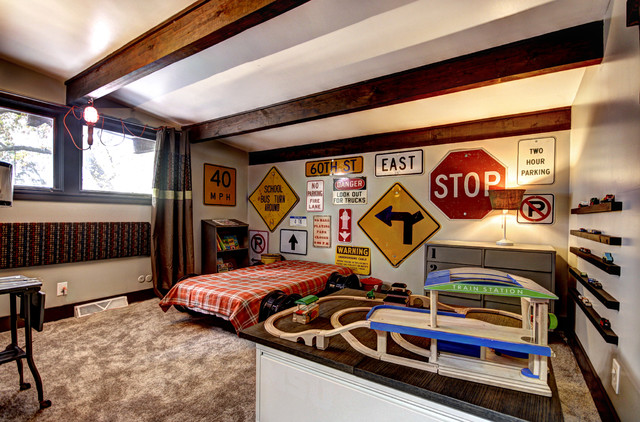
Their toddler's room pays homage
to all things locomotive. Old traffic signs cover the walls, preloved
rims support the bed frame and two repurposed filing cabinets with
desktops make up a train table with storage underneath. Freng displays
her son's cars on 2-by-4 wood strips that she cut in half, painted and
mounted on the wall.
|
|
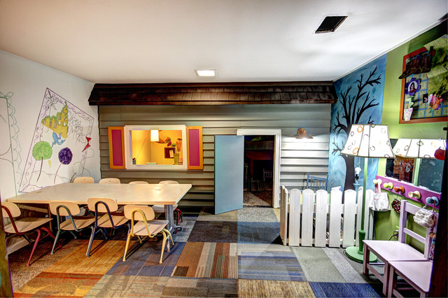
"This playroom was a last-minute
project that I revealed on Christmas Day. I needed a space for my kids
to be able to do whatever their imaginations dreamt up for them," says
Freng.
The designer bought the siding and shingles from a Habitat for Humanity ReStore for a mere $11. She salvaged the carpet squares from a school project's toss pile. "We did the murals on the wall and left the ones on the white wall unfinished so that the kids could color, paint and fill in the work over time," she says. |
|
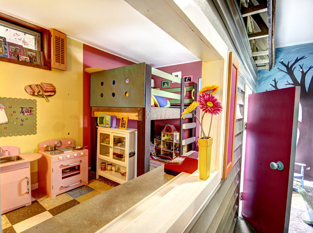
An adjoining area houses a reading perch, a play kitchen and dollhouses.
|
|
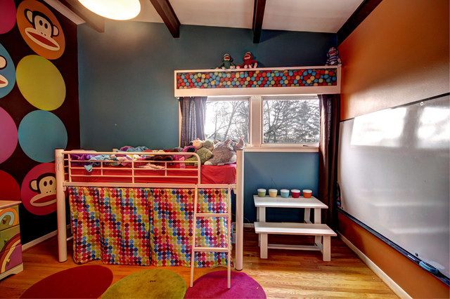
One of Freng's favorite custom
pieces is her daughter's window box, which Freng filled with playground
balls and constructed with medium-density fiberboard and Plexiglas. "The
balls can be changed out to whatever my daughter is into at the moment,
so it will change with her tastes," says Freng.
A whiteboard from an office supply outlet gets lots of use when the kids are playing school. "It keeps them occupied for long stretches of time," she says. |
|
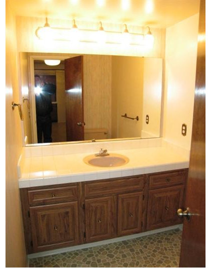
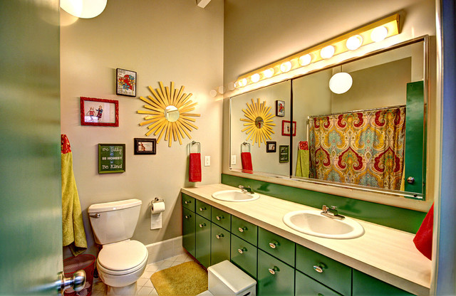
Freng updated the kids' bathroom
by refacing the cabinet doors and drawers. She painted the cabinet doors
in Sherwin-Williams' Argyle, an on-trend green.
"I'm really happy with how it turned out. We replaced the toilet and
sink but kept the Formica countertops, which are low maintenance," she
says.
|
|
It's taken years for her husband
to trust her design and color choices, she says. "Part of overcoming
fear, especially a fear of color, is the importance of actually moving
forward and seeing something work. A successful project gives you — and
anyone else involved — the confidence to move ahead," she says.
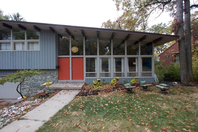
The entrance hints at the colorful fun inside the home by making an opening statement in Sherwin-Williams' Jalapeño. |
