10 Ways to Make Your Neutral Palette Shine
Decorating entirely in neutral colors can create a space that is soothing, sophisticated and warm if it is done well. A lot of people are afraid to use color, worried that they will get it wrong, so they end up with all neutral colors by default. But it takes more than a lack of colors to create a successfully executed neutral color palette. Take a look at these beautiful examples and my observations on what makes these rooms work.
1. Use many different shades of your neutral color. Whether you have decided to work mostly with taupe or cream or gray or any other neutral, using several shades of that color will add depth. In this room, the seating pieces employ four different colors: the draperies and walls are a different color, and the wood is quite dark compared to the upholstery.
2. Use multiple textures that contrast well. If the seating pieces in this room were all microfiber, the room would fall flat. But the fabrics on the two sofas and the chairs have distinctively different textures, and they contrast well with the leather piece in the foreground. The drapery panels are the same color as the walls, but the walls are a matte texture, and the drapery shines.
3. Use high-quality texture. Yes, note that I said "high quality." When you don't have dazzling colors to create interest and get attention, other aspects of your room become even more important. Texture is one of them. In the room above you can see how the light is reflected and absorbed at different angles on the fabric of the sofa by the window. Even in the photo, I can tell you that is one luscious fabric. Also, the leather on the chair in the foreground at the very bottom of the photo is definitely not your cheap, bi-cast or bonded leather. Take a little time to educate yourself on the grades of leather.
Tip: Mix the "high" with the "low." I know we don't all have the budget to use $300-per-yard designer fabrics, high-end furniture, original art pieces and one-of-a-kind accessories throughout our entire home. Buy the best seating pieces you can afford. You'll use them and touch them every day, so you'll notice the difference. Choose a few other standout pieces and the look of your space will be elevated even if you have many bargain pieces.
|
4. Use beautiful and interesting shapes.
Removing color from the equation also brings shape into the foreground
and the shapes in this room really catch your attention. The ottoman is
unique and so is the side table composed of metal discs. The little
swoop of the wood on the arms of the chairs also adds interest and
contrasts with the very straight lines of the coffee table.
5. Use a combination of interesting materials and surfaces. In the photo above we see a shiny metal side table and a mica coffee table. They both add interest to the room that would be missing if matching wood coffee and side tables had been chosen. Tip: Do not go into a furniture showroom and buy the matching 5-piece-sofa-loveseat-chair-coffee table-side table combo. It might feel like a safe choice, but it is boring, boring, boring! |
|
6. Incorporate pattern. The
large-scale pattern on this upholstery really makes the room. The area
rug also is patterned, and if you click on the photo to enlarge it on
your screen, you can see that there is pattern in the drapery fabric as
well.
|
|
|
|
This room is so interesting and it
works on so many levels. Lots to learn here about working with a neutral
color palette. First, I would like to point out that all of the above
elements are included: Different shades of color, multiple textures that
are of high quality, interesting shapes and different materials, and
wonderful patterns. But there is even more going on here that
contributes to the success of this design.
7. You can mix your neutrals. Most people think a neutral color palette is made of a bunch of beige. But there are other neutral colors and you can mix them if you want. In this room, the designer has mixed shades of beiges and browns with several shades of gray: light silver-gray, medium steel gray and also deep charcoal. 8. Add black (or almost-black) for punctuation. In this room, the black on the cowhide chairs adds a strong bit of punctuation and so does the dark color on the rugs — more of a charcoal. In fact, notice that in all 4 photos you've seen so far, there is a little bit of black or near-black. The first room has black lampshades, the second room has black picture frames and espresso wood, and the third room has that super deep almost-black wood. 9. Include elements from nature for interest and warmth. I'm crazy about the driftwood lamp bases in this room! |
|
A neutral color palette can be light and creamy ...
|
|
|
|
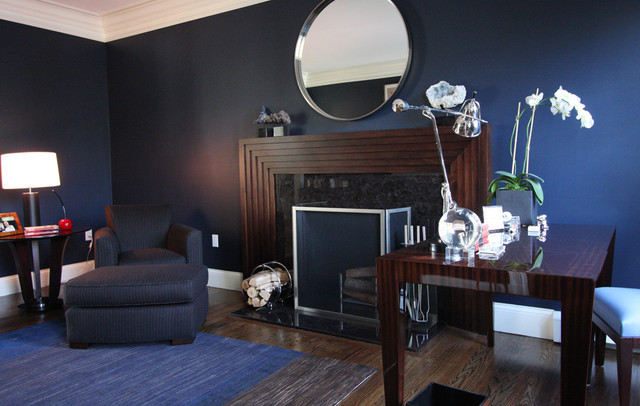
... or it can be deep and
dramatic. Do you have the nerve to use black walls? Mixed with rich
wood, deep grays and silvery metal and mirror, this is a pretty striking
room.
|
|
|
|
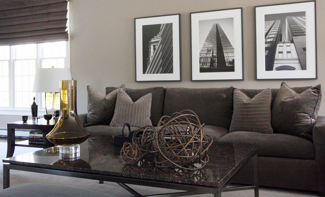
Your neutral can be all grays. If you decide to choose gray as your neutral, I think it looks best in warm shades that lean toward taupe.
|
|
|
|
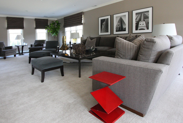
10. Don't be afraid to add a little bit of color to your neutral palette in small doses.
I think an all-gray room works best with a little hit of color. This is
the same room as the last photo. The red performs the same function of
adding punctuation as black would — just stronger.
|
|
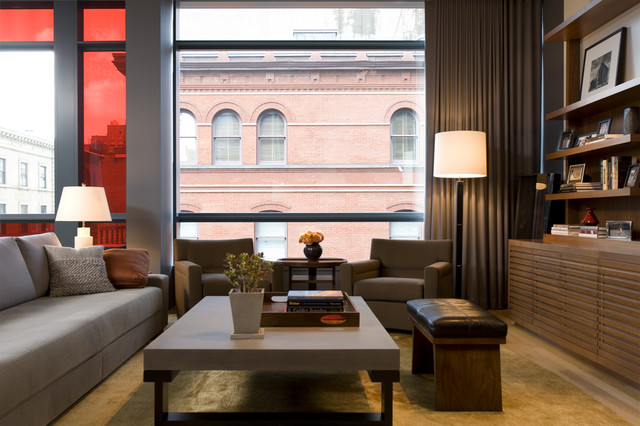
The soft red glass color is lovely next to this serene room.
|


