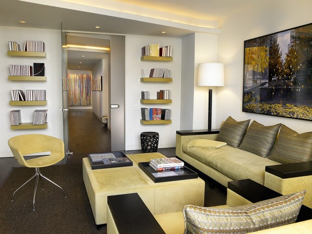
Line Up for Intriguing Horizontal Elements in Design
|
Long and Low Horizontals Cry Out for Company
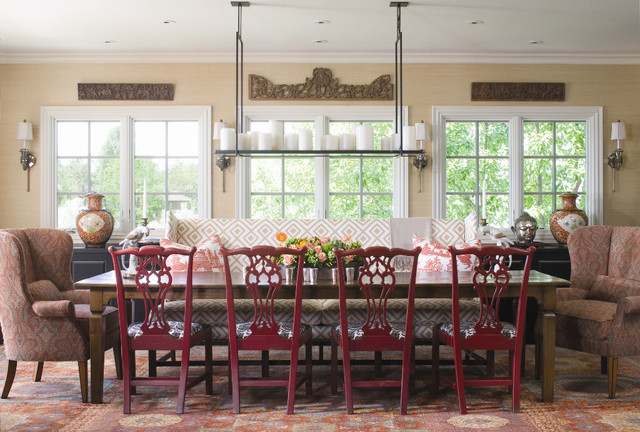
When working with a long and low horizontal dining space, you can either break up that expansive horizontal area or accent it with a deep and wide table chock-full of dining chairs. The long horizontal light fixture and artwork above the windows give the horizontal lines even more power. |
|
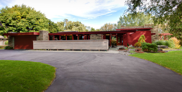
This long and low home is
accented perfectly by a long and low privacy fence. The lines work
together instead of competing, allowing the house to fit snugly into its
surroundings.
|
|
Rethink Traditional and Celebrate Horizontals
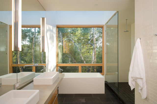
Bathtubs are often rounded. Even if they fit into a square space, the design always reads oval thanks to the interior cutout. But when installing a freestanding tub, consider a rectangular design to accent other horizontals in your space. The shape story continues here with the choice of rectangular, low-profile sinks. |
|
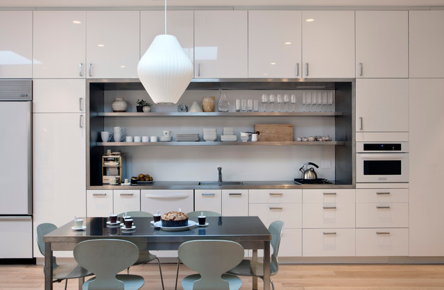
When you have a large bank of
cabinetry against a horizontal line, as here, opening up a long
rectangular box in the middle can make a pleasing design statement. The
same line is repeated in steel gray with the table, shifted to the left
for a perfectly asymmetrical setup.
|
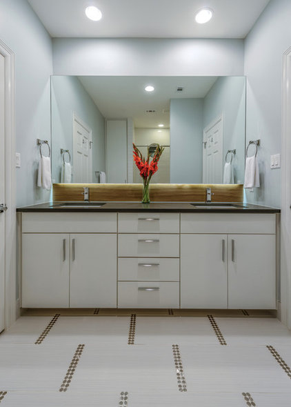
Accenting horizontals doesn't mean everything in a space has to run on the same line. In this bathroom the repeating horizontals, from the cabinet doors to the backsplash to the mirror, are contrasted and accented by similar lines turned vertically on the floor.
|
Look around your spaces today.
Which lines are inherent in the architecture of your house? Are there
horizontals that you could played on with furniture arrangements,
accessory choices or even a new paint treatment? While at first
horizontals might seem commonplace, they can make fascinating designs in
any space.
|
