From Dated Southwestern to Serene Minimalism in a Cleveland Bathroom
Natural materials, a simplified color scheme with strong textural contrasts, an extended vaulted ceiling, more storage and a new layout add up to a minimalist retreat designed for two. Sneak a little break from whatever you're working on and let this bathroom daydream take you away.
Bathroom at a Glance
Who lives here: A couple and their blended family
Location: Cleveland
Size: About 192 square feet
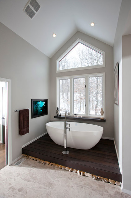
The bathtub sits on a platform made of Brazilian massaranduba wood. "The platform elevates the tub so that they can enjoy the view, and creates a moment of contrast between the wood and stone," Duebber says. Massaranduba is used for outdoor decking and can stand up to water splashing over the sides.
Duebber found the river rocks at a landscaping yard for about $5. The tile ends where the rocks begin, leaving a 3/4-inch recess for putting them in place atop black concrete board. In addition to the rocks, Duebber used natural cut limestone tile on the floor and in the shower to bring in a warm, natural texture. The platform was stained to match the vanity, which you'll see next.
Faucet: R10 Series 3FRTL, Rubinet; bathtub: Barcelona, Victoria and Albert; floor tile: Arctic Gray limestone, Daltile
|
The mirror contains his-and-her medicine cabinets on either end, with recesses built into the wall behind them for added depth.
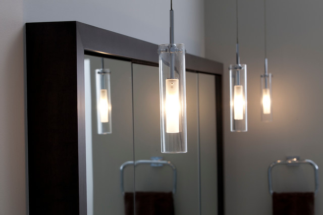
Simple clear glass tube pendant lights continue the clean lines and play off the clear glass shower surround. Pendant lights: Top-si Coax Pendant, clear, LBL |
The previous layout had two sinks (see floor plan, next). Using one long trough-like sink adds to the room's minimalist aesthetic. "The finish is beautiful, and the color blends really well with the limestone," Duebber says.
Faucets: R10 Series 1BRTL, Rubinet
|
|
|
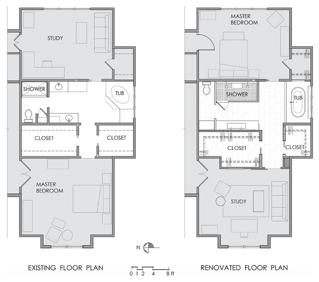
You can see the changes to the
layout on this plan; Duebber borrowed a little space from the walk-in
closets for the reconfigured bathroom.
|
|
|
|
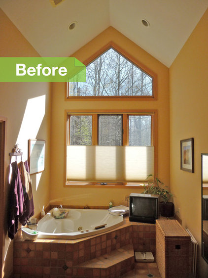
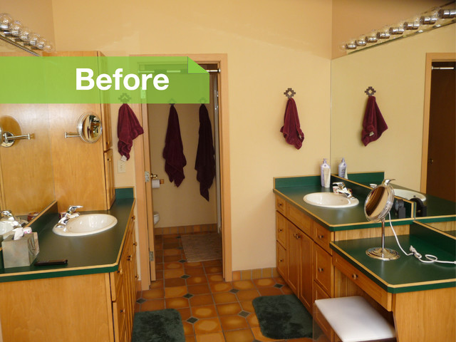
BEFORE: The bathroom had a separate toilet room, and the vaulted ceiling ended at the wall that separated it from the rest of the room.
|
Clever lighting is also an important part of the scheme; LED tape underneath the vanity and the bathtub platform illuminate the river rocks.
|
He also borrowed a little room from existing walk-in closets to create a large shower stall for two. One side has a rain showerhead, while the other has a handheld one; there's a shower bench between the two.
A 4-inch-wide ledge along the entire wall provides space for bath products. Clear glass creates an open feel. |
Duebber reiterates what I've been hearing a lot from architects lately: Many clients these days want track doors. He recommends Stanley and Grainger for inexpensive track options.
