Original Drawings Guide a Midcentury Gem's Reinvention
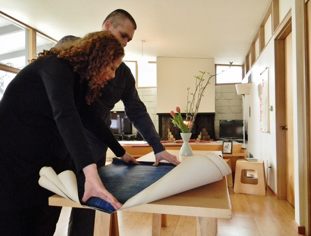
The Faulkners bought the house, moving from Seattle over the mountains and settling into their new rural town. Scott, an architect and furniture maker, built most of the plywood furniture. And though the previous owners had renovated in 2006, much of the home's original character remains. The couple was fortunate to get a complete set of the original drawings of the house, and they plan to honor and reflect Cowan's design.
Who lives here: Scott and Emily Faulkner, cats Pearl and Tiger, and dog Domino
Location: Craig Hill neighborhood of Ellensburg, Washington
Size: 3,200 square feet; 5 bedrooms, 3 bathrooms
|
by Kimberley Bryan
»
|
|
Many materials transfer between
the indoors and out. A bed of river rock inside near the entryway
continues outside, as does the concrete masonry unit wall.
A large, unadorned entry window washes the entry with natural light, while providing a clear view of the exterior vertical fir siding. |
|
by Kimberley Bryan
»
|
|
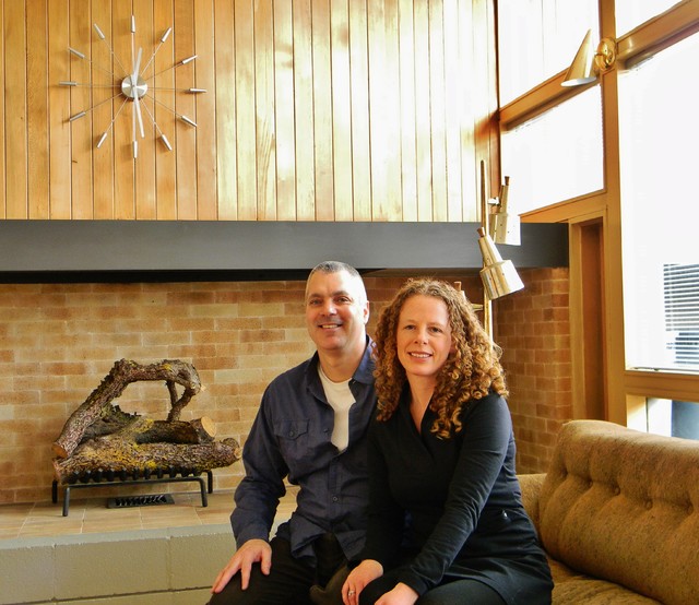
When the Faulkners, shown here,
entered the home for the first time after purchasing it, Scott presented
Emily with a midcentury style clock that now hangs on the clear,
vertical-grain Douglas fir paneling in the living room.
"I was hoping it would look like one of the built-in clocks often seen in midcentury homes. And it does," says Scott. Clock: Chiasso |
|
by Kimberley Bryan
»
|
|
The L-shaped house mixes wood,
glass and cement. A large wall of glass lets light flood into the living
room and connects the space to the outdoors, but a wood-screened
courtyard in front prevents it from feeling exposed to the street.
The home was built in 1957 for the Devney family. It remained in its original condition until it was sold to its second owner in 2006. The Faulkners have met both James Cowan's daughter and one of the Devney sons. "Speaking with them has added to the house and our desire to preserve it as a historical piece of architecture," says Scott. |
|
by Kimberley Bryan
»
|
|
The front entry is a study in
textures: fir wood siding, cement pavers and blocks, glass, river rocks
and playful shadows created by open roofing.
The homeowners created their own version of a screen door — a 3/4-inch board of fir plywood painted and dotted with circular cutouts. |
|
by Kimberley Bryan
»
|
|
The circular cutouts bring breezes inside but also create an artistic light element.
|
|
by Kimberley Bryan
»
|
|
Both enchanted with and inspired
by the home's rich design history, Scott built more than half of the
home's furniture, including this entry console made of plywood and
cherry, with cutout slots designed to make sorting incoming mail easy.
The slate flooring is original to the home. |
|
by Kimberley Bryan
»
|
|
Scott also built the long,
low-slung console, coffee table and armchair in this living room.
"Right now the chair and coffee table are raw plywood," he says.
"They'll be finished like the console, and some cushions will be added
to the chair. But, like the house, I like the furniture to be great in
its details: well made, with multiple, surprising functions and with
clean, surprising elements, like the cherry and heavily striated plywood
inserts."
The sofa and two orange vases were gifts from Scott's family. Tall orange vase: Mort's Cabin; table lamp: vintage, Vintage Vine |
|
by Kimberley Bryan
»
|
|
Eames-style rockers add curves to an otherwise straight-lined composition.
Scott built the door propped against the wall from plywood and a composite material left over from one of his own architectural projects. |
|
by Kimberley Bryan
»
|
|
The bamboo floors, installed by
the home's second owners, reflect the abundant light that pours through
floor-to-ceiling windows.
Small groupings of furniture anchored by no-frills carpets in dark browns and gray keep the attention on the home's lines and the play of light and shadow. Rugs: Morning Coffee, Espresso, Flor |
|
by Kimberley Bryan
»
|
|
Scott built the storage cabinets
to echo the scale and shape of the rectangular opening that leads down
to the dining room. "I like things minimalist, but also usable and
functional," he says. "I appreciate furniture and architecture that is
adaptive and can transform itself for multiple uses."
The tufted vintage Mort's Chair, designed by George Mulhauser, was a gift from Scott's mom. Floor lamp: vintage, from a secondhand store (now closed) |
|
by Kimberley Bryan
»
|
|
Bamboo floors continue into the
dining room, bathed in light. High windows create an open feeling but
block the view of the carport on the other side.
|
|
by Kimberley Bryan
»
|
|
An original teak and glass light fixture hangs over a table and bench that Scott built.
The low-slung round table and console are both vintage. |
|
by Kimberley Bryan
»
|
|
One of many original pocket doors
in the home connects the dining room to the kitchen, which retains its
original layout and birch cabinets.
The previous homeowners had installed new flooring, a tile backsplash and updated appliances. "It really is amazing how much of the house remained intact," Scott says. "And we have that great original spec book, which we can look at to find the things that are missing. Slowly we'll try to re-create them." |
|
by Kimberley Bryan
»
|
|
The homeowners acknowledge that
other people might prefer to completely revamp the kitchen, but they're
happy the cabinets and sliding glass doors remain. "It's just so
interesting to see how intelligently some of the aspects of the house
were designed," Scott says. "The glass sliders can be opened from both
sides, so that if you wish, you can get the light from the family room
windows pouring into the kitchen. Where the dog bed is now, there used
to be a swing-out desk that you could place up against the [picture]
wall, to work at. I'd like to rebuild that one of these days."
Clock: designed by George Nelson |
|
by Kimberley Bryan
»
|
|
The kitchen connects to a family
room, creating an open concept that's common today, "but when this home
was designed, this was forward thinking," Scott says.
The original fireplace wasn't drafting correctly, so the homeowners installed a woodstove in its place. Woodstove: Lopi Republic 1750, Armstrong's Stove & Spa |
|
by Kimberley Bryan
»
|
|
Sliding doors off the family room hide a large storage and utility room with floor-to-ceiling shelves.
Scott built the sawhorse table, coffee table and couch; the latter converts into a guest bed. "With five bedrooms in the house, we actually haven't had to use it," Scott says. "But I still like that it has that second function." |
|
by Kimberley Bryan
»
|
|
A staircase leads to the bedrooms
and bathrooms, which are "all about function," Scott says. "They’re
small, and no matter what you do, you have to leave the bedroom to get
to the bathroom. A lot of people who looked at the home when on the
market were turned off by that. But it works for us.”
|
|
by Kimberley Bryan
»
|
|
Clerestory windows are the
hallmark of the upstairs rooms. "You can tell their placement was so
carefully chosen," says Scott. "The light that comes through the windows
completely changes throughout the day."
In this home office, a vivid shaft of afternoon light seems to point directly to one of Scott's multiuse designs: a Murphy bed that folds down to reveal a full headboard and shelves. |
|
by Kimberley Bryan
»
|
|
When the bed is closed, the space becomes solely a home office in both function and appearance.
|
|
by Kimberley Bryan
»
|
|
Lined with sliding doors, the
hallway has ample storage made even more functional through another
creative original element: slide-out shelves.
|
|
by Kimberley Bryan
»
|
|
Although a bathroom renovation by
the previous owners veered away from midcentury design, the Faulkners
still enjoy the interplay of light through the original windows. "We
will return the bathrooms to their midcentury roots one day," Scott
says.
Faucet, sink: Grohe |
|
by Kimberley Bryan
»
|
|
A doorless enclosure with three rectilinear windows sets the toilet area apart from the bath.
|
|
by Kimberley Bryan
»
|
|
Though another bedroom has larger
windows, the Faulkners made this their main bedroom because they love
the way light pours in through the clerestory windows.
Scott built the platform bed with underbed storage. |
|
by Kimberley Bryan
»
|
|
The only other furniture in the
room besides the bed and some shelving is a vintage desk. "I saw it at
an auction and thought it might be a George Nelson piece," Scott says.
"It wasn't, but we still like it."
|
|
by Kimberley Bryan
»
|
|
Living in the house for the
past five years has revealed the carefulness of the design to the
Faulkners. "Cowan took into account all the natural elements we have
here in Ellensburg: our famous winds, the need to capture the sun in the
winter through glass walls but protect from the sun in the summer with
large overhangs," Scott says. "The house doesn't have air conditioning,
but it doesn't need it. The home wasn't just designed to be pretty, but
to be very livable."
|
|
by Kimberley Bryan
»
|
|
One of the couple's greatest challenges was expanding storage in the carport for their motorcycles while still staying true to the home's design.
The couple increased a storage area by 6 feet, built doors to match the home's front "screen" door and repurposed the home's siding to create a wall. |
|
by Kimberley Bryan
»
|
|
For this couple, the home’s
architectural history helps them enjoy the home itself. “It’s like
unraveling a mystery,” Scott says. “We’re lucky that we have the
original spec book for the home, as well as all the blueprints. Whenever
we wonder what the house had that is now gone, we can always reference
those. It’s unusual and amazing to have all of those materials.”
|


