A Single-Wall Kitchen May Be the Single Best Choice
The efficiency of single-wall kitchens happens through the spacing and location of these three elements, the sizing and articulation of the countertops, and the use (if any) of a nearby kitchen table or island. The following examples illustrate these efficiencies, but also how the single-wall kitchen relates to the rest of the house, particularly the adjacent dining and living spaces.
|
The idea to write about single-wall kitchens came to me when writing about the Dialogue House
in Arizona. In that minimalist residence, the use of a single-wall
kitchen followed from the location of storage and other other service
areas at the perimeter, in order to free up the center for an expansive
view of downtown Phoenix.
This kitchen in Sweden works according to a similar logic; it is pushed along one wall to keep the dining room open and not block the large windows. This kitchen is more generously sized than most we'll see, but it has an order that we'll see repeatedly: refrigerator on the far right or left, followed by the sink, then the stove. The simplicity and clean lines of the cabinets and wall tiles make the kitchen work really well covering one wall of the space. |
|
Often a single-wall kitchen is
used for the efficiency of space within the whole house, rather than
just for the efficiency of the kitchen. This houseboat is a good example
of a home where the footprint of the kitchen needed to be minimized.
Like the previous example, it is a handsome design that fits well on one
side of the living space.
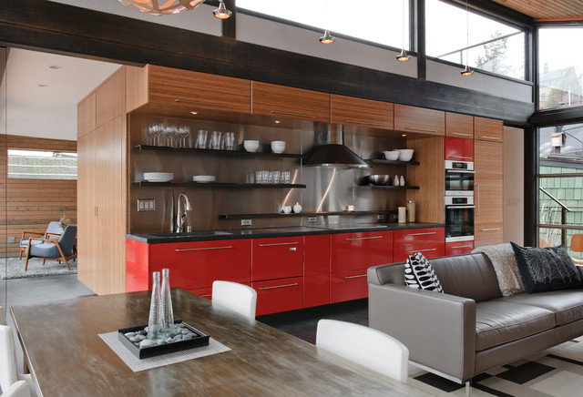
Also, this layout illustrates one change since the days of the middle of the 20th century, when the work triangle was being developed: The oven and stove are not a single appliance. Here a double oven sits next to the refrigerator at right, while the stove is located between the refrigerator and the sink on the far left. |
|
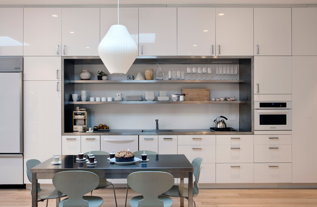
Here is a very carefully designed
single-wall kitchen, from the cabinets and integration of appliances to
the framing of the work surfaces and open shelves. The kitchen is part
of a gut renovation in Manhattan's West Village, a locale pressed for
space.
|
|
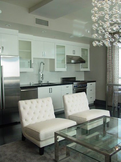
The intentional design of the
kitchen in this Portland, Oregon, condo can be seen in the balance of
the refrigerator on the right with the cabinets on the left, and the way
the tile and shelves work with the hood over the stove. As this and all
the previous examples show, it's important to have an appealing design
when one wall of an open living space is defined by the whole kitchen.
These kitchens also illustrate another change from the middle of last century: The kitchen today is a social hub within the house, be it for daily activities or entertaining. Single-wall kitchens offer the openness that goes along with this socializing, yet without taking up as much room as island or galley kitchens. |
|
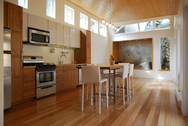
The space constraints in this
Vancouver house's living/dining space are clear. The single-wall kitchen
is an obvious choice, given the width of the room. As in the previous
example, tall cabinets bookend the kitchen, with the refrigerator on the
left, then the stove and then the sink. This kitchen flips the order of
the stove and sink from earlier examples, but it's less important today
that people's actions progress in the kitchen from the refrigerator
(getting out the meat, dairy and vegetables) to the sink (cleaning them)
and to the stove (cooking them); more important now is having a zone or
area to work in. Single-wall kitchens may have less room for this than
other shapes, so every bit of surface is important and should be used to
its utmost capacity.
|
|
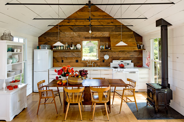
This 540-square-foot house
in Portland, Oregon, is served by a kitchen that fits into one end
under the gable. A hutch takes over for the lack of upper cabinets, but
the reclaimed wood is worth highlighting; its use on the range hood is
particularly nice.
|
|
by mango design co
»
|
|
Help can also come in the form of
an island work surface, space permitting. This kitchen moves from the
refrigerator (out of frame just to the right) to the sink in front of
the window, and then to the stove on the left. The integrated design of
the lower and upper windows, lower cabinets and upper shelves, and paint
color is very appealing.
|
|
by LUX Design Inc.
»
|
|
Here is another loft space, one
with room for a fixed eating island. This island surface provides an
extra work area, even as the three main elements are located along one
wall.
|
|
by mango design co
»
|
|
City condos are also good places
for single-wall kitchens, since many new high-rises have large expanses
of glass. If a kitchen is close to the exterior, rather than set back
toward the hallway and core of the building, this layout allows for more
light coming into the apartment.
|

