Do These Surprising Contemporary Exteriors Hint at the Future?
But what if the house has an unconventional appearance, and the familiar parts that make up the facade are not quite where we expect them to be? In these cases an initial read of contemporary houses can puzzle at first, but if we stop and take a closer look, we may be able to interpret what shaped it. An understanding of the historical, architectural or cultural background may also inform us a little. But one thing for certain is that contemporary houses rarely reveal their secrets at a glance.
We have a greater choice of materials and building methods than ever before. Do we choose to use them as a skin-like appliqué to decorate our houses? Or do we seek to use them in innovative ways that can help to reduce our reliance on our ever-diminishing natural resources? How we respond to this question will play a significant role in shaping the exterior design of our houses as we move into the future.
Here we'll look at some very different house facades. This ideabook does not attempt to cover the myriad of possibilities, but it might provide insights on some of the influences that might shape the next generation of contemporary homes.
|
|
|
Blurring the Line Between Inside and Out
The Rietveld Schröder House, Utrecht (1924), Gerrit Rietveld. This end-of-terrace house was designed for Truus Schröder-Schräder. It makes no attempt to relate to its redbrick neighbors. In contrast to them, its facades read as a collage of planes and lines that blur the distinction between the inside and outside. |
|
|
|
This house design became the architectural manifesto of the modernist De Stijl movement. Were Schröder’s neighbors bemused, confused or appalled by this abstract young upstart?
More about the Rietveld Schröder House |
|
|
|
Case Study House, Pacific Palisades, Los Angeles (1949), Ray and Charles Eames. A
radical design at the time it was built, this home is still
delightfully fresh looking 60 years later. The architects were so
concerned with minimizing the impact of house on the site that they did a
complete redesign. The house is composed of two linear steel-framed
buildings, separated by outdoor space and tucked into the hillside.
|
|
|
|
The Eames also aimed to maximize volume with minimal materials. The
two-story black steel-framed facade is broken down into geometric
panels, either infilled with horizontal glazing or solid, in white or
primary colors.
More about the Case Study House |
|
|
|
Weighing Privacy and Community
Rainy Sunny, Toyko (2008), Masahiro Harada. This house in suburban Japan was severely restricted by its small plot size. It appears to turn it back on the street by presenting an unwelcome solid facade. How would this building be received on your street? |
|
|
|
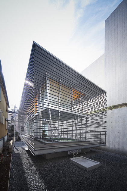
Hojo, Toyko (2009), Akira Yoneda (Architecton). In contrast to the previous house, this one makes no attempt to shut itself away from the outside world. Each of the building's sides is translucent.
|
The owner appears to be quite at ease with the openness of this house.
More about these two Tokyo houses
|
Discovering a New Efficiency
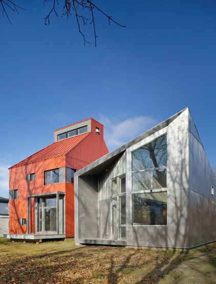
R House, Syracuse (2011), Architecture Research Office and TED by Onion Flats. These two houses share only a similar scale and plot size with their more conventional neighbors (not seen here). Both are designed to passive-house standards (minimal energy input), which informed their compact form and appearance. Their north-facing entrance facades have minimal glazed openings to reduce heat loss. |
Some might consider that the houses in this ideabook have landed from another world, with their unconventional shapes and unusual materials. Perhaps they hint at how different and varied our houses will be in the future, given the greater choices of materials and methods of assembly available and the need to reduce our reliance on nonrenewable materials.


