Blog by Beebe Cline, PREC*

<< back to article list

Shape Up Your Surfaces With New Tile Textures and Forms

Technology has taken our movies, TV shows and printing into three dimensions, and now it's taking tile there. Tile not only has taken on textures like damask, stacked stone and textiles in its new looks, but has also become an integral part of architecture, with sculptural tiles adding new dimensions to walls. Tiles bump, undulate, weave, wave, crimp, crumple, create rhythms and draw our hands, which cannot resist touching them to check them out. Philippe Starck has even turned the way we look at joints between tiles upside down. Here are some of the most interesting innovations I saw at the spring 2013 Coverings stone and tile show in Atlanta.
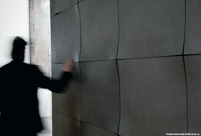
Patterns with large-scale shapes. Separate tiles work together here, meeting at the corners to create new shapes; it's like the wall was a large crumpled-up piece of paper that's been somewhat smoothed out.

Shown: Apavisa
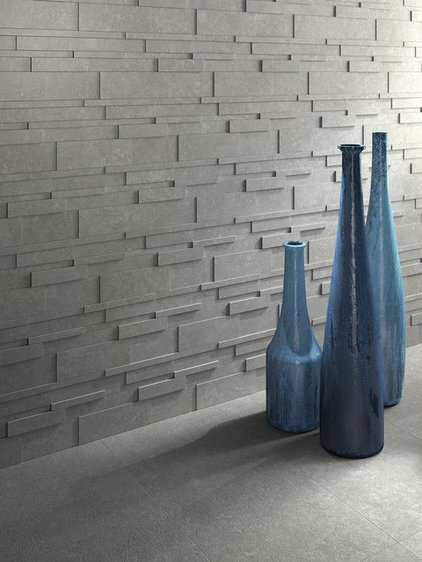
Inspired by stacked stone. This look is a more uniform and contemporary take on stacked stone's popular aesthetic.

Shown: Archistone by Ceradisa
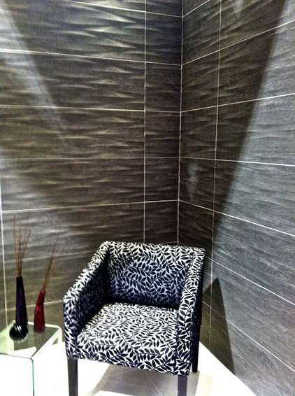
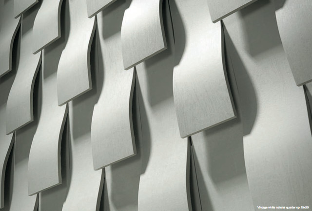
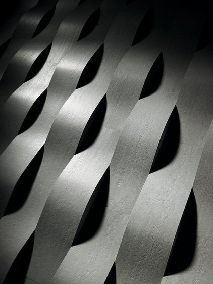
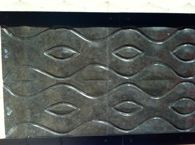
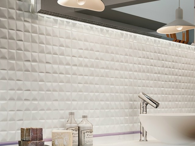
Sculptural patterns. These patterns on wall tiles play with light and shadow and give the whole wall an artistic quality as well as depth.

Shown: Lamosa
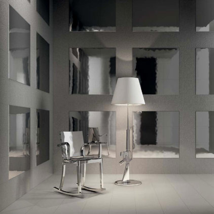
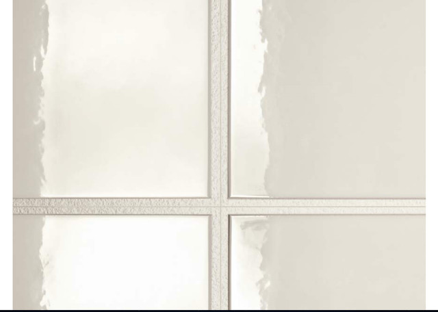
Tiles with different levels and textures. Famed designer Philippe Starck has a new line called Flexible Architecture for Sant'Agostino that approaches tile installation in a new way. "The ugly joint used to be a problem; now the ugly joint becomes more than the advantage. It becomes a reason to exist," Starck explains. Think of the flat area between the shiny squares here as expanded joints.
Here is said Starck joint: The glossy part and the lower rough part are on the same tile, so there are two different depths on one square tile. There are different tile options (some are just the rough part, some have rough edges around all four raised sides, some have two rough edges, some have one rough edge etc.) and interesting ideas for configuring these tiles that you can check out in the catalog. I promise the pictures explain it much better than my words do, and the concept is really brilliant and simple!
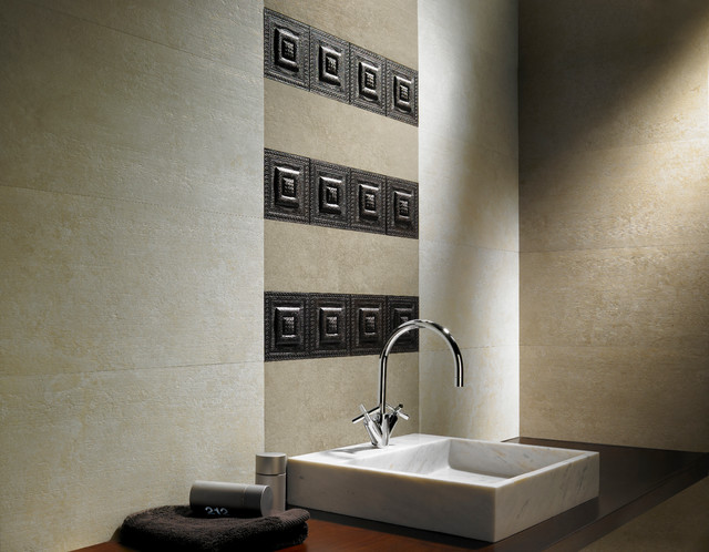
Seriously sculptural. The Archconcept Collection by Apavisa takes 3-D tiles to a whole new dimension. These tiles and the tiles below are anything but flat. They have the power to completely transform interior architecture. And no, I don't have any idea how to clean these!
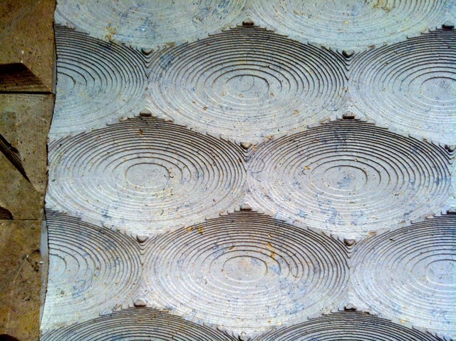
Hieroglyphic style. This tile and the one below are both from Egypt. They look like they're straight out of an archaeological dig.
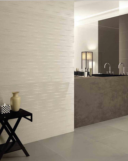
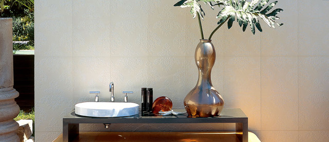
Subtle patterns. Subtler patterns work well in a more minimalist room, whether cream tiles (these are from Viva) cover an entire wall or ...
... just form an interesting border or stripe.

Shown: Ascot
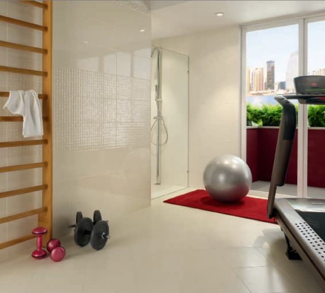
Small-scale 3-D tiles. Tiny tiles are in on the pattern game too; here the small tiles give the wall depth and interest in a mosaic pattern.

Shown: Abita by Sant'Agostino
Fabric-inspired textures. Patterns like damask are also appearing in relief on tiles.

Shown: Interceramic
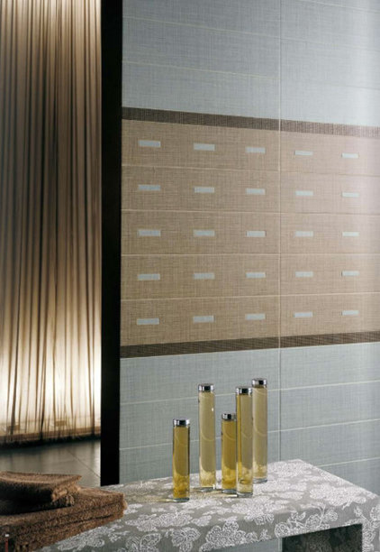
Other tiles are taking on a rough linen or burlap look.

Shown: Sant'Agostino
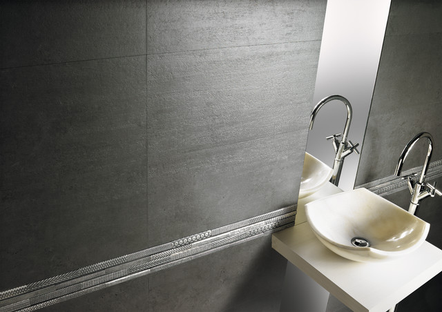
Tiles are also integrating intricate borders, emblems and other ornaments.

Shown: Apavisa
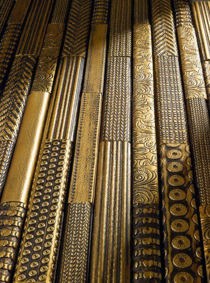
Here is a closer look at these detailed border pieces in a shade of golden bronze.
Bronze Greek key details break up this tile wall.

Shown: Ascot
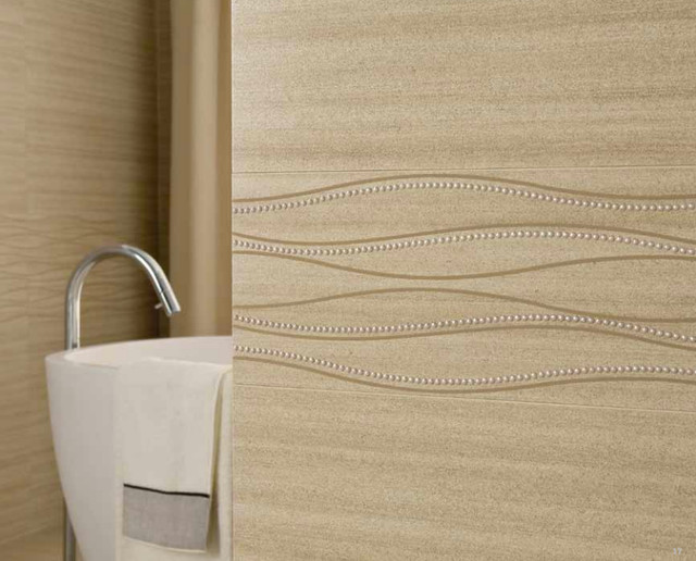
Small beads in wavy patterns draw the eye here. Ornamental pieces like these are like jewelry for walls.

Archives