7 Dramatic Bathroom Makeovers Across All Styles
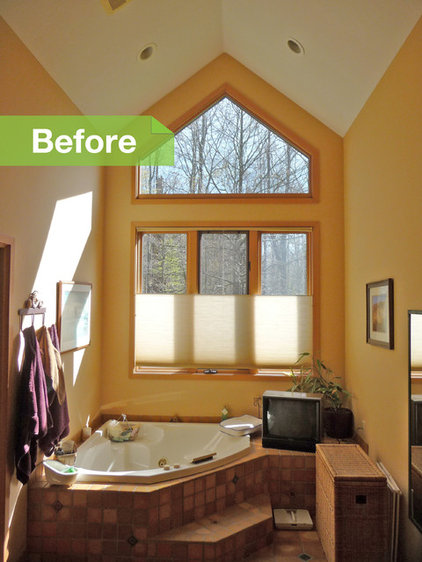
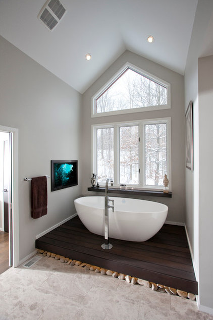
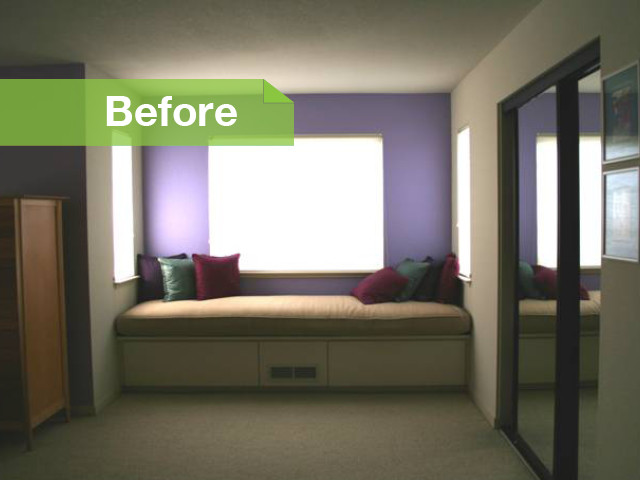
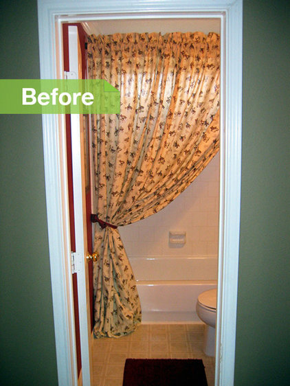
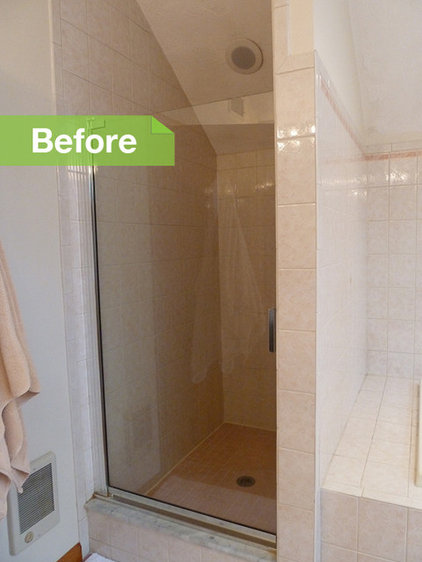
Architect Ryan Duebber had his work cut out for him when it came to the odd proportions and awkward configuration of this master bathroom.
|
|
|
|
See more of this renovation
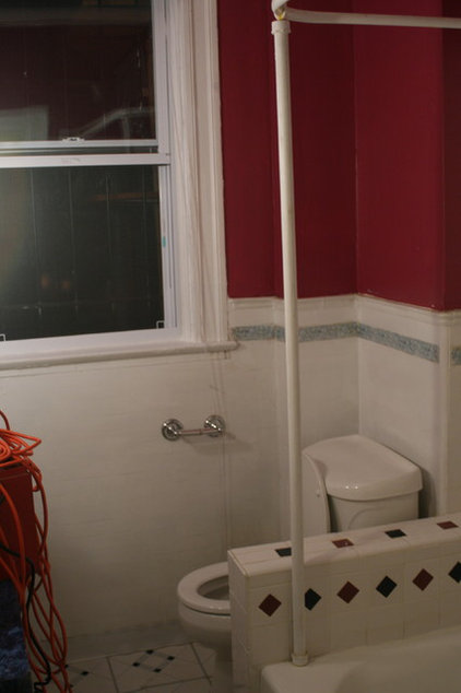
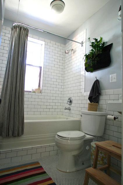
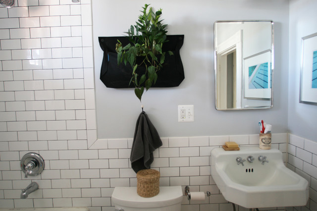
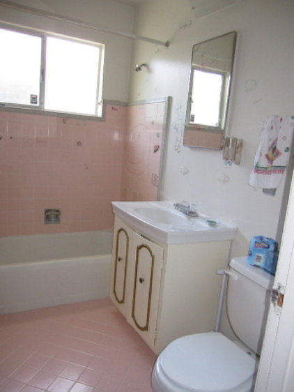
Underneath the ugly red walls and dated tiles of this bathroom lurked a host of plumbing and electrical problems, as well as rotting wood. Clever homeowner Megan Adams found ways to save money, completing the restoration for around $10,000.
|
Sticking with a classic subway
tile on the tub surround, backsplash and walls is a relatively
inexpensive choice, and the look will never go out of style. Gray grout in between is much easier to keep looking clean.
|
|
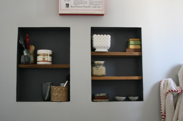
Simple wall niches give Adams a place to store and display pretty soaps and vintage finds.
Learn more about this renovation |
|
|
|
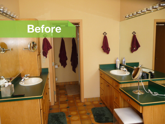
3. Totally '80s style gets a fresh layout and contemporary look in Sonoma.
This California condo's master suite was full of wasted space yet had a very cramped little bathroom. |
|
by Amy A. Alper
»
|
|
AFTER: Architect Amy Alper
commandeered the wasted dressing area and window seat space and turned
it into a relaxing tub and sink room. She maintained a continuous line
from the counters around the room, which is easy on the eyes and
provides balance from side to side.
|
See the rest of this renovation
This bathroom was not giving furniture dealer and stylist Brad Ross and his wife, Tiffany, the Parisian elegance they were yearning for.
|
AFTER: Doing the work
himself, Ross transformed a French door into a shower stall divider,
which not only saved a lot of money but also inspired the style of the
rest of the room. A repurposed sewing machine cabinet painted gray,
topped with marble and adorned with glass knobs, adds elegance, as does a
thrifted silver-framed mirror.
See the rest of this renovation |
This New England bathroom was not only drab and closed in but also cold. Located over an unheated garage, it had been built before things like LEED and tight envelopes were considered in construction, and thus was drafty and inefficient.
|
AFTER: A full gut renovation by designer Megan Meyers
included adding radiant heat floors, a baseboard heating system, a
heated European towel bar, a volcanic limestone bathtub and a more
energy-efficient window to help hold in the heat.
|
|
As for the decor, clear glass in
the shower makes the room look larger and provides clear views. A mix of
porcelain and glass tiles adds elegance and color, and the stenciled
walls have an ornate yet subtle pattern.
See the rest of this renovation |
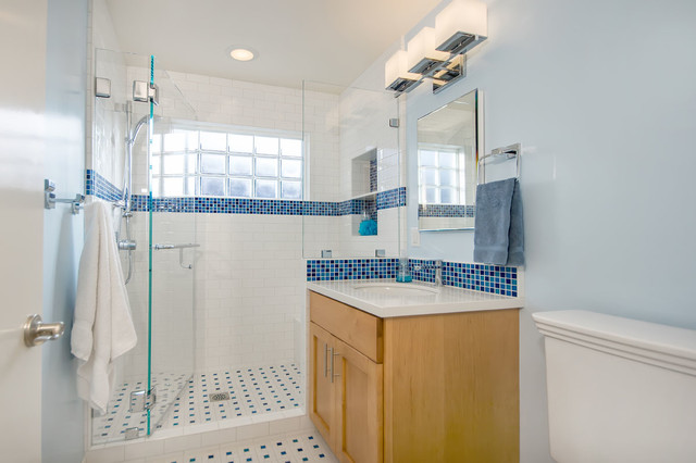
Scary clanking noises and bad electrical work were a recipe for disaster in this bath. In addition the layout, style and storage were not working for this mom and her 9-year-old daughter.
|
AFTER: Bill Fry Construction
converted the never-used bathtub into a shower with a clear glass
surround and brightened up the space with blue mosaic tiles the daughter
helped choose. Along with a new window, the color and material palette
infused the space with vibrance and a zestfully clean feeling.
|
Learn more about this remodel
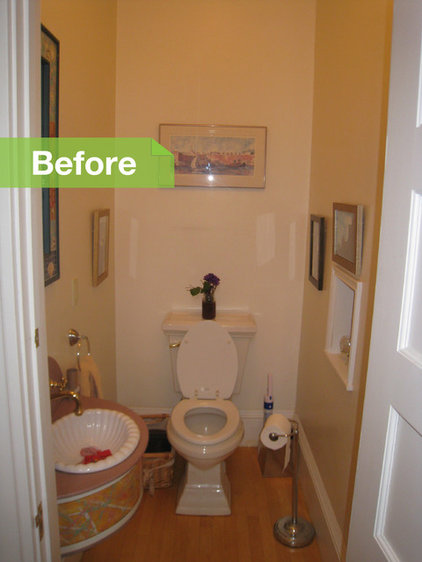
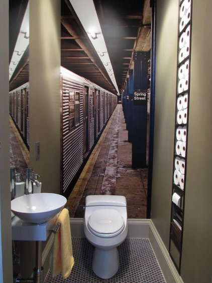
I think this is the tiniest room I've ever written about on Houzz, and it may have inspired the largest response.
|
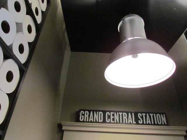
Every detail was carefully
considered, from the industrial pendant to the way the round holes in
toilet paper rolls could be used to make a graphic installation in a
shallow wall niche.
|
