Blog by Beebe Cline, PREC*

<< back to article list

8 Splendidly Redesigned Home Basics We All Use

Have you ever noticed that there are some things around the house that we always expect to look the same — the hose spigot outside, the plug socket, the light switch? But savvy companies are now bringing high design down to the smallest utilitarian details. Here are a few items that have been catching our attention lately.
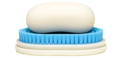
This is brilliant. Instead of a soap dish filled with that watery soap goo and a brush that lingers off to the side without a proper place, the brush is the soap dish, collecting the goo and being handy for a good postgardening nail scrubbing.
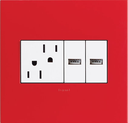
Instead of the usual stack, these plug holes are upside-down opposites, creating an unexpected subtle composition on a wall. These days homes have charging ports everywhere, so it's time to rethink what our outlets look like.
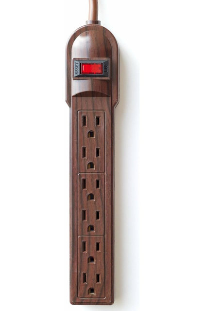
Speaking of outlets, no one wants to look at a dirty gray power strip clunking up the floor. These new faux-bois strips blend right in. They come in several different "woods" to match your hardwoods.
contemporary living room by Nest
by Nest »
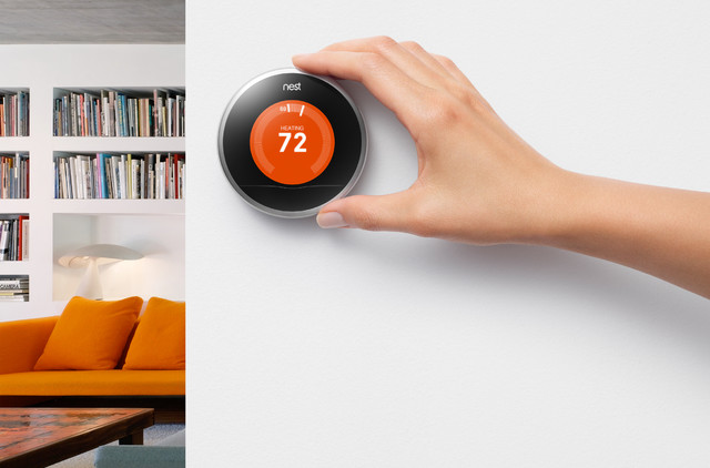
This quirky little thermostat from Nest looks like it was conceived by a team that included Kenneth Noland and Steve Jobs. Actually, it was designed by Tony Fadell and Matt Rogers, who had thermostat ennui. The bull's-eye shape, array of eye-catching colors available and simple graphics make me look at my own thermostats and feel sorry for them for being so frumpy.

Learn more about the design of this thermostat
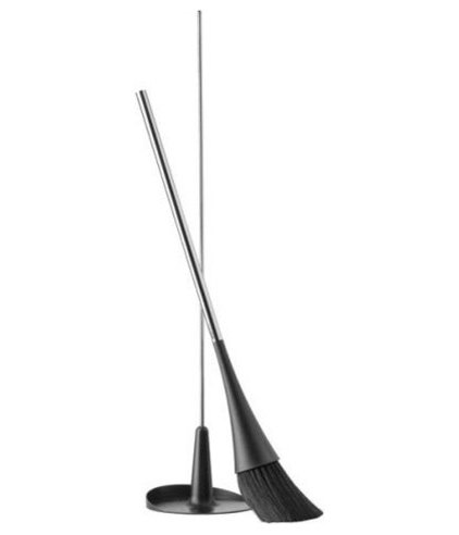
This sleek broom and dustpan can stand on their own (no leaning required) and blend into a corner.
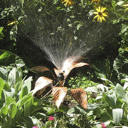
This artful hosta sprinkler adds sculpture and copper foliage in addition to water to the garden mix.
contemporary outdoor lighting by IKEA
by IKEA »
A flashlight is often a clunky appliance one tucks out of sight in the nightstand drawer, but the Ljusa flashlight has brazen coloring and an hourglass figure. You'll want to leave it out as an accessory.
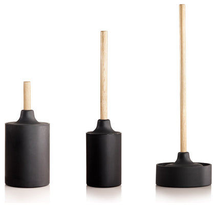
Talking about plungers is usually kind of gross, but these shapely units from Kontexture are just right for that cool black and white bath with the white subway tile, gray grout and vintage wall-mounted sink.

Archives