How many empty cabinets do you have in your home? If you’re like me,
you don’t have a square inch to spare. A well-designed bank of
cabinetry organizes and conceals the everyday clutter of life, helps us
live more efficiently and is an aesthetically pleasing element integral
to the architecture of a home.
Let’s look at three distinctly different approaches to integrating cabinetry into a home.
1. The Thick Wall
Walls
are one of the fundamental components of an architect’s design palette,
and quite often architects like to think of cabinetry as a really thick
wall. Typical cabinet depths range from 12 to 24 inches, so compared
with a standard wall at roughly 6 inches deep, cabinets are indeed
thick walls.
This depth offers certain special opportunities: It
allows us to fill the space within; it allows us to pass through the
cabinets and actually experience their depth; and it offers a visibly
prominent zone for us to shift perceptions in rooms.
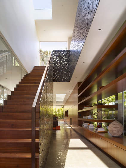
Here that
zone begins on the right as one enters, with open shelving above and
closed cabinetry below. It quickly transitions to a more solid zone as
one enters the living area beyond. The architects have used this to
create two spatial effects. First, in the more horizontally compressed
entry and stair area, the cabinetry is more open, which enlarges the
perceived width of the space. Second, in the more open living area, it
becomes more solid and a backdrop for the activity of the room.
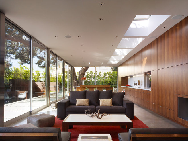
The lightness at the entry gives
way to the solid anchoring wall of cabinetry at the living space. The
thick wall connects the spaces of the home and explains clearly the
priorities of each space. Plus, the cabinetry wall supports the design
objective to defer to the monumental tree and view outside.
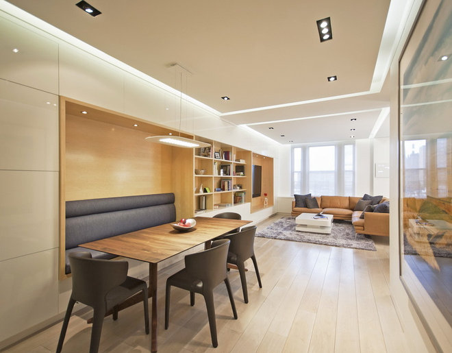
The thick wall here is only
understood as being thick because the zone has been cut away and
function has been inserted. Architects create service zones in floor
plans to establish order. Here the thick wall zone does many things: It
serves as seating in the dining area, as a storage area between dining
and living spaces and as a media center in the living room.
Ordering
functional zones in small spaces is logical. Grouping the functions
together on one wall unifies disparate components into a sensible whole.
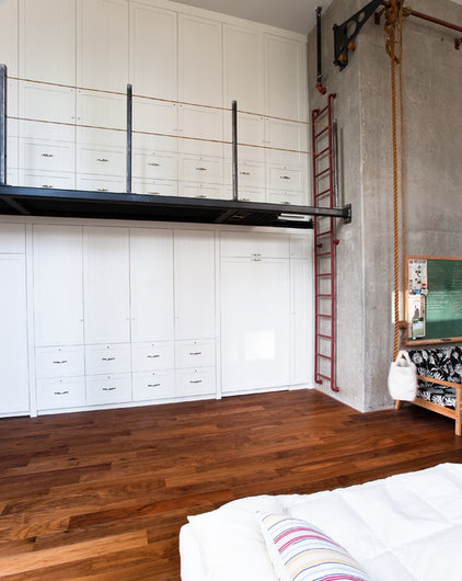
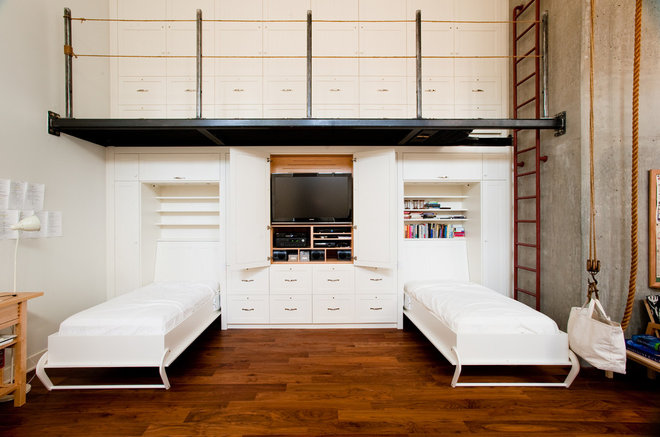
Perhaps best of all, a thick wall
offers opportunities for the rapid transformation of spaces from
nondescript to highly specific. Indications that this wall acts as more
than just a simple storage area are there — the steel walkway, the
hoist, the ladder — but it’s unclear as to exactly the function that’s
being disguised.
Seen here fully revealed, the wall
gives way to two Murphy beds and an entertainment unit. Despite the
regularity on the front face, each functional priority has been designed
carefully — integrated headboards, drawers, flip-back doors (that don’t
conflict with raising the beds) and closets.
Hosting opposing functions — bedroom and gathering space — is entirely possible with thick-wall cabinetry.
Grouping storage together and
overlaying an ordered grid of door openings, as in this example,
achieves an understated simplicity. This not only looks well thought
out, but it’s also a budget-conscious solution to storage. By selecting a
single cabinet module and putting it to work everywhere, you simplify
not only the design and appearance but the ordering, installation and
hardware selection. It goes without saying just how much we architects
and designers love ordered systems.
2. Cabinetry as Architecture
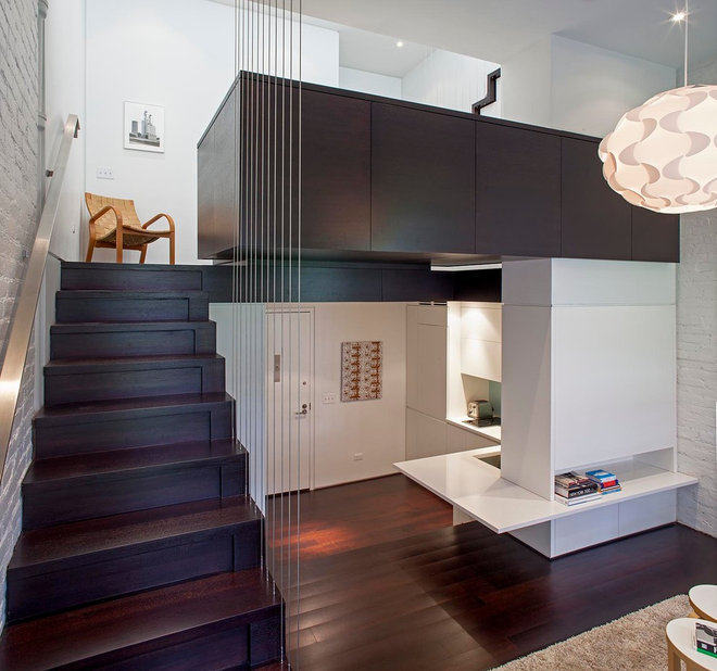
Wonderfully
inventive, this project employs the cabinetry kit of parts for an
entire range of architectural elements. The complete integration of
cabinetry forces one to consider just where the cabinetry ends and the
architecture begins.
The seamless nature of a project like this
makes it the most expensive to incorporate, because it often involves
all of the infrastructure we so easily conceal in roughly framed walls —
things like structural columns and plumbing, electrical and mechanical
systems. The upside is that the finished product feels engaged with the
architecture in ways that other solutions can’t.
Storage in the
risers, integral seating, workspaces, closets — the amount of custom
accommodation for function is remarkable here given the small floor
area.
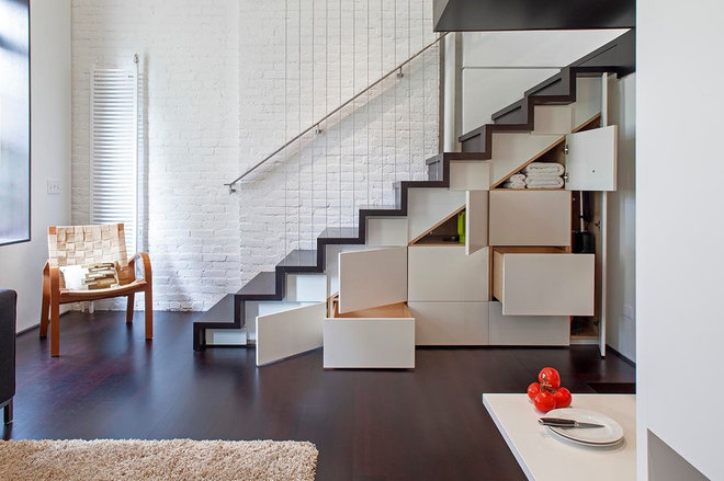
One can see from this vantage
point just how cleverly the architect has concealed an enviable amount
of storage beneath this stair. The stair stringers, the sloping wood
framing supporting the stair, are set back from the face of the cabinet
doors. This allows the cabinet doors to follow the rectangular
sawtoothed profile of the treads and risers and not the angular
underside of the stringer. When the doors are closed, they form an
understated patchwork on the face of the wall and complement the
architecture of the room.
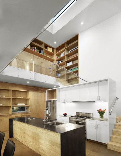
This wall of cabinetry makes an
implied connection between the main level and the mezzanine level
because the same material was used on both levels. Even though the
walkway separates the two visually, the implied connection remains
strong.
These tricks can work in a variety of circumstances
where one wants to suggest visual connections but the spaces are
physically disconnected.
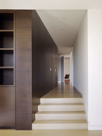
This bank of cabinetry acts as a
warm-toned paneled wall defining a corridor. The wall’s panels conceal
door openings and access to other rooms. It’s a commanding organizing
element and allows for a hidden passageway — behind the secret door — to
become a reality.
3. The Divider
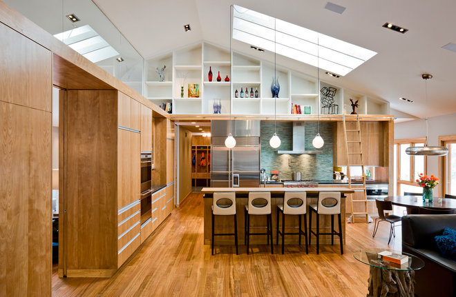
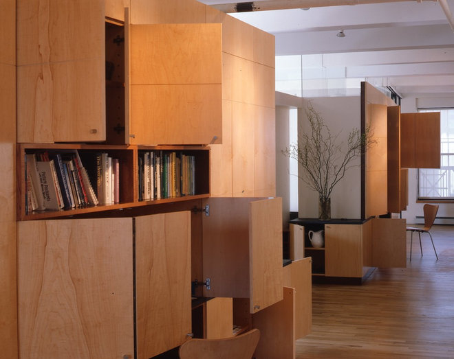
Cabinetry
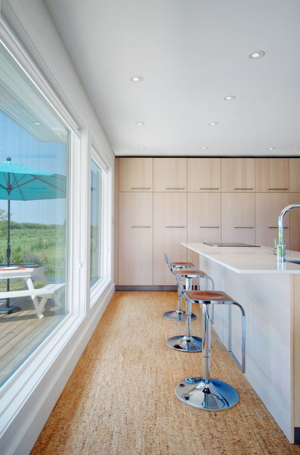
that functions as a freestanding wall object that divides space
preserves both openness and visual separation. This cabinetry
configuration serves the functional requirements of the kitchen, but
because the cabinets stop short of the ceiling, the eye can continue to
surfaces farther in the background. This establishes a feeling of
connectedness and openness, while the lower wood wall element fosters a
feeling of enclosure and spatial definition.
This wall of cabinetry acts as the
central organizing element in this renovated loft. It organizes the
public and private areas of the plan, and it also has a massive amount
of function in its subtly curving form.
When open, the various-size doors
reveal many functions. Note the desk areas with folding doors. The
design was inspired by a tribal dancing dress, whose irregular geometric
patterns are abstracted in the complex series of door openings on the
wall surface. Walls of cabinetry that transform in this manner are
infinitely changeable and, as seen here, can influence the formality of
the space in dramatic ways.
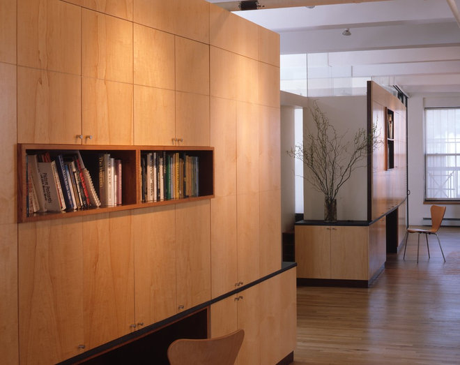
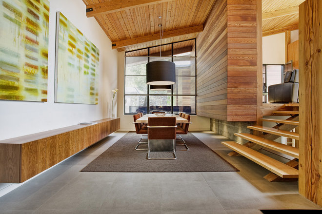
Objects don’t have to consume the
entire floor-to-ceiling volume of space to be powerful organizing
devices. The cherry cabinet on the left wall is a contrasting singular
design move against the white wall. Acting as a floating counter and
display area, it also conceals a large amount of storage. The broad,
linear horizontal proportion hovering above the floor is a commanding
gesture. Its object-like nature is reinforced by the clean surfaces,
free of ornament and hardware. The architects have used touch latches to
maintain a face free of distractions — a great technique when using the
cabinetry as divider object concept.
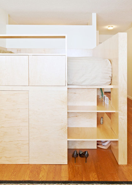
We often think of furniture as
freestanding and object-like. Built-in cabinetry, too, can mimic the
lighter properties of furniture. In this way it can be richly functional
and efficient in a small space, not overwhelming it but supplementing
the functional priorities.
The bed platform in this loft
combines the functions of sleeping and storage, and defines a raised
private space within the larger public space. It manages to do this as
an open furniture-like piece that floats in the room.
In all of
these examples, the cabinetry feels neither overwrought nor tacked on —
rather, integral to the architecture. And the resulting spaces are all
the better for it.
