After experiencing a peculiar weather phenomenon the other night
that can best be described as “thunder-sleet,” I’m more than ready for
spring to arrive. In fact, I’m already thinking of how I can pull my
home from the darkness of winter and give it a happy makeover.
And
there’s no better way to do that than with a dash of zesty colors. Two
of my favorites are yellow and green. I love working with these hues —
by themselves and in tandem — because they are just so incredibly
versatile and uplifting. If you love bright colors, there are plenty of
options with these two. On the other hand, if you favor softer, more
muted colors, you’re also in good hands with this combo.
To help
get your creative juices flowing, and hopefully lift you out of any
winter doldrums, I’ve gathered eight enticing examples of yellow and
green-hued interiors and exteriors, along with paint color palettes
inspired by each image.
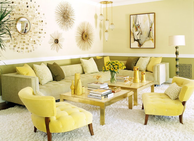
This colorful space has a fun,
vintage vibe. Once you establish a yellow and green palette such as
this, you can accessorize with hues that bridge the two colors.
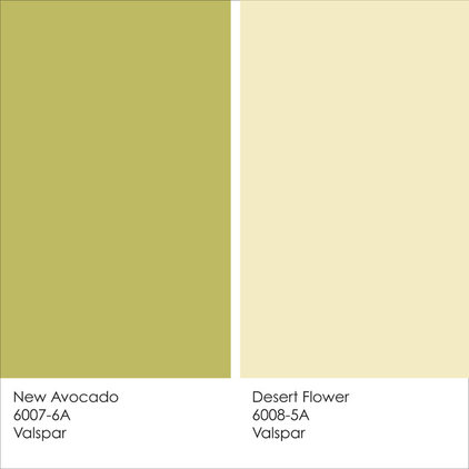
Example palette: New Avocado and Desert Flower, both by Valspar
A yellowish green and a greenish yellow combine to make a colorful yet harmonious palette.
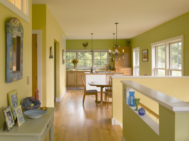
It can be tricky pulling off
colorful interiors when you have an open-concept floor plan. Ideally the
spaces should flow into one another, but you may not want to slap one
single color on all of the walls. One successful strategy is to pick
analogous colors — those that are next to each other on the
color wheel, such as yellow and green. You’ll have a colorful space that avoids being too busy and disjointed.
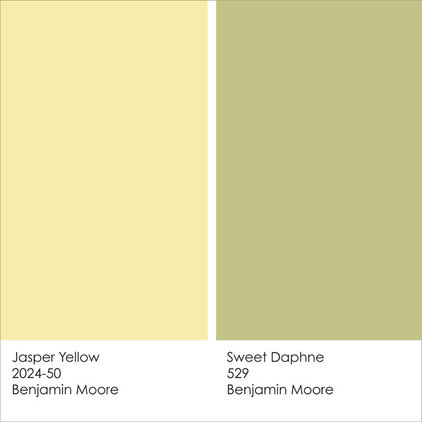
Example palette: Jasper Yellow and Sweet Daphne, both by Benjamin Moore
Take inspiration from nature by selecting a sunny yellow and a deep, grassy green.
When working with a palette that
has two main hues, try making one bolder, such as this yellow wall
color, then keep the other lighter and soothing, such as the muted green
hue of the bedding.
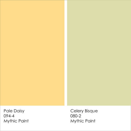
Example palette: Pale Daisy and Celery Bisque, both by Mythic Paint
This soft celery green looks great with (and helps tone down) the brighter orange-yellow.
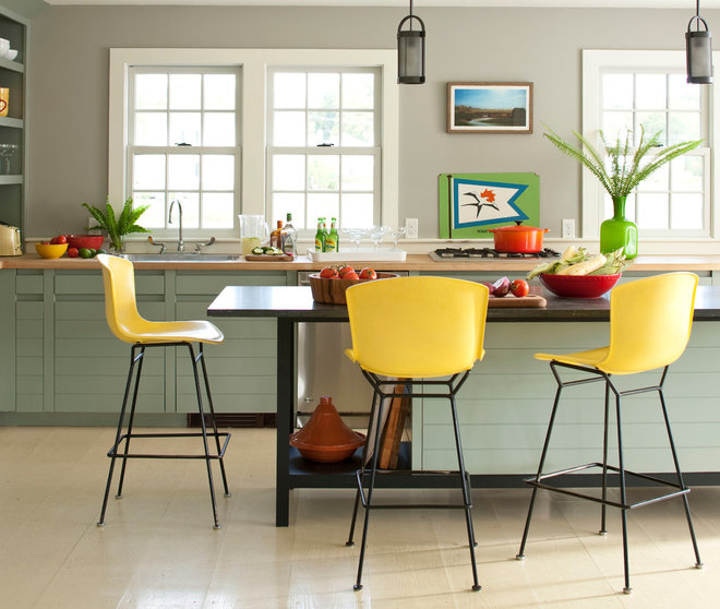
Of course our featured hues need
not be limited to wall colors and textiles. Consider using them in
unexpected ways, like with lighting fixtures. These celery-green
pendants add a nice dash of color and coordinate nicely with the cheery
yellow counter stools and citrusy kitchen accessories. This is a great
way to add fun color while keeping the room light, neutral and airy.
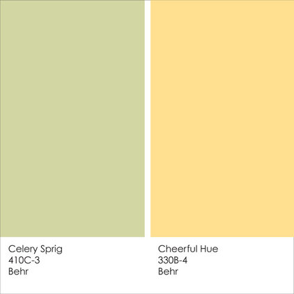
Example palette: Celery Sprig and Cheerful Hue, both by Behr
Try this leafy green and bold gold pairing.
Here’s an example of a neutral
green. Because it is a light color and has a good bit of gray in it, it
works as a nice muted backdrop to the bolder spots of yellow from the
counter stools.
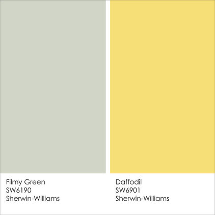
Example palette: Filmy Green and Daffodil, both by Sherwin-Williams
Add
plenty of cool gray to green and you have a neutral that can be paired
with practically any other color, such as a bright daffodil yellow.
You don’t always have to make one
of your feature colors bold while keeping the other muted. But try
limiting the bright colors to relatively small doses, as accent colors,
rather than painting entire walls as well as the ceiling. I bet this is a
fun kitchen to work in — no room for the winter blahs in this colorful
space.
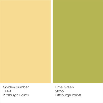
Example palette: Golden Slumber and Lime Green, both by Pittsburgh Paints
Select your favorite citrusy hues and use them in small bits throughout a room for fun, unexpected color.
Greens and yellows are also good
options for the exterior. This cool, muted green looks fantastic against
the bright mustard yellow on this contemporary home.
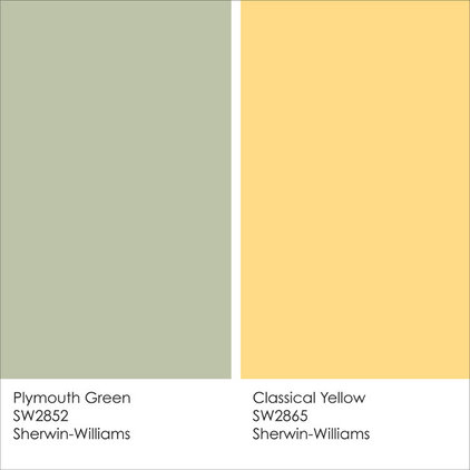
Example palette: Plymouth Green and Classical Yellow, both by Sherwin-Williams
Add some spice to a muted, cool green by working in a small bit of intense mustard yellow.
Summer isn’t that far off,
really. I like to think this outdoor lounge area was inspired by my
favorite summer cocktail: a margarita!
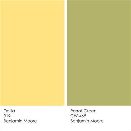
Example palette: Dalila and Parrot Green, both by Benjamin Moore
Lemon and lime aren’t just for margaritas; use them to inspire you as you select accent colors in and around the home.
