Houzz Tour: New York Apartment Redesign Cooks Up Good Looks
“Judging from the size of the kitchen, I would guess Grace Coddington didn’t cook much,” says Katie Martinez, the interior designer who, along with architect Anastasia Amelchakova, remodeled the space for the current owners — newlyweds Trevor and Christina Winstead. The bride and Martinez are old college friends, and she trusted the designer to help make the couple’s first home fit their sensibilities.
Location: Greenwich Village neighborhood of Manhattan
Year built: 1864
Team: Interior designer: Katie Martinez; architect: Anastasia Amelchakova, Studio Ppark
Size: 1,225 square feet (113 square meters); 2 bedrooms, 2 bathrooms
Martinez describes the former layout of the home as not suited to the Winsteads’ taste. “Christina likes to cook, so she wanted room to do that and entertain,” she says. “And although they definitely needed storage, they didn’t need a series of walk-in closets. It wasn’t as much of a priority for them.” The designer also says the upstairs bedroom with its “wacky” roofline was better suited to guests who were passing through than everyday living.
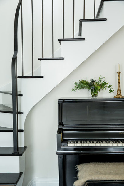
Together with the architect, Martinez reordered the layout, creating a lower-level master bedroom and bath, storage that was long and shallow rather than deep, and a more elegant, easy-to-climb staircase. That staircase now divides the lower level, with the living room and kitchen on one side of it and the master bedroom and bath on the other.
The living room showcases the chosen style of the couple: traditional with youthful, modern touches. “Christina and I did a lengthy exploration of what their style was,” Martinez says. “In the end she had a strong sense of personal style, and it is traditional and classic with modern elements. She and her husband grew up in very traditional suburban homes. They didn’t want completely traditional homes for themselves, but they didn’t want something cold and modern either. We landed on something that is graceful, classic and timeless with modern detailing and nods to contemporary style.”
Artwork: Geoffrey Knott, The Apartment by the Line
The dishwasher and the refrigerator (just out of frame) are covered with wood panels that match the cabinets, which also helps the space coexist peacefully with the living space.
Cabinet hardware: Restoration Hardware
How to Design a Kitchen Island
The long rows of shelves were installed by a previous resident (probably Coddington). “It can be tricky to make uninterrupted shelves look good,” Martinez says. “We did it by mixing in accessories with the books. These shelves hold everything from firewood on the lowest level to a wooden salad bowl on an uppermost shelf.”
Ways to declutter your bookshelves
Cabinet hardware: Anthropologie
The new owners and its creators love the space. “There is a calm feeling about it that, to be honest, feels great,” Martinez says. “To me it’s modern and timeless, livable and chic.” And, as the home is equipped with a more functional kitchen, its days as a regular takeout delivery stop may be over.
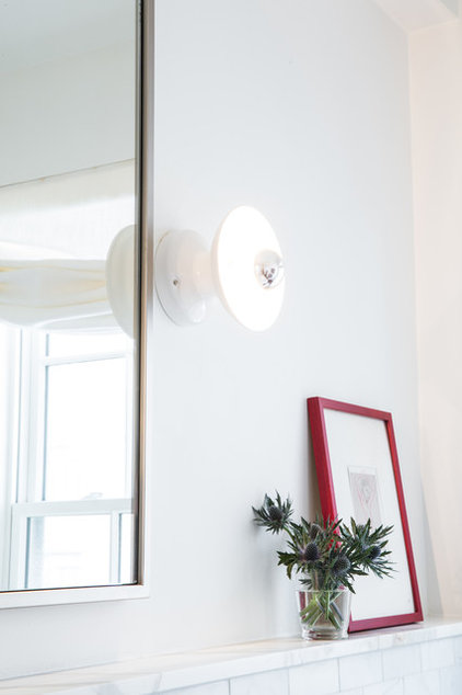
Light fixture: Schoolhouse Electric
Browse more homes by style:
Small Homes | Colorful Homes | Eclectic Homes | Modern Homes | Contemporary Homes | Midcentury Homes | Ranch Homes | Traditional Homes | Barn Homes | Townhouses | Apartments | Lofts | Vacation Homes


