Room of the Day: Dividing a Living Area to Conquer a Space Challenge
“When I first came on board to tackle the ground floor, they’d already spent some money refreshing the space — painting the walls white and tiling the kitchen — but they needed some help with the layout,” says designer Roisin Lafferty. “It’s a compact house, so we had to find a way to reflect their personalities and passion for travel without overpowering it.” Karinda also had her heart set on a dining area, though they didn’t think they could fit one in.
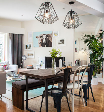
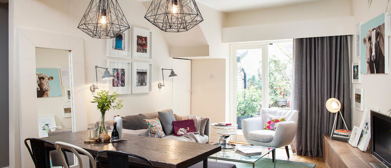
“Dividing up the space was the biggest challenge,” Lafferty says. “I adopted a zoned approach to define the different living areas and we scaled back the size of the furniture and made it ourselves to fit the proportions of the room.”
Who lives here: Karinda Tolland, husband Donnacha and their baby girl
Location: Dublin, Ireland
Size: The open-plan, ground floor space is 375 square feet (35 square meters)
Designer: Roisin Lafferty of Kingston Lafferty Design
The ground floor of the couple’s house is essentially one open-plan room. “Before the renovation it was quite a gloomy space,” Lafferty says. “The doors leading out to the garden were in dark timber and the space didn’t flow very well.’”
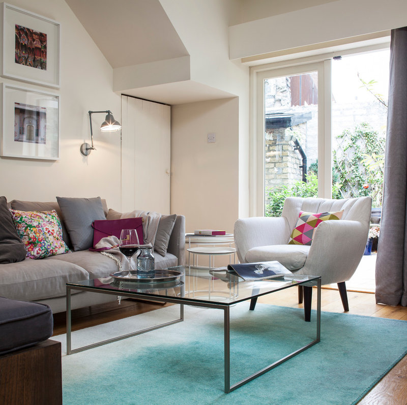
After painting the garden doors white, Lafferty left the windows unobstructed to allow as much light as possible to filter into the space. “I created the pelmet for the curtain above the door frame and it extends over each side, so when the curtains are open, they’re not covering the window at all.”
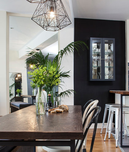
Blackboard paint on the wall by the kitchen is a playful touch. “Karinda and her friends are very artistic, so we wanted to have a little fun as well,” Lafferty says. The cabinet on the wall was custom-made and is inlaid with another mirror to contrast with the matte black paint.
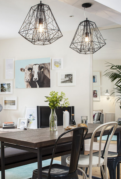
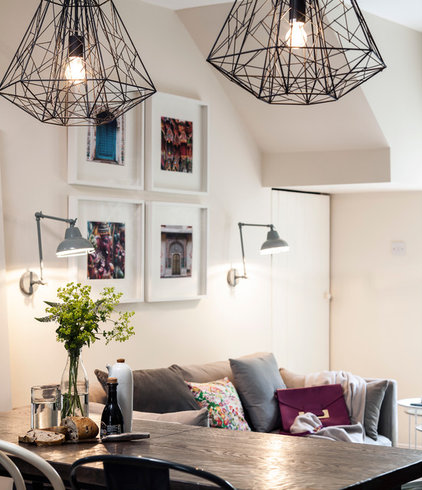
Sculptural pendants above the dining table lend an industrial-style feel to this zone. “I’ve used different lighting throughout the different zones downstairs in order to define each area,” Lafferty says.
Hive pendant lights: Made.com
18 Ways to Make a Small Space Look Larger
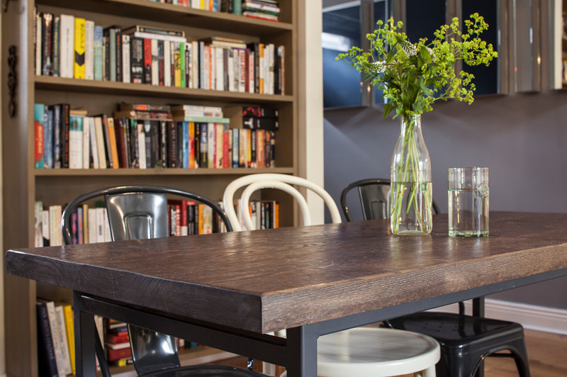
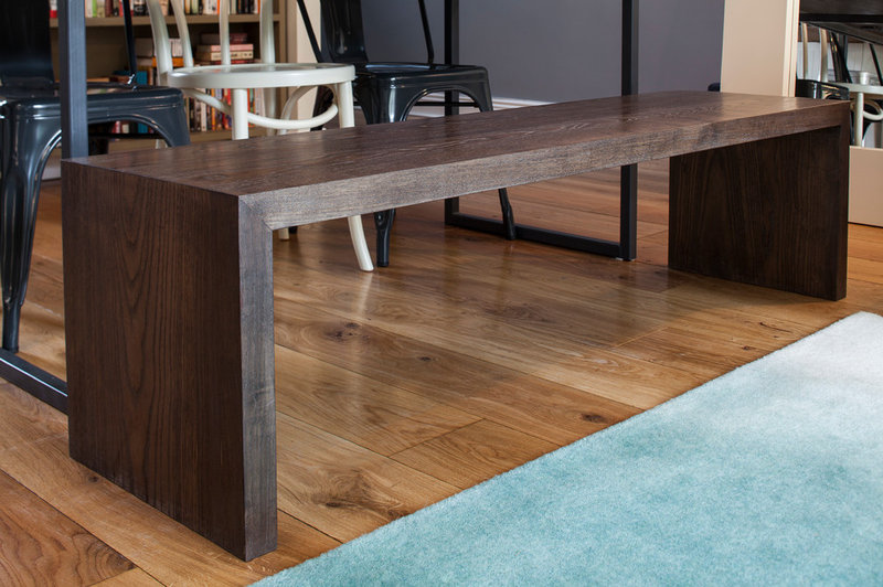
The ash was stained dark to give it a more “solid” appearance, and Lafferty painted the wall at rear mid-gray to add depth.
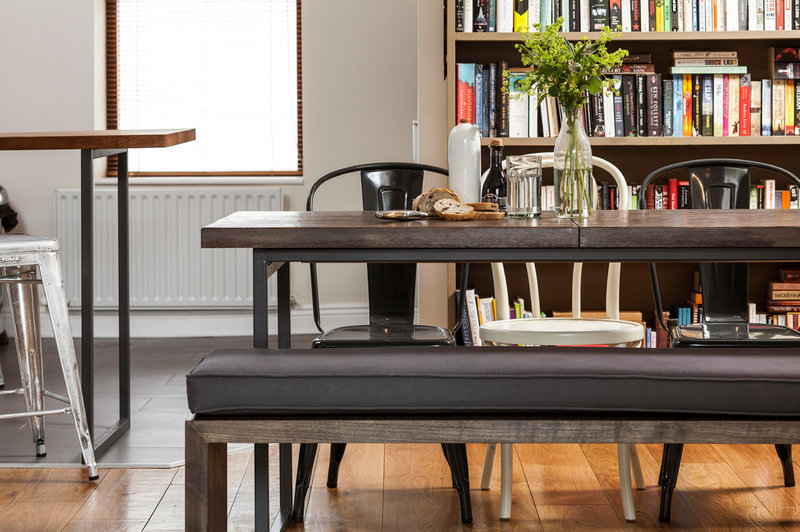
Black chairs: Tolix
Bar stools: Tolix
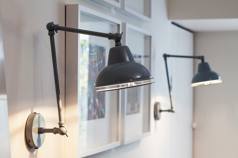
Wall lamps: House Doctor
Sofa: The Conran Shop; rug: Bluebellgray
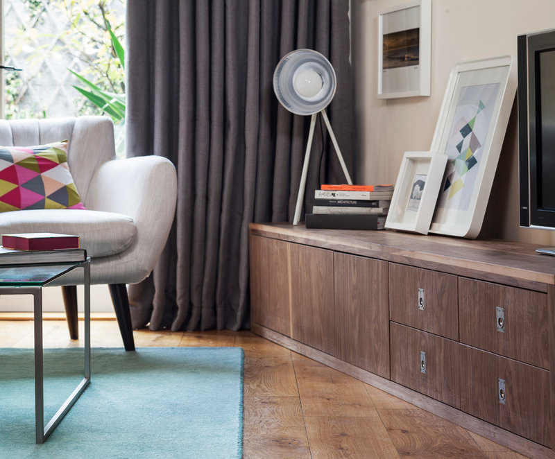
The dark gray curtains — two ready-made pairs that were tailored and sewn together — were chosen to add warmth to the space. “We were on quite a tight budget, but the curtains work beautifully,” Roisin says. “It goes to show you don’t always have to spend a lot of money to achieve a ‘designer’ feel.”
Armchair: House of Fraser; cushion: Etsy
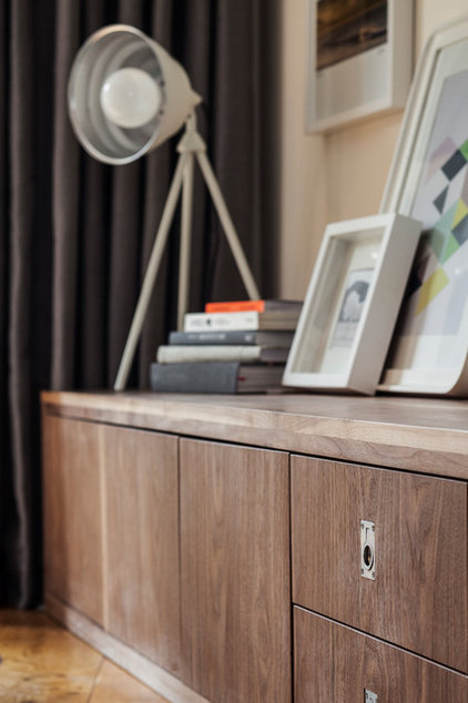
Lamp: Habitat
More
Timeless Design Ideas for Small Spaces
How to Make Any Small Space Seem Bigger
