Family Digs In for a Chic New Kitchen and Dining Area
“Andrea and Adam had spent years getting their house exactly how they wanted it, so they didn’t want to move,” says designer Siobhan Casey. “Instead they decided the best solution was to dig down to create a basement for a new family kitchen and dining area that would then free up the existing kitchen for Andrea’s custom cake business.” The couple wanted the basement to be the new hub of the home, where the sociable family could entertain and spend time together.
“Andrea’s not afraid to experiment when it comes to design,” says Casey, “and the finished room is such a wonderfully eclectic and welcoming space, perfect for entertaining family and friends as well as kicking back and watching TV.”
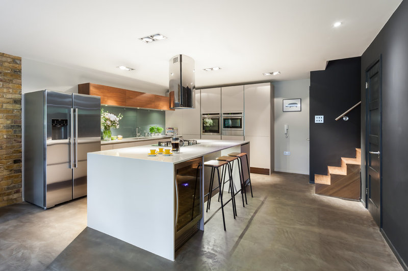
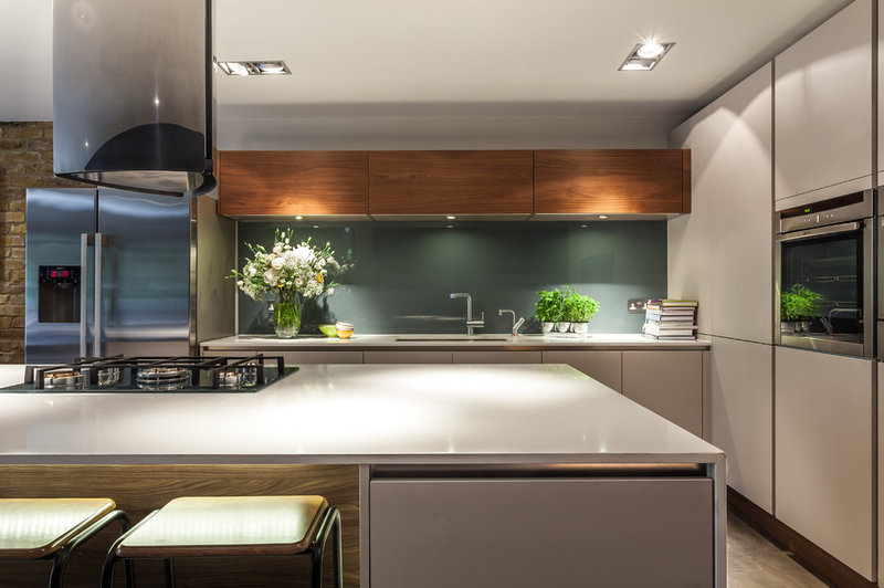
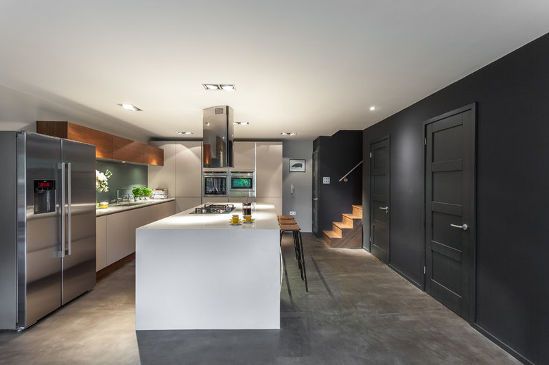
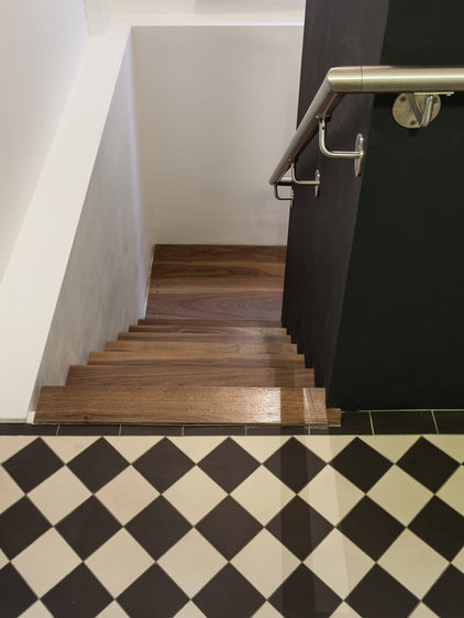
A walnut staircase, just peeking out, leads down from the main house into the new family kitchen and dining area. “It’s a large space with limited natural light, so we opted for neutral units with accents of walnut in the upper cabinetry and underneath the island to add warmth,” says Casey. “It’s a lovely touch that brings texture to this part of the room and prevents it [from] becoming too cold or clinical.”
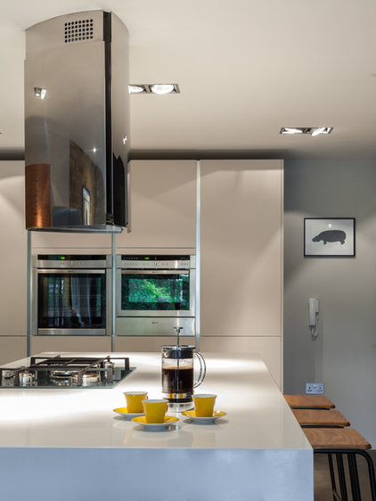
A double-width island, in Glacier White quartz, is the main feature of the room, providing ample space for relaxed family breakfasts.
LED lighting is set into the ceiling and bathes the kitchen in pools of soft light. It’s Casey’s favorite feature in the kitchen. “It’s such a wonderful product that’s cost effective to run, and they’re specially designed to prevent any harsh spots of light, so they gently illuminate the entire space,” she describes.
Range hood: Britannia; LED lighting: Ecoled
The Smeg gas range, with a cast iron griddle, references the industrial feel of the concrete floor and has been set into the quartz worktop of the island for a seamless effect. The range surface “is silver glass, so although it looks quite sturdy, there’s still an element of glamour, plus it’s very easy to clean,” says Casey.
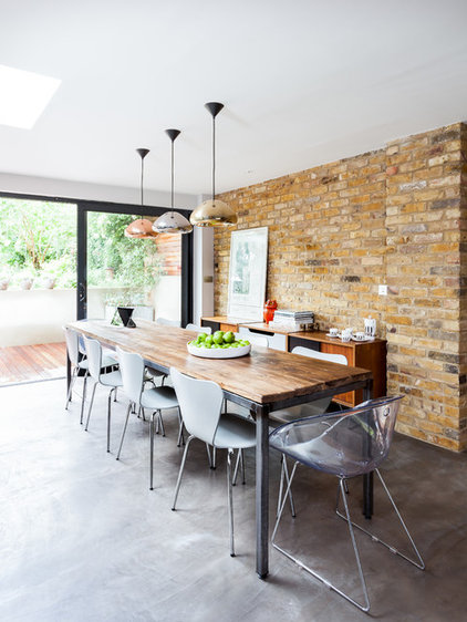
The polished concrete floor injects an industrial-style vibe into the space. “It’s a great look with a seamless finish, but it was a practical choice, too,” says Casey. “With three kids and all their friends coming in and out, as well as a dog, Andrea wanted a surface that was easy to sweep and mop clean. And the underfloor heating means it isn’t cold underfoot.”
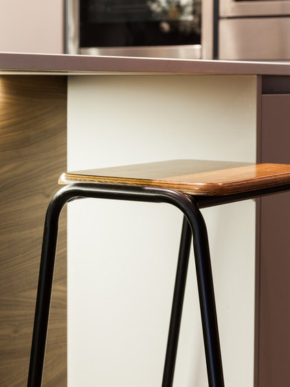
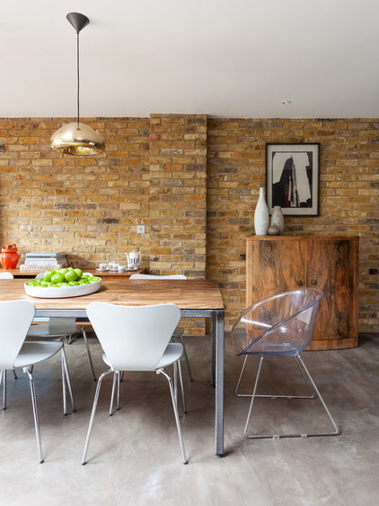
Vintage bar stools are an elegant but simple choice. The contemporary elements of the kitchen area blend seamlessly with the midcentury styling that continues as the space transitions into the dining area.
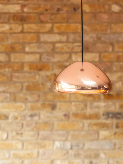
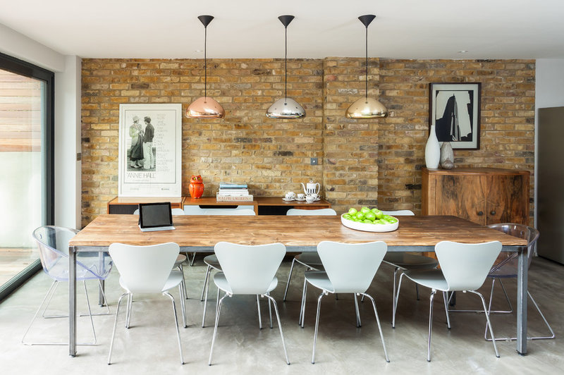
Tom Dixon pendant lights illuminate the dining table and reflect light from the bifold doors. Each pendant light is in a different finish. “Andrea didn’t want a homogenous scheme, so we’ve introduced subtle differences wherever we can,” says Casey.
Table: Horace, Metro Retro
Pendant light: Tom Dixon
The drinks cabinet was requisitioned from elsewhere in the family home.
The brushed stainless steel handrail gives a hint that the basement may be a departure from the traditional scheme elsewhere in the house. “Brushed stainless steel gives an even more industrial-style feel than polished steel would, so it clearly marks a departure from the more traditional elements of the house,” says Casey.
