Basement Becomes a Family-Friendly Lower Level
On the main
level of their 1950s ranch house, this family of five was feeling crowded. The room they’d been using as a family room was supposed to be a small study, and they had outgrown it. Expanding their living space into the basement also meant they’d always know where their kids were. “They told me they wanted their house to have the cool hangout space, where the kids and their friends would want to be,” says architect John Conroy of Princeton Design Collaborative. Their wish list for a finished lower level included spaces for game night and movie night (complete with a mini kitchen for fixing snacks and drinks), a space for visiting grandparents and other overnight guests, a separate place for crafting and playing Wii and Ping-Pong, a laundry room and, most important, a place that would serve as the neighborhood headquarters for slumber parties and sleepovers.
Lower Level at a Glance
Who lives here: Russell and Rachel Kaplan and their three young daughters
Location: South Orange, New Jersey
Size: 1,227 square feet (114 square meters) plus 148 square feet (13.7 square meters) of new exterior space
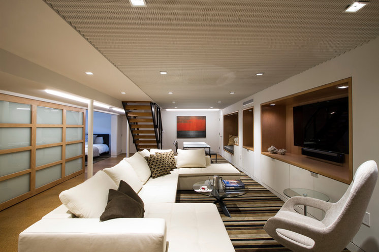
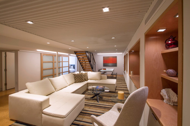
The team knew they had to break up the main living space, which is much longer than it is wide. They employed several strategies via interior architecture, furniture layout, lighting and pattern. First they looked up to the ceiling, which is about 7½ feet (2.2 meters) high. They brought in a mechanical expert to help them reconfigure what was a hodgepodge of ductwork on the ceiling. Now not only are the ducts streamlined, but the whole system is more efficient. It’s even hard to make out — the system is the lowest portion of the ceiling on the left side of this photo. They also paid attention to what was on the ceiling.
“Ceilings often get ignored, but we think of them as the sixth plane,” Conroy says. In this case, they covered part of the ceiling with perforated corrugated metal panels, which add texture and rhythm overhead and help break up the long expanse. The panels can be removed easily to access wiring if necessary.
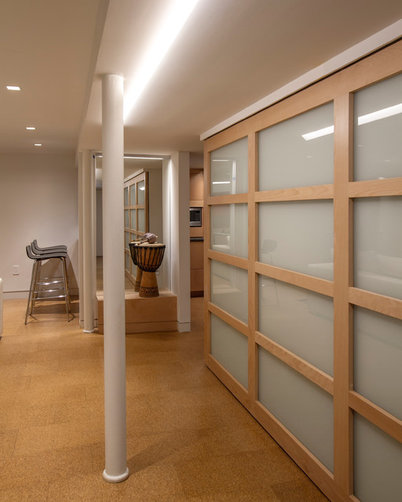
Another part of the strategy was creating a long sliding door between the guest bedroom and the living area. The texture of the frosted glass and beechwood on the door breaks up the long wall on the left and lets in natural light even when closed for privacy. On the right is a series of white cabinets and deep niches lined in natural beechwood.
A striped rug emphasizes the room’s width, which mitigates the long, narrow proportions. A large sectional sofa and a table at the end of the room delineate two separate areas within the large, open space.
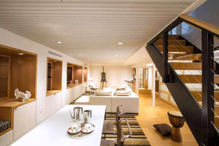
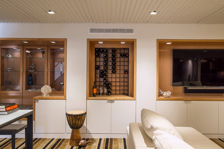
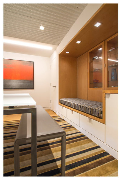
“We always want to make the most of dead space, which existed behind these walls,” Conroy says. They used a thick-wall strategy, creating a series of niches wrapped in natural beechwood, including a seat with cabinets behind it, a wine rack wall and a deep recess for the TV, all with cabinets underneath and around them in contrasting white. The niches break up the long wall and add storage for board games and wine as well as display space. They also provided an opportunity to layer in more lighting, which we’ll get to in a minute. These kinds of thoughtful design solutions and details are proof positive of why hiring professional designers is worth every penny and then some.
“We always want to make the most of dead space, which existed behind these walls,” Conroy says. They used a thick-wall strategy, creating a series of niches wrapped in natural beechwood, including a seat with cabinets behind it, a wine rack wall and a deep recess for the TV, all with cabinets underneath and around them in contrasting white. The niches break up the long wall and add storage for board games and wine as well as display space. They also provided an opportunity to layer in more lighting, which we’ll get to in a minute. These kinds of thoughtful design solutions and details are proof positive of why hiring professional designers is worth every penny and then some.
The family had already had plans drawn up in the past, but they thought something was missing. They perused Houzz for ideas for the rest of their home and for their basement, and came across this story about a swank contemporary basement designed by Princeton Design Collaborative. The team, which includes architects, interior designers and landscape architects, helped the couple visualize their basement’s potential through the entire design process via plans, 3-D renderings and material and color samples.
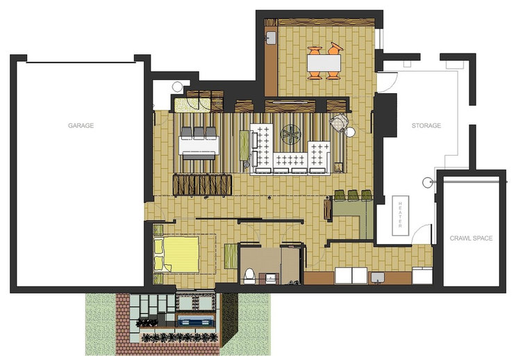
On the plan you can see how the program fits together. The main living space is in the middle, with the craft area at the top of the plan. A mini kitchen is toward the lower-right side, with the guest bedroom and its new courtyard on the bottom left. The laundry room is in the lower-right corner. Worth taking note of on the plan are the long sliding door that divides the guest room from the living room, the entrance the family uses when entering from the garage, and the vestibule that leads to the bathroom from two sides (the bedroom and the common areas).
On the plan you can see how the program fits together. The main living space is in the middle, with the craft area at the top of the plan. A mini kitchen is toward the lower-right side, with the guest bedroom and its new courtyard on the bottom left. The laundry room is in the lower-right corner. Worth taking note of on the plan are the long sliding door that divides the guest room from the living room, the entrance the family uses when entering from the garage, and the vestibule that leads to the bathroom from two sides (the bedroom and the common areas).
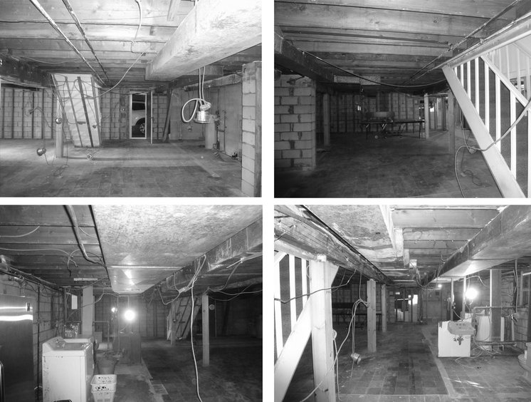
BEFORE: Originally the homeowners had a very basic rec room down here, but they gutted it after a power outage caused by Hurricane Irene caused everything in a large freezer they kept down here to rot.
AFTER: To brighten up the space, the team used a strategy that combined natural light and layers of light. The sliding door on the left is 9½ feet (2.8 meters) long. It separates the bedroom from the main living space, and can be opened but still lets in natural light when closed. There is also a wall-washer light that runs along the ceiling parallel to the sliding glass door. This light is recessed into the ceiling and washes light down the entire door.
The tall lighted mirror you see here is located at the opposite end of the corridor from where the family enters from the garage. The mirror gives the effect of being a large window and helps bounce the light around.
The tall lighted mirror you see here is located at the opposite end of the corridor from where the family enters from the garage. The mirror gives the effect of being a large window and helps bounce the light around.
Downlights are recessed into the ceiling. “We chose square lights for a more contemporary look,” Conroy says. All of the lights are energy-efficient LEDs.
The next layer of lighting comes from puck lights, located in the niches and cabinets and in the kitchen. All of the niches align with the structural elements so that the team did not have to go to the budget-busting expense of altering those components during construction.
The long light over and in front of the artwork is another wall washer. The interior design throughout the space incorporates glass in the display cabinets and tabletops, which brightens the space by reflecting light.
Art: Modern Digital Canvas; carpet: Masland Carpets & Rugs commercial carpeting (to the trade only)
Art: Modern Digital Canvas; carpet: Masland Carpets & Rugs commercial carpeting (to the trade only)
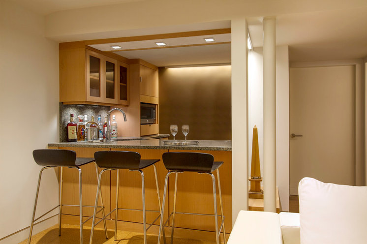
In the kitchen, in addition to the downlights and puck lights, there is a wall grazer against the brown wall, which lets the light graze down the wall and draws the eye up. The wall grazer is right up next to the wall, while a wall washer is 2 to 3 feet out from the wall.
The team paid careful attention to scale throughout the space, even in the form of small, subtle details. For example, they added reveals in the wood on this side of the bar.
The team paid careful attention to scale throughout the space, even in the form of small, subtle details. For example, they added reveals in the wood on this side of the bar.
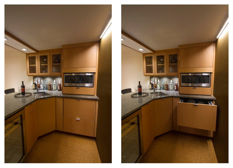
The kitchen has room for storing snacks, making drinks and microwaving popcorn. The open drawer on the right side is a dishwasher. The cabinets are natural beech, and the counter is synthetic quartz.
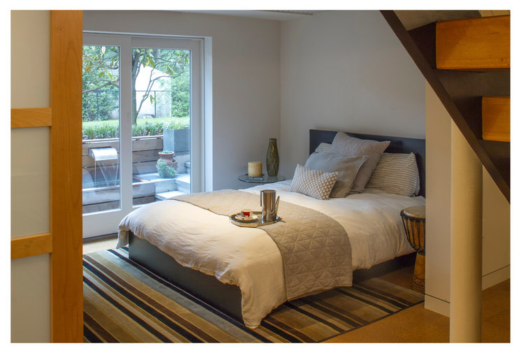
Beyond the large sliding glass door is the guest room, which will double as a study in the future.
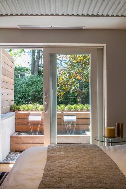
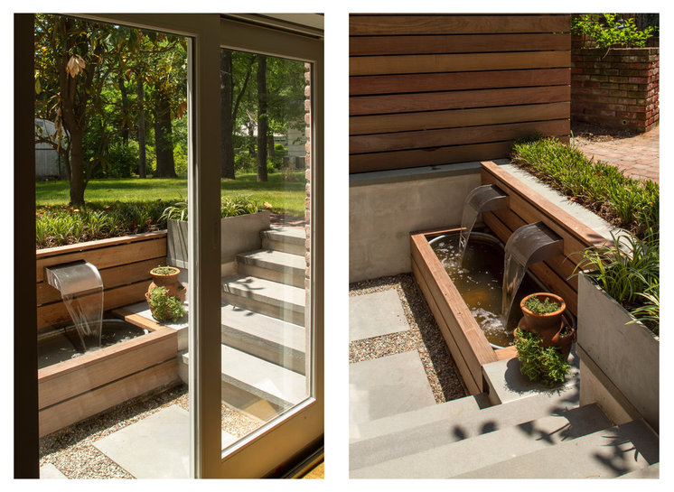
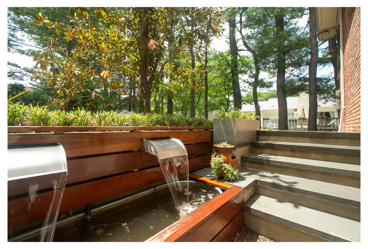
To let in the natural light, the team expanded an existing entry, excavating, adding 6-foot-wide glass sliding doors and creating a small courtyard with a fountain. The fountain is a wonderful feature that can be enjoyed from the bedroom. This room has the same perforated corrugated metal ceiling as the living room.
The owners have plans to convert this into a study-bedroom in the future, using a desk that converts into a bed. Because the piece is rather expensive, they are filling in with an inexpensive bed from Ikea that suits the room’s style.
The owners have plans to convert this into a study-bedroom in the future, using a desk that converts into a bed. Because the piece is rather expensive, they are filling in with an inexpensive bed from Ikea that suits the room’s style.
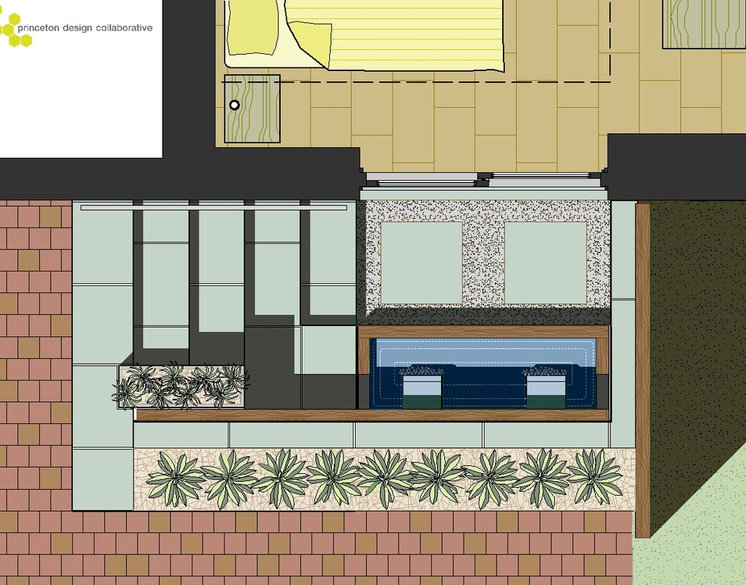
To save on budget, they used a feeding trough for the pond and added ipe wood around it. “This was much less expensive than creating a masonry pond and waterproofing it,” Conroy says.
The galvanized steel is a good fit for the contemporary minimalist design and coordinates with the spouts and a planter. The rest of the limited material palette is more ipe, pea gravel, bluestone pavers and a stairway made of concrete topped with bluestone treads.
Here is a plan of the outdoor space.
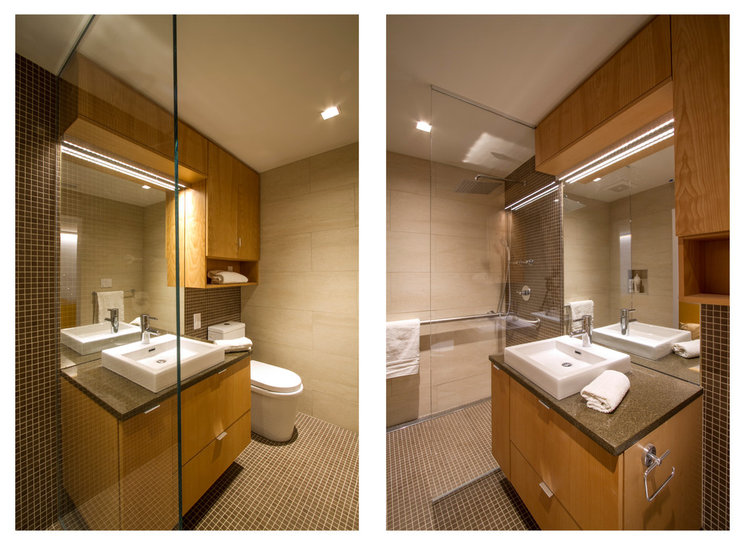
Conroy set up the lower-level bathroom with guests and universal design in mind — the clients’ parents will be their most frequent houseguests. The shower is curbless and doorless and has a grab bar. The smaller tiles on the floor provide good traction for safety.
The design strategy was to keep the budget in check by keeping the space tight but making it look expansive. “The more square footage you have in a bathroom, the more it can run up the overall budget on a project like this,” the architect says. The team chose a 1-inch by 1-inch tile that runs down the wet wall and continues across the floor to create continuity. They paired the small tiles with large-format (14-inch-by-36-inch) tiles on the other walls to create a big contrast in scale between the two. A clear glass shower partition also makes the room feel bigger.
Toilet, sink and tile: Porcelanosa
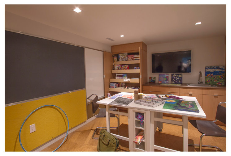
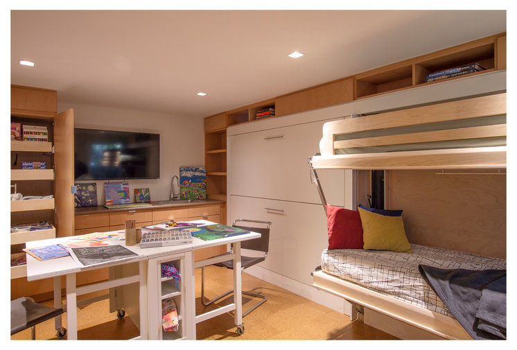
“It was also important to the clients to have a just-for-kids space where they could be creative,” Conroy says. When the homeowners have families over, the adults can congregate in the main living space while the kids do crafts, play Ping-Pong or use the TV for Wii.
The wall to the left has a blackboard on the top, a tack board on the bottom and a whiteboard just past it for their artsy endeavors. A long row of cabinets provides plenty of room to stash craft supplies and toys, and there is a sink in here for convenient cleanup.
The craft table folds up and can be rolled into a nearby closet when they want to swap it out for the Ping-Pong table, which is stored in the large storage area and is easy to roll in and out.
 Vitamin V