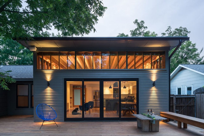
A Great Room Pays Homage to Ordinary Architecture
When architect Murray Legge was hired to renovate a 1940s stick frame home in Austin, Texas, he took a somewhat uncommon approach: He didn’t add on to the home and he didn’t tear it down. “We really like stick framing construction,” Legge says. “There’s no obvious historic value, but it’s part of the fabric of what Austin is.”
Who lives here: Emily Ramshaw, editor of the Texas Tribune, and David Hartstein, a filmmaker
Location: Austin, Texas
Designer: Murray Legge Architecture
Year built: 1940s; remodeled in 2015
Homeowners Emily Ramshaw and David Hartstein hired architect Murray Legge to remodel the main bathroom, kitchen, living and dining rooms. For many renovation projects in Austin, Legge says, this would have been enough to tear the house down and start from scratch, but he wanted to improve the house, not erase it.
“We were going to take the best of the 1940s stick frame modernism and try to strategically make these interventions that would make it a bright, open, airy space without fundamentally changing its appearance from the street,” he says.
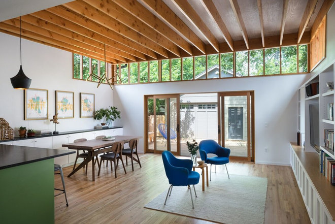
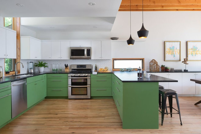
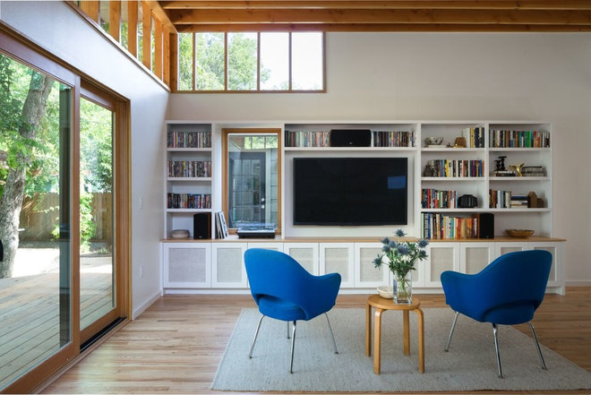
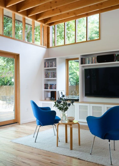
Without increasing the home’s square footage or changing the layout, he tore down the walls of the compartmentalized kitchen, dining and living rooms and created one spacious living, cooking and eating area. Natural light floods the room from a new wall of windows, which also highlight the home’s structure.
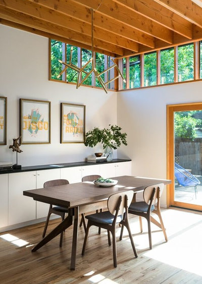
The walls were painted a clean white for contrast and to avoid having the house visually dominated by wood.
Dining table: Cross Extension Table, Matthew Hilton for Case
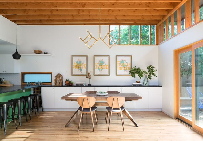
Built-in cabinetry along the far wall stores plates and serveware close to the dining table.
The ceiling joists become concealed at the kitchen peninsula. Since the kitchen had more color and more detail, the architects felt it more appropriate to maintain a white backdrop and keep everything clean.
The new horizontal window over the peninsula divides the two spaces and also brings in more natural light. The window overlooks the driveway, so the architects used obscure glass to screen the view but still allow the light to wash across the dark counters.
Cabinet paint: Snowbound and Dill, both Sherwin Williams; pendant light: Tom Dixon
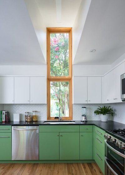
Golden light filters through the tree and into the room, Legge says, and the 10-foot-tall window captures the view of the setting sun in the west, something the clients requested. The hole for the window was cut between existing roof trusses, avoiding extensive structural work.
Doors and windows: Sierra Pacific
The vertical window overlooks a mini courtyard that the couple hope to turn into a garden one day. The window projects out slightly to accommodate the subwoofer in the cabinet below.
Side table: Alvar Aalto; armchairs: Executive Armchair, Eero Saarinen (the couple are looking for a couch)
