Kitchen of the Week: Bold Color-Blocking and a Central Banquette
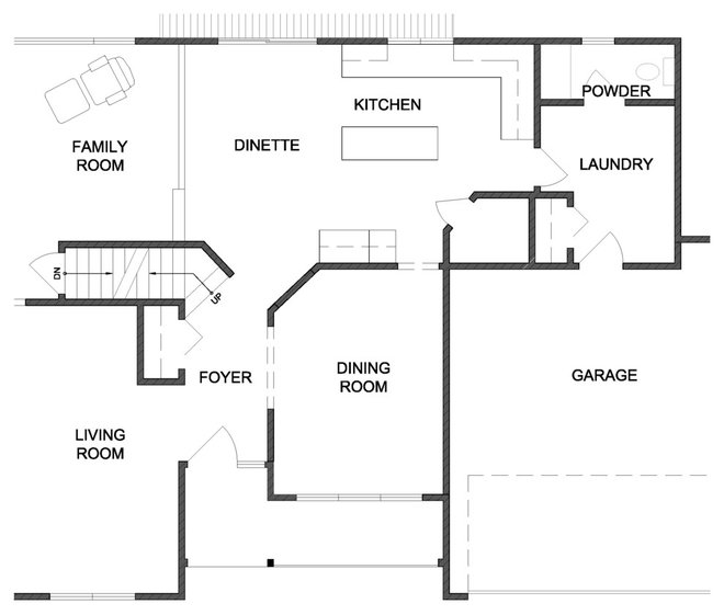
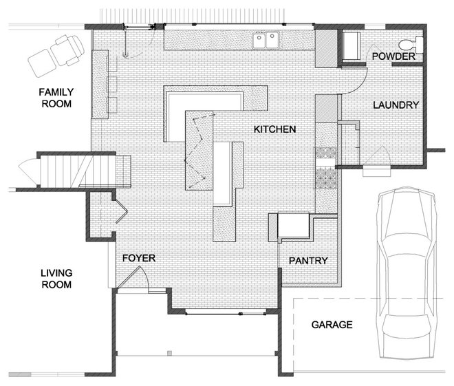
Awes created a lounge-style banquette in the middle of the kitchen and, by eliminating the home’s formal dining room, nearly tripled the 200-square-foot space. Now Palda finally has a kitchen and dining area large enough — and dynamic enough — for her lifestyle.
Kitchen at a Glance
Who lives here: A professional woman
Location: Mendota Heights, Minnesota
Size: 560 square feet (52 square meters)
Architect: Ben Awes of CityDeskStudio
“As an architect, you design a lot of kitchens in your life, and you think, how many ways can I do a kitchen?” Ben Awes says. “It’s pretty surprising when you find yourself going in a direction you’ve never gone before.”
Palda’s original kitchen captured neither her style nor her taste. “It was simple, plain, didn’t have enough counter space, didn’t function at all for good cooking and entertaining,” Awes says. Palda, part of a large family, is an inveterate entertainer, hosting major holidays and football games. “She loves to be the host and to prepare the food,” Awes says. “And she wants to plot the people right in the middle of it.”
The first step was tripling the space, incorporating the little-used dining and entry. “We even bumped into the three-car garage and took half of one of the parking stalls” to create a 5-by-5-foot pantry, he says.
He opened it up visually too, putting in an 8½-by-4-foot wall of windows over a long sink and storage counter, and a glass door that bathes the room in bright light. It also introduces another color, Awes says: the green of the landscaping.
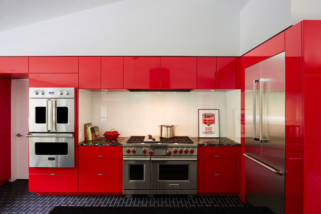
The real breakthrough, however, came in the powerful black-white-red color-blocking scheme. “She wanted bold, and was happy to go very contrasty, sharp-edged and sleek,” Awes says. “She’s got a good eye, and she was really willing to trust the process. She trusted that her intuition would lead her in the right direction, and she was working with people who would pull it all together.”
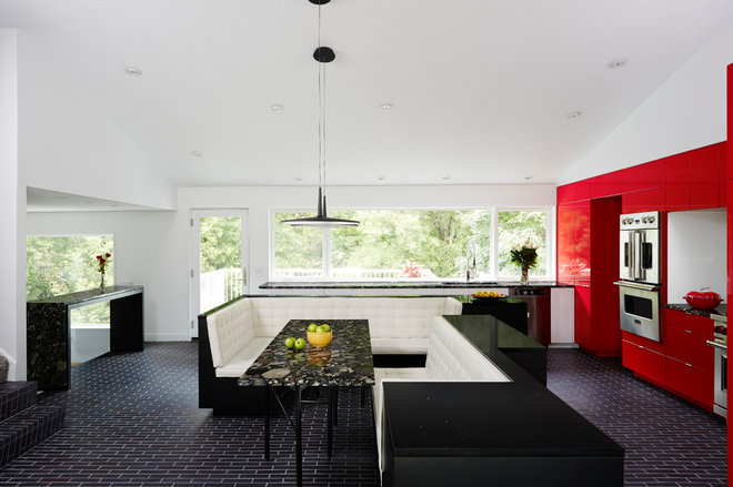
The centerpiece is the nook-like white leather banquette, a design-inspiration moment for Awes. “We wanted to bring back some of the importance of the gathering ritual and put it in the kitchen.”
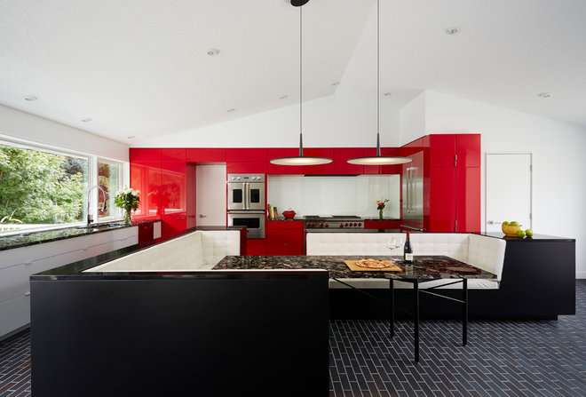
After cutting apart the island block and leaving room in the center for seating, Awes located the traditional island counter space on the perimeter of the seating. The area of the booth directly across from the range is the height of a typical island and serves as a work counter. Cabinetry underneath holds the drawer microwave and dish storage.
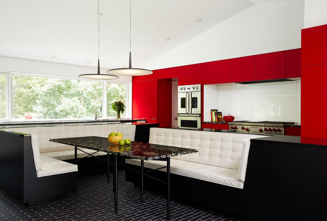
Awes went for contrasting black and white for the banquette. For the tufted seating, inspired by Mies van der Rohe’s Barcelona chair, Awes chose white faux leather that can be easily cleaned. The island itself is crafted from pressure-laminated (P-Lam) cabinetry in matte black with a Silestone black quartz countertop.
Skan light fixtures: Vibia; black quartz island countertop: Silestone
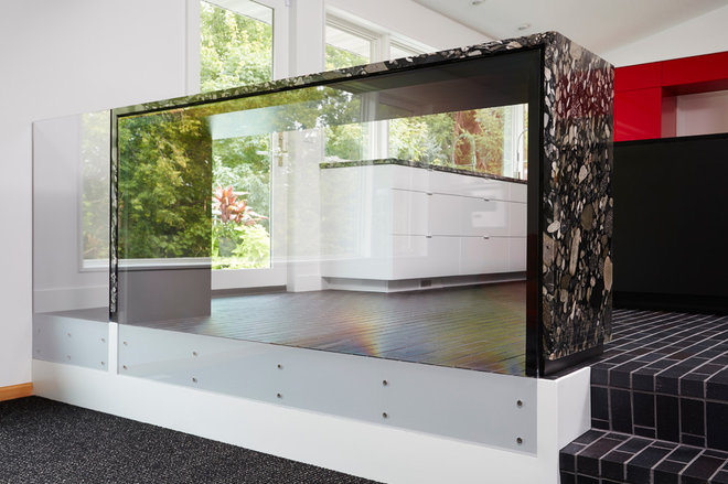
The unusual and strongly graphic granite, called Marinace, was Palda’s pick. “She was hoping we would use it — it is a fairly outrageous countertop,” Awes says. “It looks like it was made of rocks or boulders that have been sliced.” While he admits he was dubious at first, Awes now says, “I ended up loving it. It looks like a riverbed in a way. Because we had a fairly limited palette, we needed some texture somewhere, and that really helped.” The granite also was used as countertop material for the long counter under the window bank, the counters flanking the range, and for the top and legs of a freestanding console.
One of the trickiest and more technical elements in the kitchen is the table’s leg structure, which is Awes’ custom design. “Most tables in booths have a center post because you would bump into any legs set at the edge,” he says. “We needed table legs to allow people to slide in.” The base Awes designed has six 1¼-inch-diameter steel legs connected in a zigzag pattern with crossbars that can fold, allowing the legs to be repositioned beneath the table. “The table can be used in different configurations,” Awes says, and two or three people can pull up chairs at the open end.
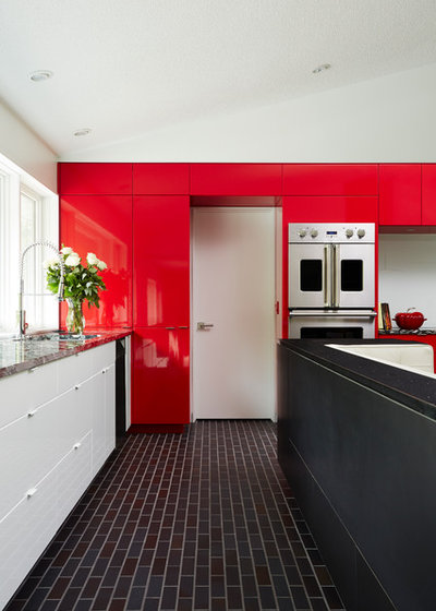
The bright white door passes to the powder room, laundry and, ultimately, the garage.
Stainless steel sink: Kohler;Presidio faucet: Mirabelle;dishwasher: Miele
Palda’s mother had six ovens and frequently had them going all at once. Palda “sees that as the ideal,” Awes says, but “was willing to pull back to four” — a two-oven Wolf range plus two wall ovens. Other appliances include an in-drawer microwave, a dishwasher and “a big, beautiful, gorgeous refrigerator,” Awes says. There’s no prep sink, but a single 30-inch-wide stainless steel sink suffices.
Range: Wolf; range hood: Vent-A-Hood; microwave: Sharp; double ovens: Viking
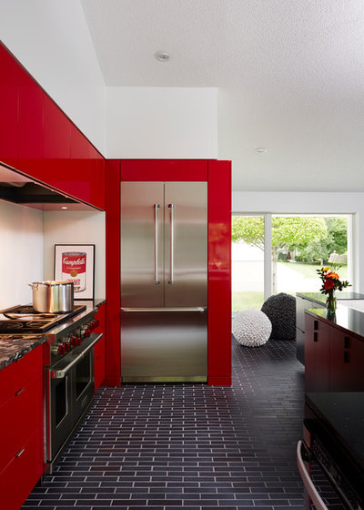
Refrigerator: LG
Its placement next to the two steps leading down to the family room demarcates the kitchen without obscuring it. The granite’s exuberant patterning adds a liveliness to the room’s solid color-blocking. An acrylic panel replaces a more traditional railing for the step-down. “It finishes the room,” Awes says, “and doesn’t block the view.”
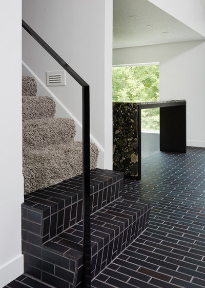
Awes passed over the floor-tile version and opted for the face brick, which has a narrower dimension. “It gives a bit of a surprise to the room and a significant statement to the kitchen,” he says. “It’s one of the first things you experience and notice when walking in.”
Ironspot brick in Manganese: Endicott
