3 Style-Setting Kitchen Backsplashes
Designers: Wanda Ely, Tawnya Clark and Scott Norsworthy of Wanda Ely Architect
Location: Toronto
Size: About 300 square feet (28 square meters); about 18 by 18 feet
Homeowners’ request: A rear addition that includes a new kitchen with a banquette area and mudroom, in a style that’s bright with touches of light wood inspired by their Scandinavian roots
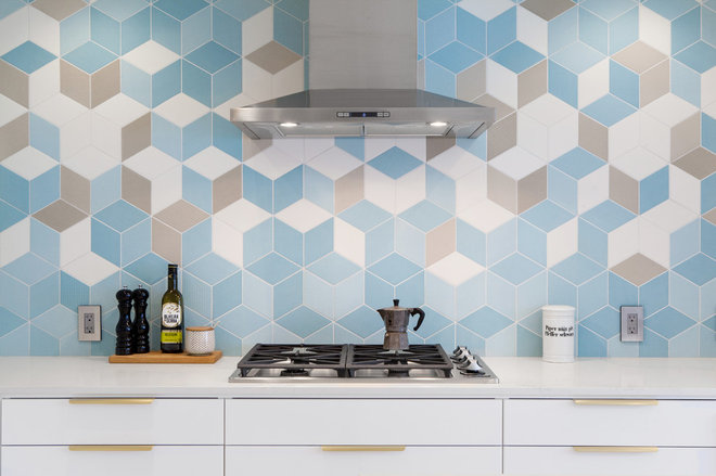
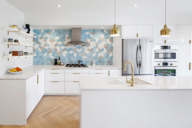
Backsplash: Glazed porcelain tile inspired by woven textiles. “It features a beautifully subtle variation in color and texture, which we feel provides an important accent of visual interest within a palette that is otherwise predominantly white, verging on minimalism,” says architect Wanda Ely. “The geometric pattern also plays an interesting dialogue with the herringbone geometry of the white oak flooring. We like that the backsplash provides a bold, modern gesture, but that it is composed of individual tiles with wonderful tactile qualities that beg to be touched and evokes much older traditions of textile making.”
Designer secret: “One trick we employed was to fully lay out the backsplash tile on the floor with the general contractor, according to a precise drawing,” Ely says. “Seeing the tile laid out in the space itself, at full scale, allowed us to make minor changes to the position and distribution of the colored tiles within the composition of the backsplash, to achieve the desired effect.”
Also on the team: Bellsmith Carpentry (general contractor)
Backsplash tile: Tex by Raw Edges, Mutina; countertop: Caesarstone
See more of this home
Designer: Catlin Stothers of Catlin Stothers Design
Location: Montreal
Size: 350 square feet (33 square meters)
Homeowners’ requests: A kitchen in a newly constructed penthouse that would be conducive to entertaining friends and family while exploiting views of Montreal’s canal and parks; a coffee and breakfast station; built-in appliances; and lots of storage
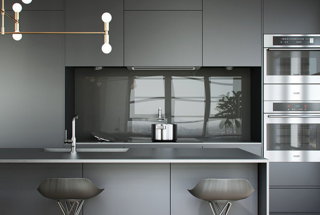
Backsplash: A single piece of ultraclear glass back-painted to match the color of the charcoal cabinetry. “It was intentional to keep a pure and streamlined aesthetic, allowing the sheen of the glass to provide an interesting contrast to the matte cabinetry,” says designer Catlin Stothers. “The drama is the result of a tone-on-tone palette, accented with organic textures and forms, such as wood cutting boards.”
Other special features: Floor-to-ceiling windows; an exposed concrete ceiling; a sculptural light fixture with brass finish; and charcoal cabinets. “It took around seven samples to get the charcoal color right,” Stothers says. “Some were too blue and others too green. It took a lot of patience on the part of the cabinetmaker, but it paid off when the final sample arrived and we knew it was perfect.”
Also on the team: Maxime Moreau and Isabelle Jolicouer (junior architect) of MXMA Architecture; Talia Kirschner (junior designer) of Catlin Stothers Design; Construction Reliance du Canada (contractor); and Jessica Weitzner (project manager)
Countertops: Nero in satin finish, Lapitec; appliances: Miele; stools: Mobilia; floors: Urbania via Capital Carpet; light fixture: Lambert et Fils
See more of this kitchen
Designer: Joshua Gurwitz of Good Property
Location: Tribeca neighborhood of New York City
Homeowners’ request: Replace a small, dated kitchen and its old appliances with a more open, functional space with updated appliances, cabinets, countertops, an island and pantry storage
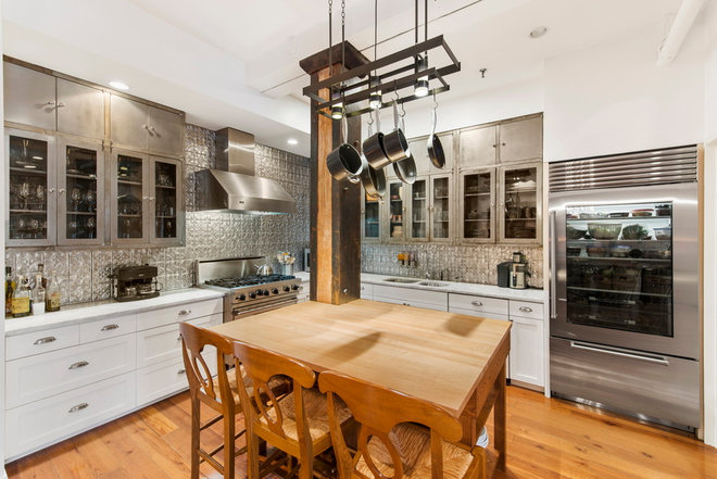
Backsplash: Composite tile that looks like old tin ceilings. “It was more durable and easy to clean and easy to install,” says designer Joshua Gurwitz.
Other special features: Vintage metal cabinets; a metal-wrapped wooden column; chef’s appliances; a private butler’s pantry; and a custom island with a combined light and pot rack above


