3 Ways to Make Your Kitchen Feel Bigger
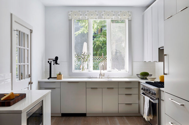
Designer: Jennifer Morris of JMorris Design
Location: Brooklyn, New York
Size: 158 square feet (14.6 square meters)
Homeowners’ request: Remove dingy cabinets and dark green granite countertops, and create a bright white, crisp and clean look in a tightly packed Brooklyn brownstone.
Space-saving style: Natural light, an open layout and a light-reflecting cabinet color, which “keeps the focus on what matters — the view out — and lends a spacious feel,” designer Jennifer Morris says.
Other special features: Custom lightly cerused oak cabinets painted a soft gray-white. “The hint of gray color prevents the space from feeling stark or severe, lending a touch of warmth,” Morris says. Calacatta Gold-style quartz countertops. Wide-plank flooring. Handmade porcelain backsplash tiles. Hand-printed fabric on window cornice.
Also on the team: NY Class Construction (contractor); Mason Woodworks (cabinetmaker); Jacob Snavely (photographer)
Refrigerator: Liebherr; range and oven: Profile, GE; range hood: Miele; dishwasher: Bosch; microwave: GE; hardware: Top Knobs; countertops: Caesarstone in Calacatta Nuvo; backsplash tile: Akdo; window cornice: David Michael Interiors, with fabric from Galbraith & Paul; paint by Benjamin Moore: white in matte finish (walls) and Silver Satin (cabinets)
See more of this kitchen
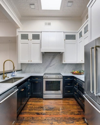
Designer: Brad Ramsey
Location: Franklin, Tennessee
Size: 120 square feet (11.1 square meters); 10 by 12 feet (3 by 3.6 meters)
Homeowners’ request: Remove three columns, replace laminate countertops and old cabinets, add new appliances and create a “modern Parisian loft” theme.
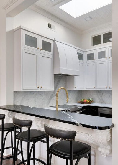
Space-saving style: “Using the same marble on both the counters and the backsplash makes the space feel larger and less busy,” designer Brad Ramsey says. “Also, grounding the base cabinets in black and then doing the uppers in white to match the walls gives the space a more open feel.”
Other special features: New cabinets with soft-close drawers and pullout corner storage. An undercounter microwave keeps the counters free of clutter. Brass finishes.
“Uh-oh” moment: “We took down pendant lights hanging in the kitchen because they felt too busy in such a small space,” Ramsey says. “I hoped we could just recess cans into the ceiling, but it turned out we couldn’t. So, I was staring at a beautiful metal ceiling with holes in it and had no idea what to use to light the space. Fortunately, I found small square LED fixtures that we were able to surface-mount. They really disappear into the ceiling and provide light like a recessed can, but without having to rip up the ceiling. It was a win for function and design in the end.”
Also on the team: Josh Rosanbalm of Rosanbalm Homes (builder and contractor); Showcase Photographers
Cabinets: custom; paint by Benjamin Moore: Decorator’s White (upper cabinets) and Universal Black (lower cabinets); cabinet hardware: Pottery Barn; kitchen countertops: marble; bar countertop: soapstone; appliances: KitchenAid; faucet: Waterstone
See more of this home
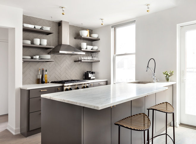
Designer: Gabriela Gargano of Grisoro Designs
Location: Manhattan, New York
Size: 120 square feet (11.1 square meters)
Homeowner’s request: Bring better flow to a poorly laid-out space and create a larger island with seating.
Space-saving style: Custom cabinets with smart, efficient storage allowed the homeowner to skip upper cabinets and go with open shelves for a lighter feel. Moving the refrigerator to the other side of the room helped open the workspace.
Other special features: Glass tile backsplash in herringbone pattern. Olympian marble countertops. Brass pulls and shelf rods.
“Uh-oh” moment: “One of the more challenging issues we encountered in this space was how to have a full 10-inch overhang for seating at the island without inhibiting the swing of the patio door,” general contractor Jonathan Eklund says.
“After some real deliberation, we made a judgment call to vary the depth of the top from one end to the other. This was a risky move, as I wasn’t sure how it would play out. However, having installed dozens of banjo tops in bathrooms in the past, I had a pretty good idea that it would work. The client was thrilled with the result, and no function has been sacrificed to accommodate.”


