Before and After: Storage Spot to Backyard Bungalow for $2,000
Who uses it: Susan Koehn Habermann and her family and friends
Location: Water Mill, New York
Size: 400 square feet (37 square meters)
Designer: Natasha Habermann, creative director and owner of Natasha Habermann Studio
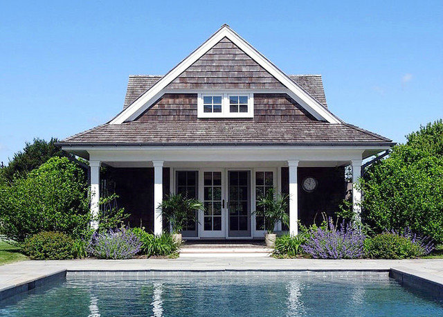
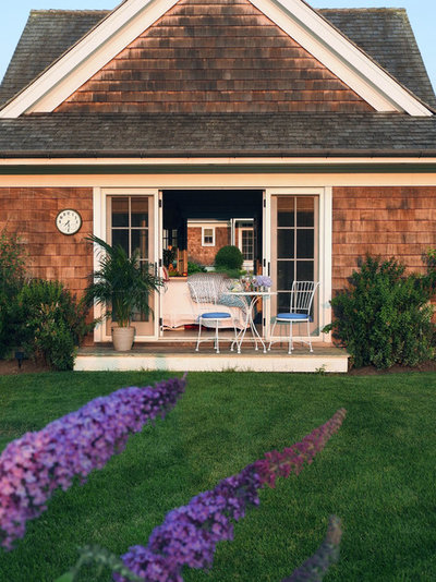
Backstory: Susan Koehn Habermann’s backyard building next to the pool looked cute from the outside but lacked a poolside oasis feel inside. That’s because, over time, it had turned into a storage spot for outdoor furniture and kayaks and a functional bathroom for pool visitors. When designer Natasha Habermann saw her mother-in-law’s space, she knew it could be a much cooler, welcoming place. Natasha started giving Susan ideas, which Susan loved but she wanted to stick to a budget.
Scope: They decided on a budget of $2,500, but ended up finishing the project under that at $2,000 thanks to creative thinking, repurposing and some stellar sales.
Natasha gave Susan lots of suggestions, and they took the interior design style in a tropical beach direction, instead of preppy and nautical. “After cleaning it out and inventorying the furniture and other items stored there, it became clear that some were useable in the new scheme,” Susan says.
Within the space, they wanted to create distinct, useable spaces: a kitchen and dining room, a sitting area, a guest bedroom and an indoor-outdoor bathroom. The whole project took three weeks.
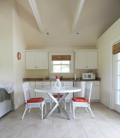
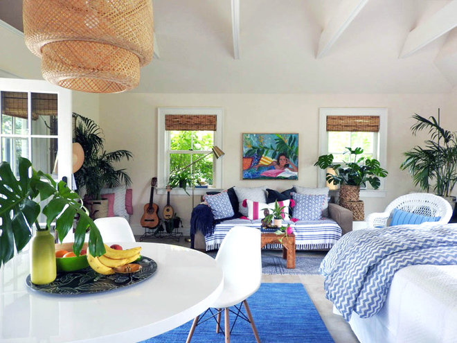
Before: An all-white space provided guests a place to dine and make a simple meal, but it lacked personality. This is the first space you see when walking into the poolside bungalow.
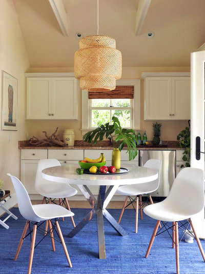
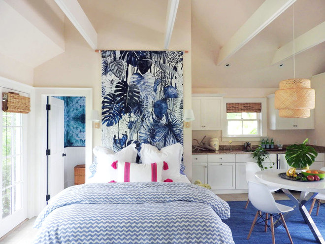
Dining table: Susan already owned the table, but Natasha wanted to surround it with more modern chairs. The plastic chair material also made sense in a building right off the pool. “People can sit in them with their wet bathing suits on, and it’s fine,” Natasha says.
Lighting: An inexpensive Ikea pendant light hangs above the dining table. This light adds to the beach vibe Natasha sought and was fairly easy to install. A can light already existed in the ceiling in the perfect spot, so she had an electrician make the lighting swap.
Chairs: All Modern; table: One Kings Lane; pendant light: Ikea; rug: Burlington Coat Factory
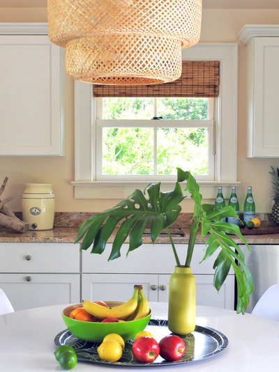
Natasha then styled the kitchen countertop with entertainment items, making them easily accessible for everyone.
Vase: Heath Ceramics; tray: Ikea
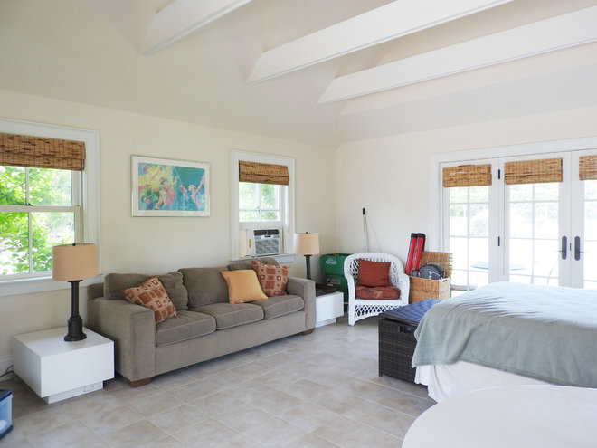
Before: A couch sits against the wall next to two very low side tables. The back corner is being used for storage, holding tennis rackets and an outdoor chair.
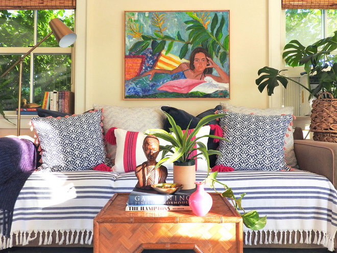
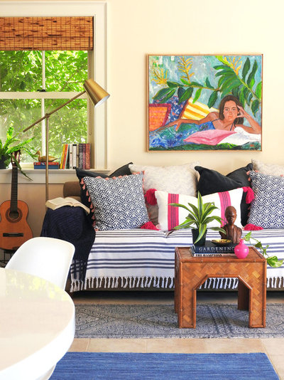
Couch: The limited budget created a challenge for Natasha, especially when it came to the couch. She didn’t love it but knew she would have to make it work. “A new couch would have eaten up our whole budget,” she says. “I was nervous about how I was going to fix up this couch.” In the end, a row of pillows created a daybed look, and the towel gives the base of the couch a bright, clean look.
Rugs: Natasha used two doormats pushed together to create a runner in front of the couch. This option, which was much cheaper than one long runner, also made sense in a space that’s going to get wet, because they will be easier to clean.
Art: Natasha’s mom, Grace B. Keogh, painted the piece hanging behind the couch. Natasha had considered a framed photo of a beach, but it felt out of place in the fun, now whimsical space.
Towel: Fouta Beach Towel, Serena & Lily; pillows: Pier 1, Anthropologie and TJ Maxx; lamp: Target; rugs: TJ Maxx; art: Grace B. Keogh
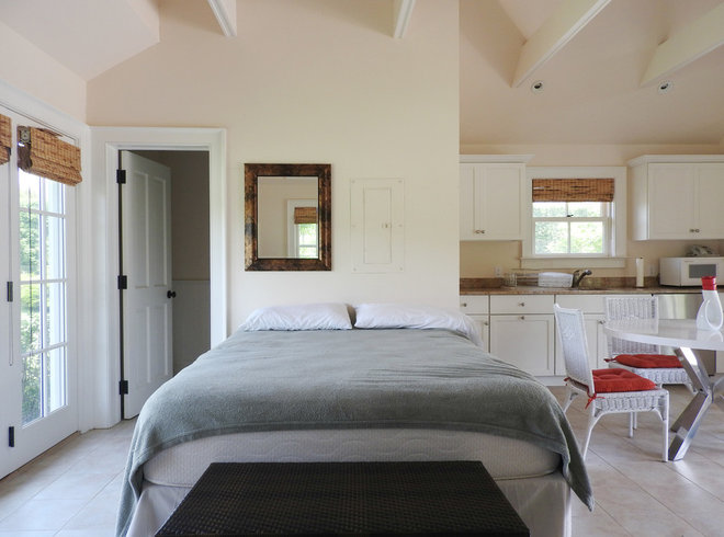
Before: A basic bed sat across from the couch and gave guests a place to sleep, but that’s about it, says Natasha, who had slept on this bed in the past. Natasha and Susan also wanted to find a way to hide the electrical box situated right above the bed.
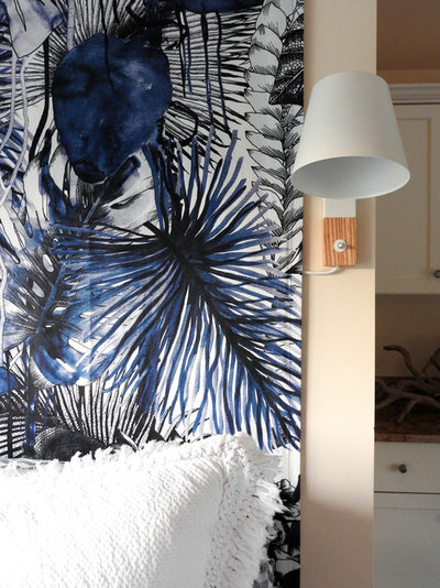
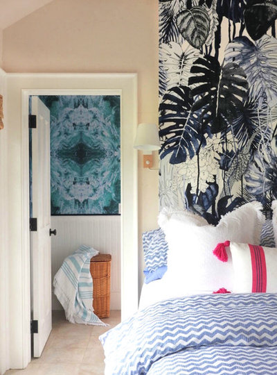
Wall covering: Determined to do something dramatic above the bed, Natasha threw out the idea of installing a large piece of fabric from the ceiling beams to the floor. “Susan was hesitant about the fabric behind the bed, but I told her, you just have to trust me on this,” Natasha says.
Reflecting on the project, Susan could not be happier about this design decision. “The best part for me was deciding on the wall coverings,” Susan says. “The hanging wall cover behind the bed eliminated the need for a headboard and covered an ugly electrical box.”
Bedding: A blue chevron duvet cover over the top of white sheets that Susan already owned quickly freshened up the bed. “They were light and bright and the right price,” Natasha says.
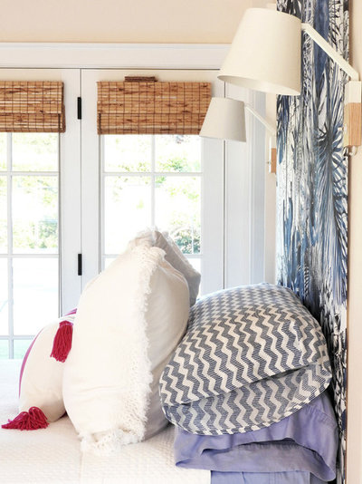
Shams: Anthropologie; pink and white pillow: TJ Maxx; bedding: Ikea; sconces: Crate & Barrel
The stack of regular pillows is hidden by shams and a peppy pink-striped decorative pillow. At night, guests can use the shams as backrests for reading and then set them on the couch or chairs when they are ready to sleep.
“All the light was overhead light before,” Natasha says. “Now the bed actually has its own lights.”
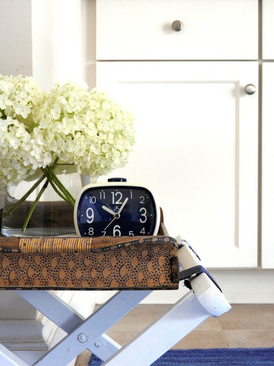
Clock: Infinity Instruments
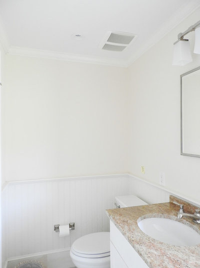
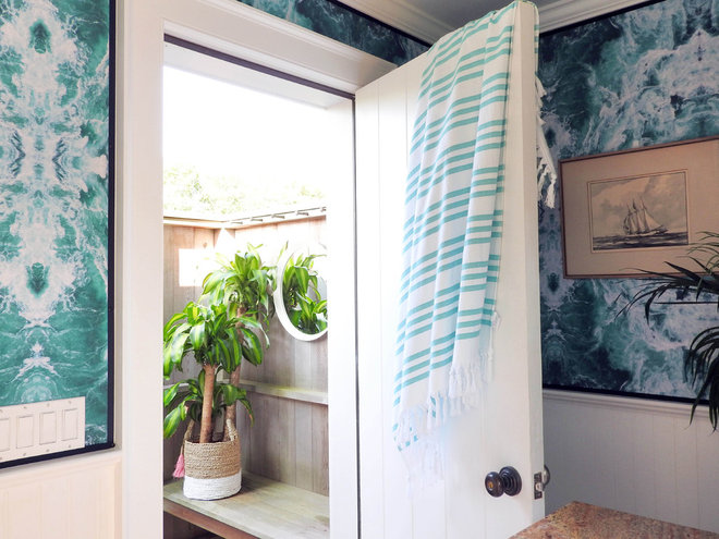
Access: From inside, the bathroom is accessed through the door to the left of the bed. The bathroom can also be accessed from the outside on the side of the building.
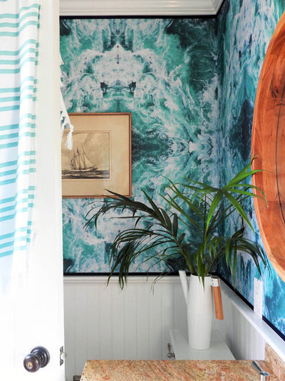
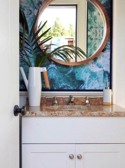
Wallpaper: Natasha hung the wallpaper herself, but says, “I’ll probably never wallpaper again. This was supposed to be easy, but it was such a disaster and I almost ran out of paper.” Thankfully, everything did work out in the end, and Susan loves it. But Natasha is still going to avoid hanging wallpaper by herself again.
Wallpaper: Sea Wallpapers, Wallpapers for Beginners
Mirror: CB2; browse round bathroom mirrors
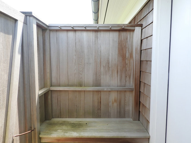
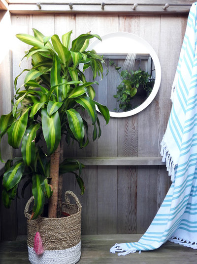
Shower: In the mirror, you can see the shower, which is just a fixture on the side of the building. This outdoor space didn’t need any major updating. With a few small changes, it now feels more like an extension of the indoor bathroom.
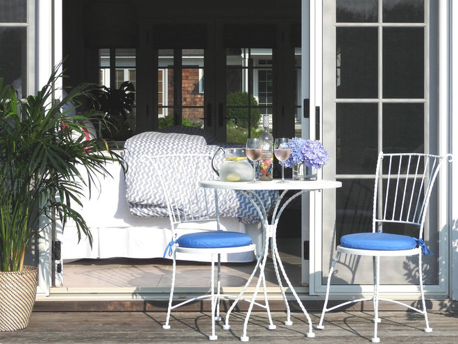
Outdoor seating: Susan already owned this little dining table set, but it was black. Natasha spray painted it white and replaced the chair cushions. The total DIY project cost $10.
Find an outdoor dining set for your patio
