10 Fresh Takes on Ombre
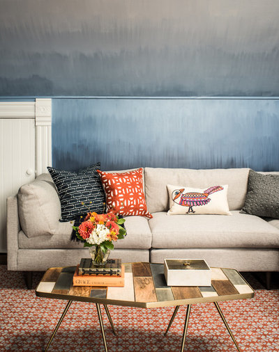
When it was time to paint the playroom in this historic San Francisco Victorian-style home, interior designer Tineke Triggs didn’t seek out an expensive wallpaper. Instead, she told her housepainter to get a little fancy free. Her direction was simply for him to change up the blues vertically every few feet.
See the rest of this Victorian home
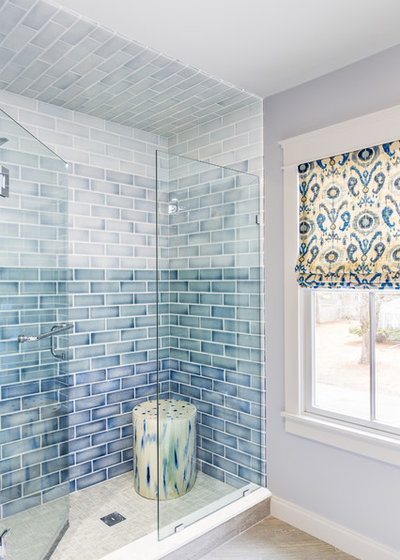
In this bathroom, interior designer Nikki Dalrymple used four different colors of a handmade crackle-glazed tile to create stripes.
The sharper delineation between the different hues is a more modern interpretation of ombre, but the graduated effect remains.
See the rest of this modern farmhouse
Tile Style: Beautiful Beach-Glass Blues for the Bath
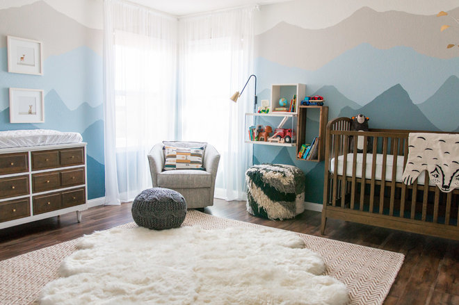
A “babymoon” trip to Alaska inspired the mountain silhouettes on the walls of this popular nursery, while the graduated hues of ombre inspired the color palette.
See more of this nursery, including a video of the homeowner painting the walls
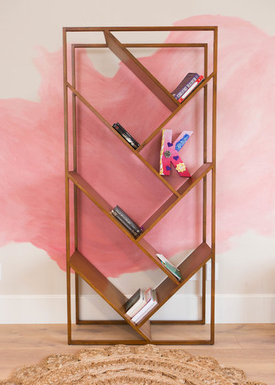
Interior designer Ginger Curtis is a big fan of ombre and loves playing around with different ways to use it. In this teen girl’s bedroom, she had artist Sommer Haney create an effect on the wall that combined the graduated hues of ombre with the shape of an ink spill.
See more of this warm contemporary home
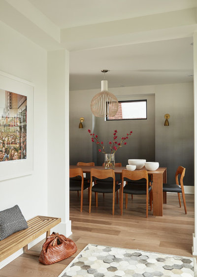
Blues and pinks were the first of the reigning ombre colors. But in the wallpaper in this Toronto home, neutrals start dark and lighten toward the ceiling.
The monochromatic palette makes the ceilings feel higher and is well-suited to the modern style of the home.
See the rest of this fantastic monochromatic home
Wallpaper: Designer’s Guild
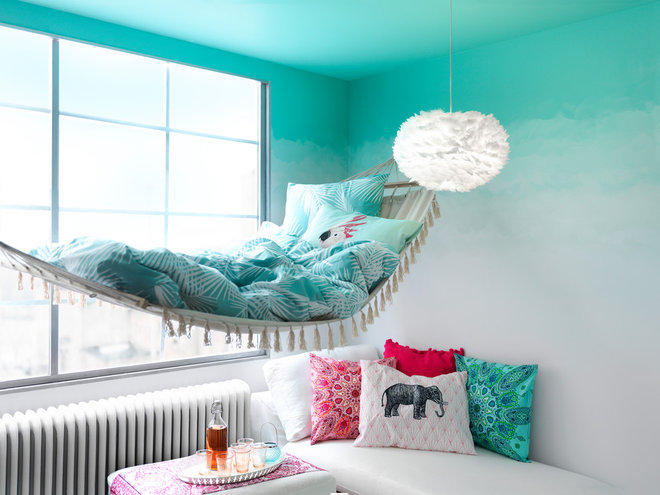
This is an interesting photo to pair with the previous one because it uses a similar technique but in reverse. A range of blue/greens are darkest on the ceiling and become gradually lighter toward the floor. And there’s no better spot to admire the ceiling than from a swinging hammock.
Check out a detailed explanation of how the designers accomplished the look
Designers are giving ho-hum furnishings a fresh update with an ombre treatment. Once a basic white, this cabinet is now the purple-hued star of the room.
See more of this creative home
Learn how to do this yourself
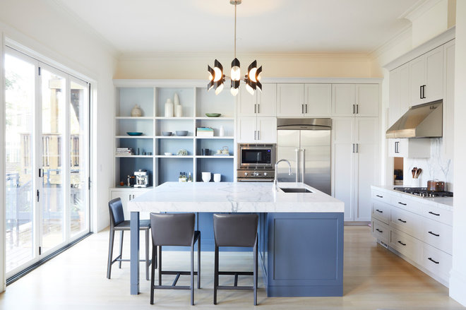
The backs of shelves are often ignored. By paying attention to them and giving them an ombre paint job, this designer has cleverly connected them to the kitchen island and the rest of the room.
Tip: A strip of color samples from a paint store’s fan deck is an easy way to find a good ombre palette.
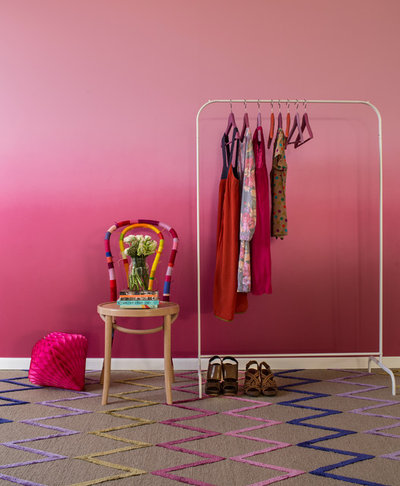
In the first wave of ombre mania, the colors often lightened all the way to white. But this room goes from shocking pink to medium pink. As a result, the saturated wall practically pulses with energy.
What Is Millennial Pink, and Why Are People Going Crazy for It?
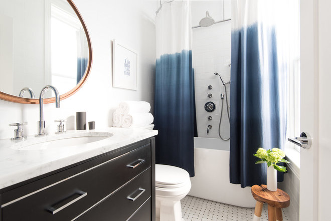
If you love the look of ombre but don’t want to commit to a big paint job, try something smaller like an ombre shower curtain or throw pillows.
![Eclectic Living Room by Design Fixation [Faith Towers]](https://st.hzcdn.com/fimgs/8e51a8d906fd2442_3804-w400-h560-b0-p0--eclectic-living-room.jpg)
