Style Rules in a Man’s 450-Square-Foot Studio
Who lives here: Ryan Lore, attorney and consultant in the biotech industry
Location: Nob Hill neighborhood of San Francisco
Size: 450-square-foot studio (42 square meters)
Building built: 1964
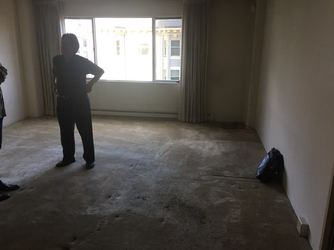
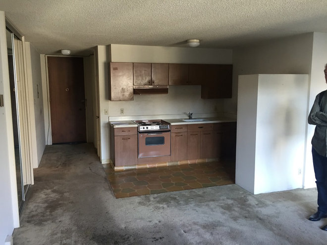
Before
Backstory: First-time homeowner Ryan Lore bought his Nob Hill apartment in 2015. “The place was pretty rough when I first got it,” he says. “It hadn’t been touched since 1964, and literally every surface needed to be updated, including removal of the asbestos popcorn ceiling.”
Another immediate challenge was figuring out where to put the bed. He loves having friends over but didn’t want the bed in the middle of the living space when they visit. “Plus,” he says, “I just don’t like the idea of always looking at it.”
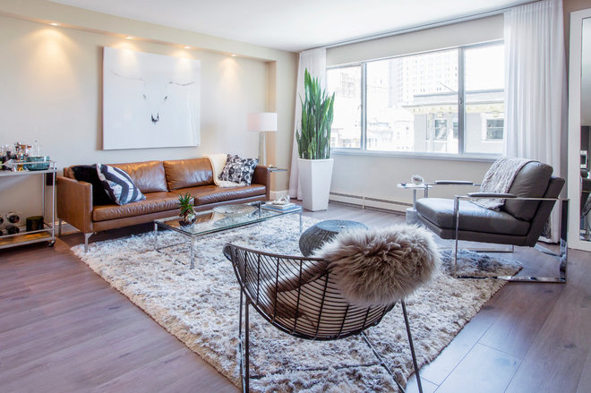
Scope: The homeowner removed the popcorn ceiling and replaced it with a smooth painted finish. The ceilings are 8 feet high, and Lore wanted to keep the space feeling uncluttered, light and open. He removed the dirty carpeting and replaced it with new cork floors. The walls received a fresh coat of white paint, and he installed new lighting in the living room under a newly built soffit. He renovated the kitchen and bathroom with new tile, cabinets, lighting and flooring. The interior doors were replaced with custom 8-foot-high doors. The remodel took five months.
Design team: “I didn’t work with any designers on the renovation or decoration. I came up with everything on my own after doing a ton of online searching for inspiration, a lot of it on Houzz. It was a slow process, but worth it,” Lore says. He also worked closely with his father throughout the project. “I used contractors for some minor electrical and plumbing work, to install the countertops and to remove the asbestos ceiling,” he says.
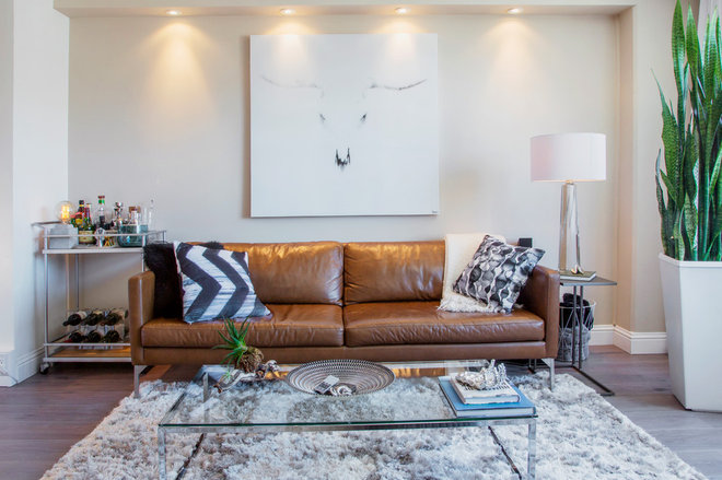
Color palette and style: “I didn’t want it 100 percent white but tried to stay in the silver, gray and taupe color scheme,” Lore says. The walls in the kitchen and bath are white, and the walls in the rest of the living area are taupe. “The building has a midcentury modern look, so I wanted to stay true to that in my place, but with a luxurious feel.”
Window treatments: Lore’s mother sewed custom curtains out of sheer batiste fabric.
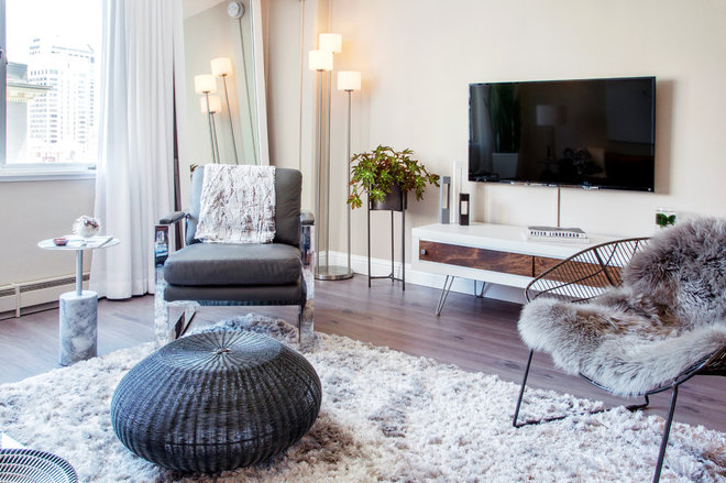
Chrome chair and rug: HomeGoods; flooring: QU-Cork; wall paint: White 52, Behr
Gray leather chair: HomeGoods
A gold bar cart in the corner was disassembled and painted silver.
Wood and glass gold finish bar cart, Target; Echo Oxford tan sofa, Article; art: Parvez Taj, Gilt; Smart glass-top coffee table: CB2; side table: CB2
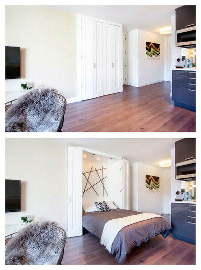
Biggest challenge: “I didn’t want a bed in the middle of my living room since I entertain quite a bit,” Lore says. One original idea was to open up the walk-in closet and make it a sleeping nook, but he discovered that was not possible because there was building plumbing running through the wall that he wanted to remove. “There was another closet with sliding glass doors next to the hallway and kitchen, and I decided to convert this to a Murphy bed,” he says.
“I removed all of the shelving and replaced the sliding glass doors with custom bifold doors. The closet that I converted was in pretty rough shape after I removed the built-in cabinets. After a lot of drywall work, I added the wall sculpture as well as a false ceiling with built-in lighting.” This helped clean up the area and make it look less like a closet when the bed is down.
Lore looked at a few different Murphy bed options and wanted the least gap between the wall and bed frame. The Murphy bed fits into the width of the closet.
Murphy door bed frame, Murphy Bed Depot; sculpture: Crate and Barrel
Problems: The compact kitchen featured dated linoleum flooring and appliances. “The kitchen was untouched since 1964. Most of the appliances didn’t even work. The cabinets were steel and had a fake wood sticker finish on them. Very strange,” Lore says.
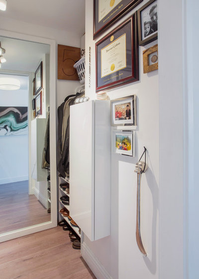
Shown on the left side of this picture is the sliding closet where the Murphy bed is installed. The two glass doors were repurposed as full-length, leaning mirrors in the living room and walk-in closet.
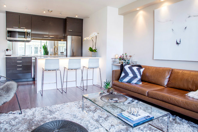
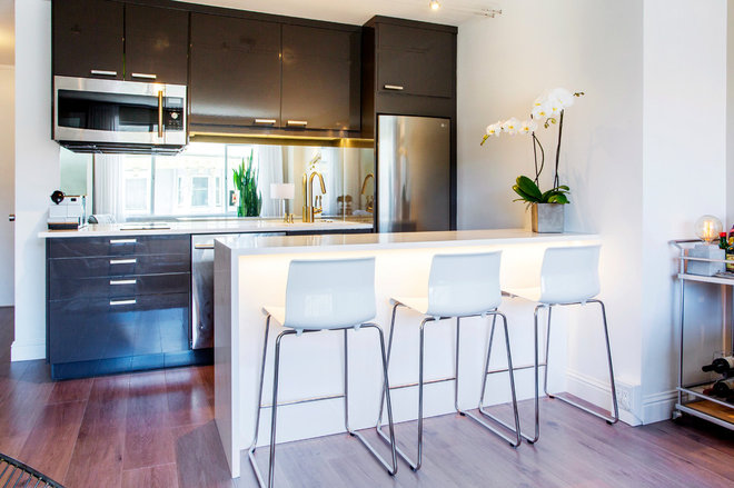
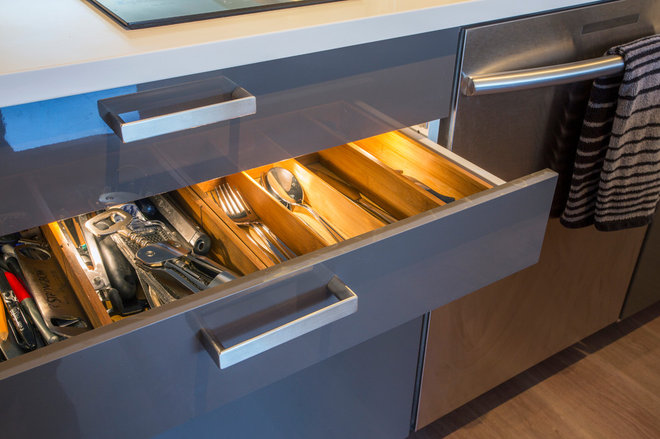
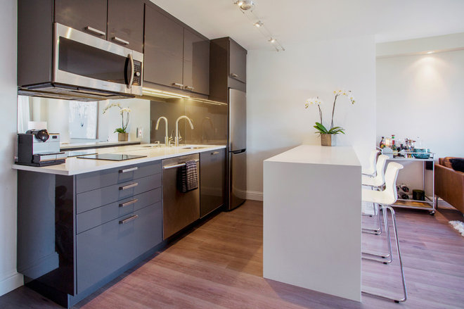
Solutions: The kitchen was a gut remodel. New glossy cabinets from Ikea were installed along with new stainless steel appliances. A new peninsula with a waterfall quartz countertop created additional seating and a convenient work and eating space. Lights were installed under the island.
“I wanted to maximize counter and cabinet space. I decided to install a two-burner induction cooktop instead of a larger four-burner [one]. I also chose to avoid installing an oven and instead went with a convection microwave,” Lore says. “This freed up space and still allows me to bake, broil or cook food.”
White bar stools: Glenn, Ikea; see more
Splurge: The white quartz waterfall countertop.
Faucet: Hansgrohe
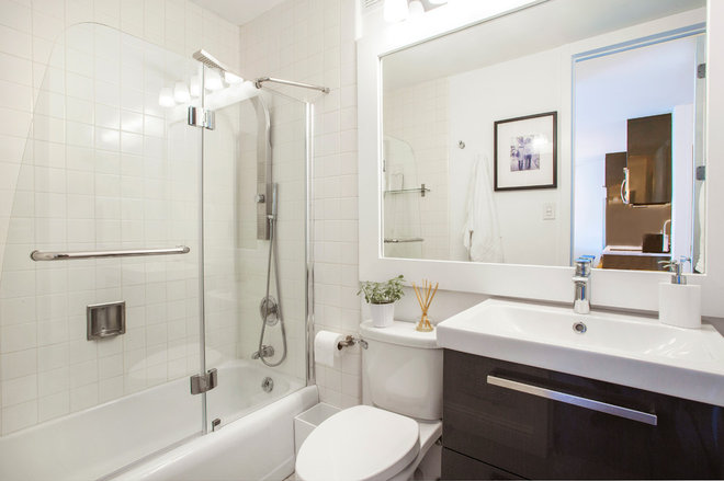
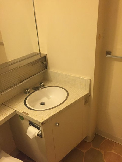
Problems: The compact bathroom included dated fixtures, floor tiles and very small vanity.
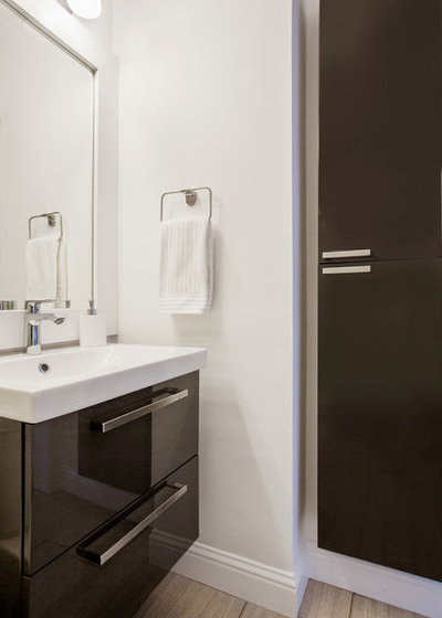
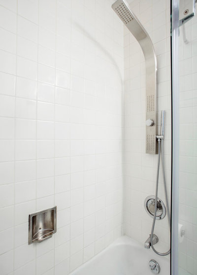
Solutions: Lore installed a new glossy vanity and cabinets in the same series from Ikea as the kitchen cabinets to add storage here. The linoleum floors were replaced with new tile, and newly installed lighting helps the space feel light and bright.
