New This Week: The Stylish Kitchen Trend Showing Up Everywhere
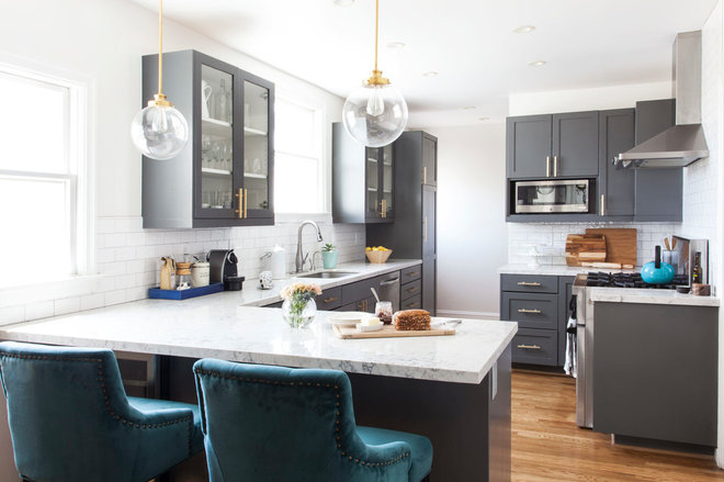
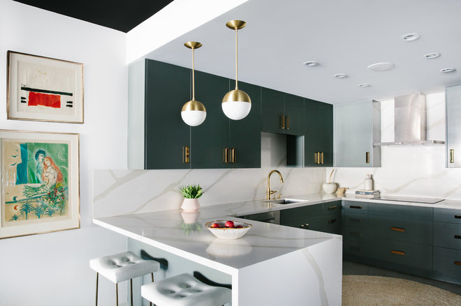
Designer: Jill Cordner
Size: 220 square feet (20.4 square meters); 10 by 22 feet (3 by 6.7 meters)
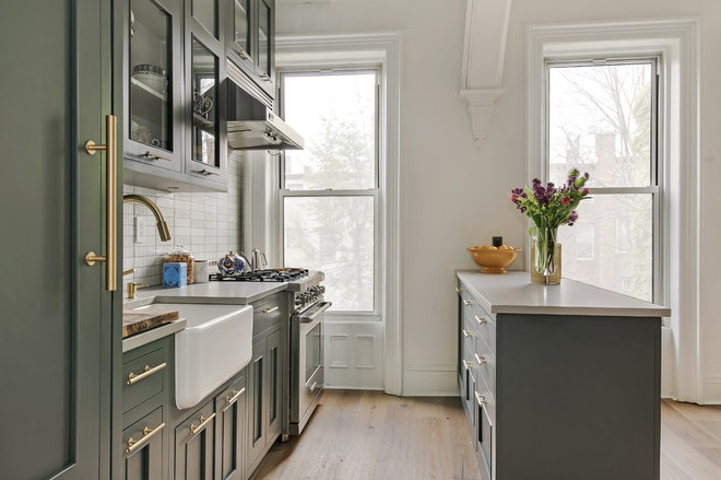
Homeowner’s request: Remodel a lackluster kitchen in a charming 1920s-era flat. The homeowner wanted it to be an “on-trend classic renovation with touches of glamour,” designer Jill Cordner says.
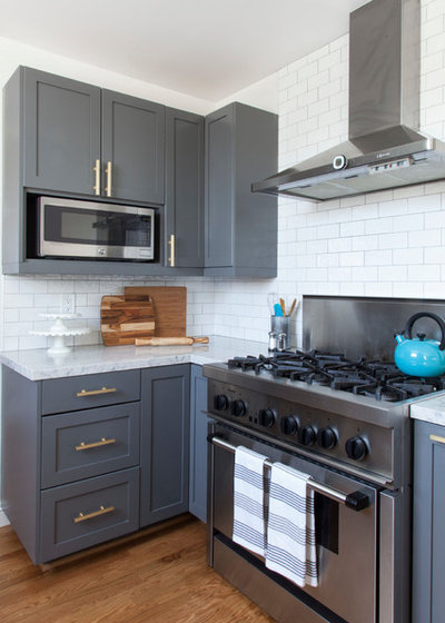
Palette: Dark gray cabinets. Satin brass cabinet hardware and pendant lights. Marble-look quartz countertops. White subway tile backsplash. “My client was game for a sense of drama, and we both loved how the dark gray cabinet color added contrast,” Cordner says. “The brass hardware popped really well against the cabinet color. The gray veining in the quartz picked up on the cabinet color well too. Even though we went with a dark cabinet color, installing light quartz counters and light walls made the space feel larger.”
Cordner painted the existing honey-toned wood cabinets (in Kendall Charcoal by Benjamin Moore) to save money.
Designer secret: “Use what you have,” says Cordner, who modified a lot of what existed in the space. “Even things like changing out the frosted glass in the upper cabinets to clear glass was a budget-friendly way to change the look and style of the kitchen. We also modified the layout of the cabinets but reused them.”
Cabinet paint: Kendall Charcoal, Benjamin Moore; wall and cabinet interior paint: Cloud Cover, Benjamin Moore; pendant lights: similar to Luna pendant rod, Schoolhouse Electric & Supply; backsplash tile: Cottage, Equipe Ceramics; countertops: Silestone in Helix; range: 30-inch pro Harmony, Thermador; cabinet hardware: Hampton collection bar pull, CKP, available on Houzz; bar stools: Atlantic Lydia, Cost Plus World Market
See more of this kitchen
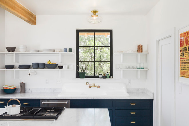
Designers: Shane Pavonetti and Matthew Baitz of Pavonetti Architecture
Size: 190 square feet (17.6 square meters)
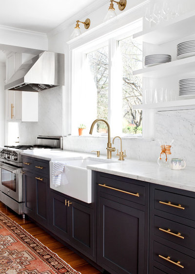
Homeowners’ request: An open, simple and playful kitchen with a modern twist on farmhouse design and plenty of functionality for a growing family.
Palette: Blue cabinets. White open shelves. Satin brass fixtures. Carrara marble countertops. Exposed wood beams. “The blue cabinets and brass fixtures mix both warm and cool hues to evoke a playful aesthetic amongst a desaturated backdrop,” designer Shane Pavonetti says. “The patina of the satin brass is a beautiful juxtaposition to the clean lines of the modern kitchen. The warmth of the exposed wood beams and subtle veins of the Carrara marble countertops also help bring this scheme together.”
Other special features: Pantry to the right of the sink.
Why the design works: “The design approach for this kitchen was to create a place where friends and family could gather, while exploiting the natural environment that surrounds the home. By implementing a simple color palette and open layout, we were able to achieve functional connections to the other nodes of the house and a visual connection to the landscape,” Pavonetti says.
Designer secret: “The homeowners originally purchased a polished chrome fixture for the kitchen sink, which they had de-chromed to reveal the beautiful brass finish you see in the photograph,” Pavonetti says.
See more of this home
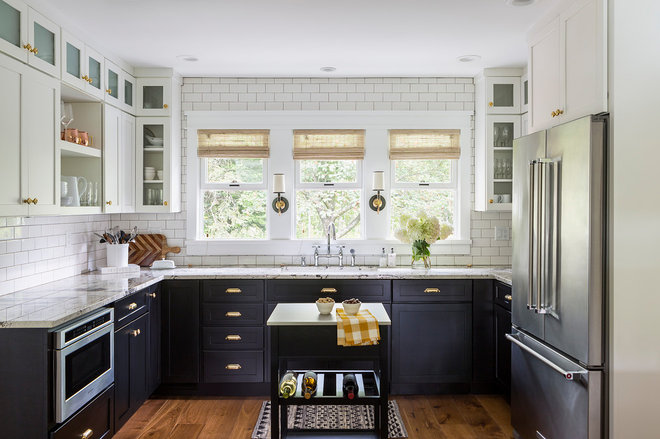
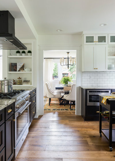
Designer: Jenika Kurtz Cuadra of J. Kurtz Design
Size: 180 square feet (16.7 square meters)
Homeowners’ request: Open up a closed-off kitchen and increase functionality and efficiency.
Palette: Black cabinets. Brass cabinet hardware. Black-and-white granite countertops. White subway tile with dark gray grout.
Other special features: Three double-hung windows. Open shelves.
Designer secret: “The kitchen before was not symmetrical and felt very enclosed,” designer Jenika Kurtz Cuadra says. “By opening up the one wall and creating a more thoughtful layout, we were able to make the kitchen feel larger with almost the same amount of square feet.”
Refrigerator, dishwasher and range: Aga; sconces: Circa Lighting; island: Target; faucet: Kohler; cabinets: Menards; cabinet hardware: Rejuvenation; window shades: Hunter Douglas
See more of this home
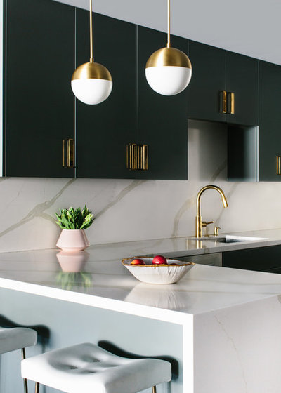
Designer: Caitlin Murray of Black Lacquer Design
Size: 150 square feet (13.9 square meters)
Homeowners’ request: Update a decades-old condo to feel “chic, fresh and soulful,” designer Caitlin Murray says.
Palette: Gray cabinets. Quartz countertops with a Calacatta Gold marble look. Polished and brushed brass. “I love the idea of mixing lacquered and matte finishes of the same metal,” Murray says.
Designer secret: “Black always adds sophistication,” Murray says. “When in doubt of what a room’s missing, that’s a great place to start.”
“Uh-oh” moment: “The 1950s walls had essentially no studs, and the second we opened one up, we had to outfit the entire unit in metal ones to meet current fire code,” Murray says. “This was a significant expense and slowed down the project. In situations like this, you have to just roll with it and do what needs to be done. I think it’s wise for any homeowner to go into a renovation expecting inevitable delays and extra costs, because there are always going to be unforeseen circumstances. It’s part of the nature of construction, and the best results happen when everyone stays calm and makes rational decisions accordingly.”
Bar stools: brass and leather Bunda stool, Thomas Hayes Studio; pendants: Cedar & Moss; countertops: Silestone in Calacatta Gold; cabinets pulls: Liz’s Antique Hardware
See more of this home
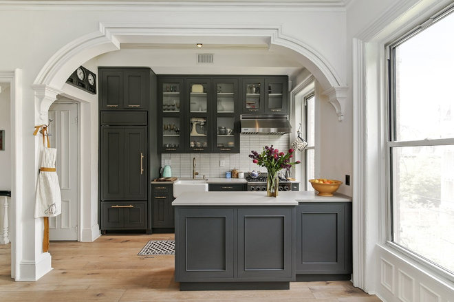
Designer: Liesl Geiger-Kincade of Studio Geiger Architecture
Size: 86 square feet (7.9 square meters); 7½ by 11½ feet (2.2 by 3.5 meters)
Homeowners’ request: Simplify cabinetry, add more countertop space and bring in more brightness.
Palette: Charcoal cabinets. Unlacquered brass hardware and faucet. White tile backsplash. White walls. “Brass is a warm tone and I think makes the dark charcoal more approachable when the two are together,” designer and architect Liesl Geiger-Kincade says.
Other special features: Decorative archway. Additional cabinet storage in an adjacent dining space flanking a fireplace.
“Uh-oh” moment: “At the beginning, we knew we needed more counter space than was there earlier, and tried laying out an island. However, a floating island was too small. So we settled on a peninsula shape. Unfortunately, the peninsula was in conflict with the window frame, because they were in the same location and same height. In the end, we stepped back part of the peninsula so it would clear the casing, and then made it wider on the rest of the peninsula to maximize the usable counter area.”
Tile: Savoy ceramic in Rice Paper color, Ann Sacks; countertops: Caesarstone in Raw Concrete; dining room light fixture: West Elm; sink: Rohl; range: 30-inch, TechnoGas; refrigerator: 36-inch with custom panel, Sub-Zero; dishwasher: Bosch
See more of this home
Your turn: What do you think of satin brass paired with dark cabinets amid a palette of white and gray?
More
28 Design Ideas Coming to Homes Near You in 2017
The 15 Most Popular Kitchen Storage Ideas on Houzz
More Houzz Resources
Find a kitchen designer
Shop satin brass hardware
