Quebec Homeowners Say Goodbye to an Open-Plan Kitchen
Kitchen and Dining Room at a Glance
Who lives here: A couple and their 16-year-old son
Location: Beaconsfield, a suburb of Montreal, Quebec
Size: 350 square feet (33 square meters)
Designer: Denis Gobeil of Cuisines Vima Design
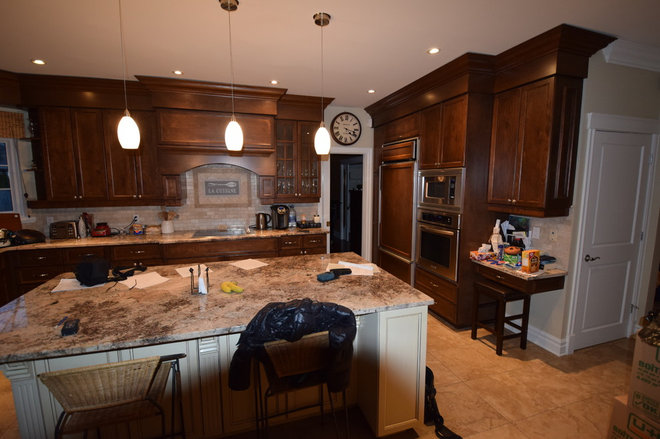
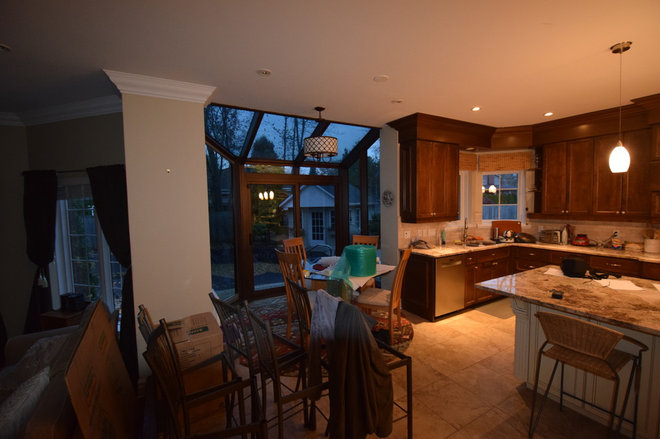
The homeowners purchased their house in a suburb of Montreal because they wanted to live along the Lake St. Louis, a lake at the junction of the Saint Lawrence and Ottawa rivers. But they didn’t care for how the kitchen and dining space were originally set up as an open space featuring a large island. They hired Cuisines Vima Design to design and oversee a remodel that separated the cooking zone from the dining area.
The request to separate the cooking area from the dining area is unusual for their clientele, says Amber Ardizzone, project manager at Cuisines Vima Design. “Here everybody is opening up the spaces. They’re one of the first clients that wanted to have it all closed in.”
In this case, the new kitchen layout is rooted in the homeowners’ long tenure living in Singapore. In Southeast Asia, it’s common for homes to have separate wet and dry kitchens — the wet area is used for heavy cooking of potent-smelling foods, the dry for baking and lighter cooking. These days, some homeowners in Southeast Asia separate their kitchens to have one hidden space for heavy cooking for the family and another open area for entertaining guests.
Pro tip: When first meeting with a kitchen designer, expect to get some questions about how you cook and how you live. “We discuss their habits – if they cook a lot, and for how many people,” says Denis Gobeil, designer with Cuisines Vima Design. “We’re trying to find out the way that they live and what would please them.”
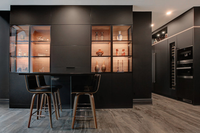
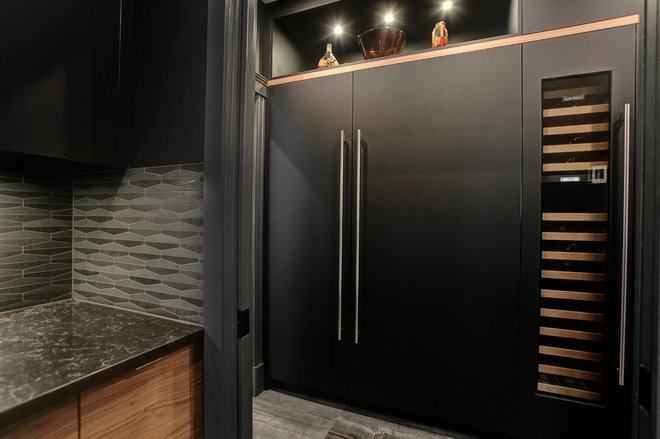
In this space, the refrigerator and microwave wall (on the right in this photo) serves as a transition from the dining area (or dry kitchen) to the main (or wet) kitchen. The appliance above the microwave is a coffee maker.
Find a kitchen designer near you
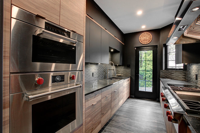
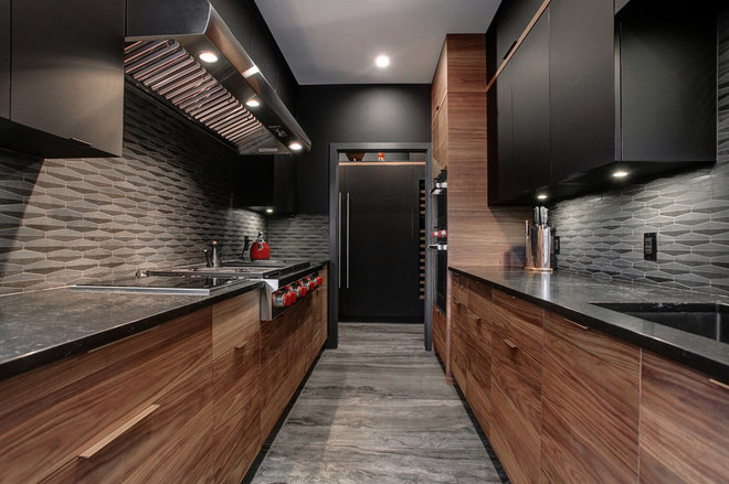
The homeowners wanted a mix of natural materials and dark finishes that would give their kitchen and dining area a sophisticated restaurant feel. The upper cabinets are made of a fingerprint-proof, scratchproof synthetic material made of paper and resins; the lowers are walnut finished with a matte clear coat. Flat front cabinetry gives the space a contemporary look.
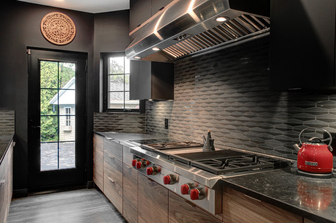
The backsplash tile has a slightly raised texture that adds interest to the space against the simple flat cabinetry. Black quartz counters with white and gold veining bring more texture into the space. The floor is large-format (24-inch by 24-inch) porcelain tile, made to look like wood.
The lower cabinet on the right side of the sink conceals a dishwasher; the cabinet to the left is the trash and recycling pullout. The far end of the right side of the kitchen houses double wall ovens.
Find kitchen backsplash tile in the Houzz Shop
The full-length door leads to the back patio.
Find cooktops in the Houzz Shop
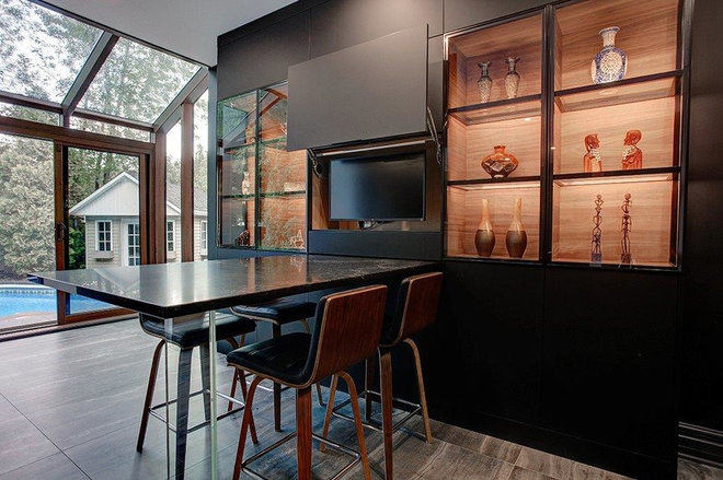
The custom dining table has a quartz top in the same pattern as in the dry kitchen. A thick glass leg supports it.
