Seattle Shed Packed With Creativity and Budget-Friendly Ideas
The project appealed to the designers of Mutuus Studio for a number of reasons. The homeowner wanted the shed to serve a variety of uses, including working from home, gardening, exercising and entertaining. And it had to be done on a strict budget. “It was an exercise in restraint,” Friesz says.
Shed at a Glance
Who lives here: A woman and her 7-year-old-daughter
Location: Ballard neighborhood of Seattle
Size: 360 square feet (33 square meters)
Designers: Jim Friesz and Kristen Becker of Mutuus Studio
Before any renovations started, the designers brought on general contractor August Bergdahl of Crescent Builds to help them clean up the structure. “Someone had helped [the homeowner] with a previous version of the idea,” Friesz says. But the roof was leaking and the shed was in bad shape. “All of that had to get demoed,” Bergdahl adds. Once they dried out the shed, fixed the leaking roof and tightened the building envelope with caulking and new framing, they got to work on the redesign.
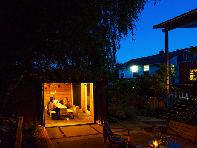
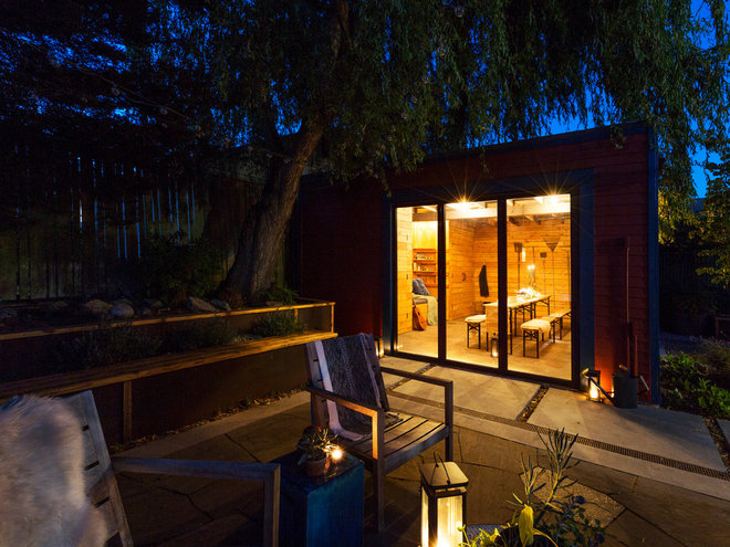
The designers immediately noticed how inviting and well-designed the outdoor space already was. Their goal was to better connect the shed to the garden and to have it feel like an outdoor escape for the homeowner. “We had this vision of the interior being warm and glowy from the inside,” like a lantern emanating light, Friesz says.
Find a remodeling professional on Houzz
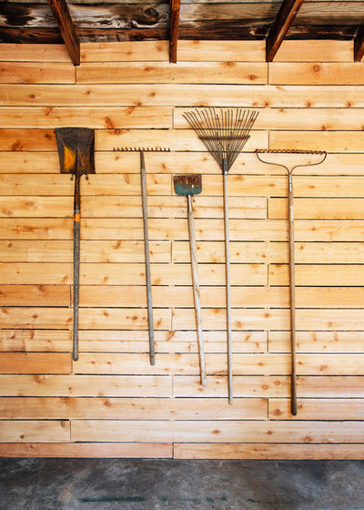
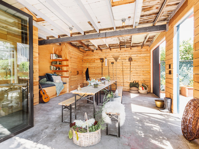
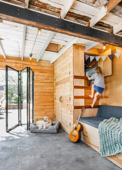
Together, they decided to cover the walls with cedar planks, a budget-friendly material that added visual warmth and texture to the space. “August and I came up with this idea to use very economical cedar fence boards,” Friesz says. “The walls are a little rustic” because of the nature of the material, he says. The gaps between the boards accommodate the irregularities of the board shapes. As the wood isn’t exposed to UV rays, it will remain this color.
Though they sealed the exterior, they decided not to insulate the structure. “We wanted it to remain as an unconditioned garage space,” Friesz says. It protects the homeowner from the elements but doesn’t need the tight building envelope of a home.
Buy wall hooks in the Houzz Shop
Budget was a major factor, as it often is, and in this project it influenced materials, finishes and other design decisions. The remodeling pros cleaned and scraped the existing concrete floors but didn’t polish them, and they left the ceiling as is, patching and painting especially worn areas. They added more extensive electrical systems, as the shed didn’t really have any before. “We spent a little bit of money on cool light fixtures,” Friesz says of the Schoolhouse Electric lights.
The beam running across the ceiling marks the place where the wall had divided the shed’s two offices from the utility space in the back. While the team discussed replacing the beam, it was unnecessary from a structural perspective and would have used up all of the budget. “Cladding it in steel added support, aesthetics and saved money,” Bergdahl says.
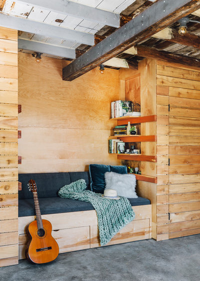
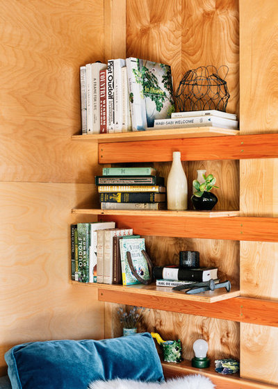
They built a daybed in between the closets, including underbed storage and plywood paneling. They coated the plywood with Seafin Oil, a simple penetrating tung oil. It brightens the color a little, Bergdahl says, and also helps protect the plywood from dirt and oils that it may come into contact with.
The other entrances are the existing carriage doors for the shed (which the contractors adjusted in order to make a tighter fit). The single door was salvaged from one of the offices.
Pro tip: Don’t put off getting a professional involved in your remodeling project. When working with an existing structure like a shed, Bergdahl suggests bringing a professional in early on to help you assess the structure and its feasibility.
