4 Refreshing Kitchens With Green Cabinets
Designers: Chris Ambrose of Ambrose Custom Builders and Emily Pinney of Pinney Designs
Location: Woodstock, Vermont
Size: 360 square feet (33 square meters); 18 by 20 feet
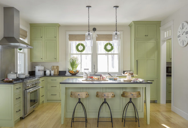
Homeowners’ request. Maximize storage while keeping everything open to the adjacent dining room.
Cabinet color. Brookside Moss, in satin finish, by Benjamin Moore on all cabinets.
Other special features. Inset Shaker-style cabinet doors. Ash floors. Honed Absolute Black granite countertops. Large windows. Nine-foot ceiling.
“Uh-oh” moment. “The pantry beside the kitchen was hard to access, so we removed the door and integrated cabinets to make it feel more like the kitchen,” builder Chris Ambrose says.
Cabinets: StarMark Cabinetry
Find a kitchen designer near you
Designer: Katrina Boschenko of Wander Designs
Location: Austin, Texas
Size: 150 square feet (14 square meters)
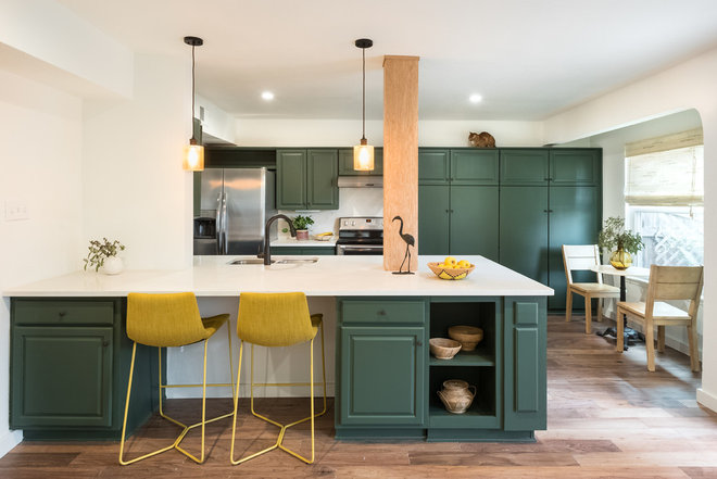
Homeowners’ request. Open the kitchen, increase space, add timeless style and save money by repainting the existing cabinets.
Cabinet color. Boreal Forest by Benjamin Moore on all cabinets. “I wanted a warm yet cheerful deep forest green color,” designer Katrina Boschenko says. “I wanted the green to be the hero in the kitchen. Incorporating neutrals and natural elements such as various wood elements (white oak beam, mango wood chairs and natural-colored woven blinds) helped achieve a modern, clean and inspiring kitchen.”
Other special features. Limestone tile backsplash. Oil-rubbed-bronze fixtures. White oak-wrapped island beam. Single-slab quartz countertop on the island. “I wanted a pop of color that would blend with the green, so I selected mustard yellow counter stools,” Boschenko says.
Designer tip. “Incorporate neutrals and natural elements to add depth, texture and character without being overwhelming or busy,” Boschenko says.
“Uh-oh” moment. “There were no real hurdles or issues other than the quartz countertop slab being dropped during install,” the designer says. “So what you are seeing is a second slab.”
Shop for counter stools
Designer: Resa Gray of Honeycomb Design + Build
Location: Malden, Massachusetts
Size: 299 square feet (28 square meters); 23 by 13 feet
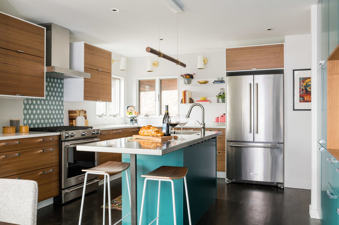
Homeowners’ request. Combine an existing dining room and poorly laid-out kitchen to create a comfortable circulation while updating finishes and relocating laundry machines out of the kitchen. “A stainless steel island counter with integrated sink was a must, but the space also had to feel warm and inviting,” designer Resa Gray says.
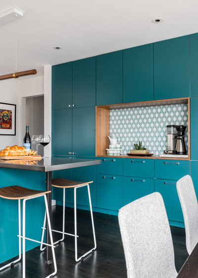
Cabinet color. Dark Teal by Benjamin Moore on the island and the wall of cabinets (seen in the next photo).
Designer tip. “I recommend having multiple light sources — recessed in ceiling, wall sconces, pendants and undercabinet — all on dimmers so the lighting scenes can be customized as desired,” Gray says.
“Uh-oh” moment. “The desire to avoid using filler strips for the cabinets at the pantry wall for a built-in look was not without issues,” Gray says. “The cabinet widths varied up to one-eighth inch larger than expected, and the niche for the pantry wall had to be adjusted after the plaster was already up.”
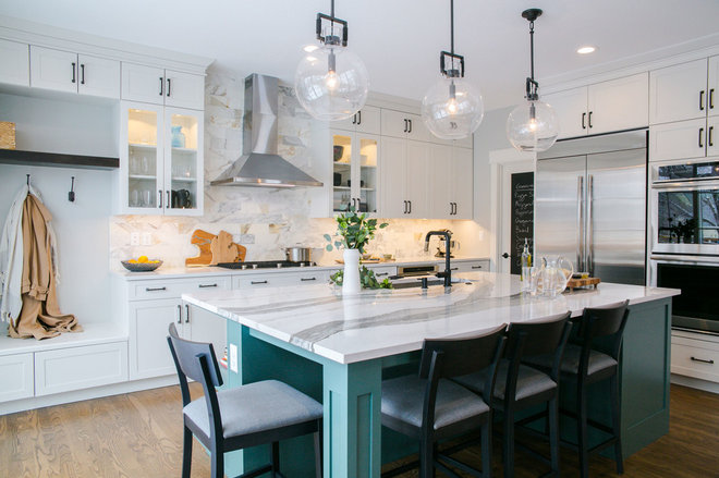
Designer: Ashley Christensen of TVL Creative
Location: Denver
Size: 250 square feet (23 square meters)
Homeowners’ request. Add a 12-foot sliding door to the backyard, reorient the island for better flow and give the space a bright, clean style without making it too sterile.
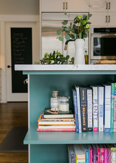
Island cabinet color. Rocky River by Sherwin-Williams on just the island. “We fell in love with this color from the start,” says designer Ashley Christensen, who used this Houzz ideabook of kitchen photos to collaborate with her client on aesthetics. “It’s a beautiful deep green with slight blue undertones that play well off of the natural tones we used in the rest of the kitchen.” (The perimeter cabinets are by UltraCraft Cabinetry in the Melted Brie finish.)
Other special features. Firenze Calacatta marble tile backsplash. Quartz countertops. Matte-black-and-gold-finish faucet. Large globe pendants. “Adding in the dark metal accents of the hardware, light fixtures and faucets gives us moments of interest without distracting from the beauty of the island,” Christensen says.
“Uh-oh” moment. “We originally started the kitchen design by working with semicustom cabinetry, but we found that we couldn’t make the island exactly how we wanted it with that route,” Christensen says. “The clients really wanted cookbook storage and a Shaker-style leg, so we turned to our custom cabinetry friends for a solution. They were able to create the little bookcase we were looking for and built out the custom leg that added the perfect finishing touch to the island.”
