Master Bath Loses Dark Finishes and Gains Airy Glamour
Bathroom at a Glance
Who lives here: A couple with two preteens
Location: A suburb of Nashville, Tennessee
Size: 198 square feet (18 square meters)
Designer: Terri Sears of Hermitage Kitchen Design Gallery
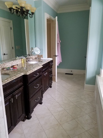
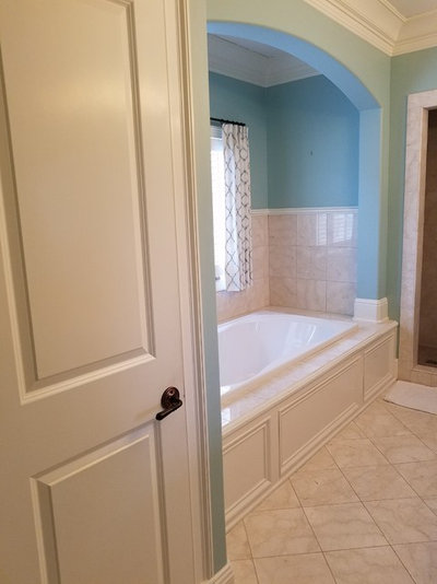
The owners of this lovely renovated bathroom weren’t happy with how the space looked before, so they hired Terri Sears of Hermitage Kitchen Design Gallery to help them make it over. They wanted the room to feel brighter and larger but they didn’t want to change its footprint.
Find a bathroom designer near you
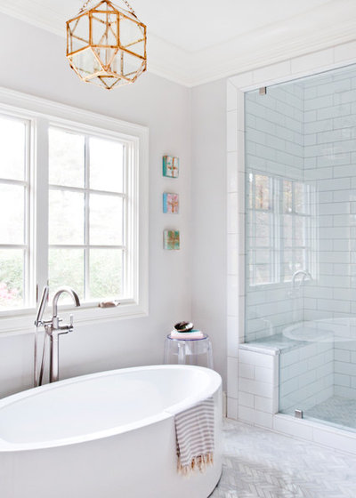
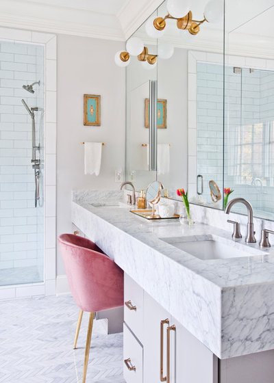
The changes allow more light into the shower stall, which now has a glass panel and door. The shower walls are tiled with 3-by-12-inch white subway tile with a pale gray grout. Sears chose the gray to give the tiles some definition and because it’s easier to keep looking clean than white grout.
The shower bench seat is Carrara marble, as is the mosaic floor tile, which Sears ran in a chevron pattern across both the bathroom and shower floors. (The floors have the same gray grout as the shower walls.)
The geometric chandelier above the tub has a satin gold finish.
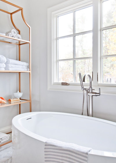
Bathtub filler: Delta
Browse freestanding tubs in the Houzz Shop
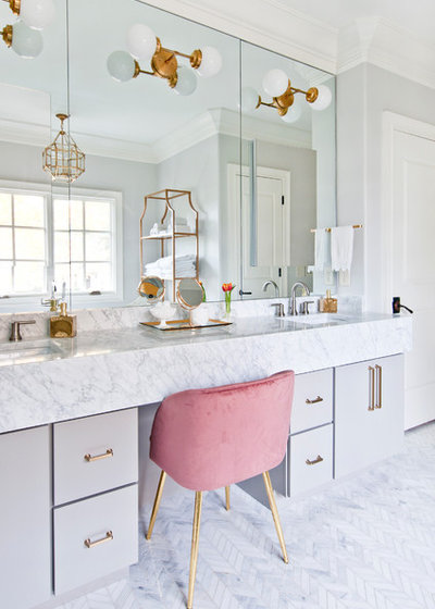
The homeowner purchased the pink chair on Houzz.
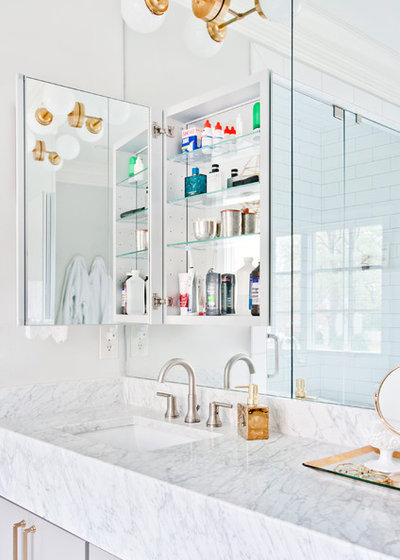
The designer mixed metals for the bathroom’s fixtures, with stainless steel for the sink faucets and shower and tub fixtures, and a satin gold finish for the lighting and cabinet pulls. “There’s a couple reasons why we did it,” Sears said. First, what’s in style for finishes changes over time, so Sears put the gold — the trendier of the two finishes — on the elements that would be less costly or complicated to replace. Second, adding warm gold worked in a room that has both warm and cool grays in it.
Sears placed the light fixtures directly on the mirrors rather than above them to reflect and amplify their glow.
Cabinets: Medallion Cabinetry in Macchiato Classic finish; cabinet hardware: Top Knobs
Shop for bathroom vanities on Houzz
