Organic Modern Style for a Chef and a Baker
Kitchen at a Glance
Who uses it: A chef and a baker
Location: Woodacre, California
Size: 330 square feet (31 square meters) including the dining space
Architect: Craig O’Connell Architecture
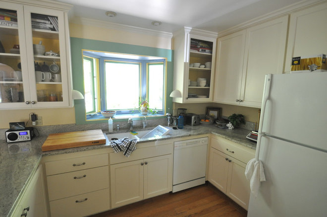
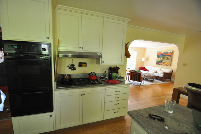
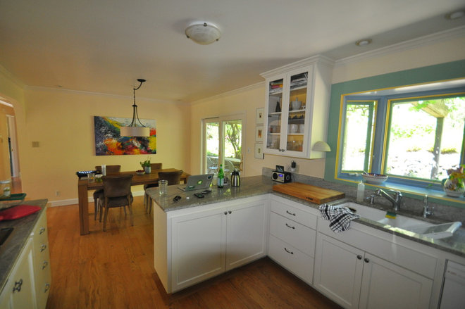
Northern Californians Nick and Arielle Giusto make magic in the kitchen. Nick is a fourth-generation miller and baker and helps run the family business, which provides restaurants and bakeries with premium-quality flour and grains. Arielle is a talented chef who caters and has helped open several popular restaurant kitchens in the area. So their dated kitchen with limited counter space, low ceilings and a lack of social space was not cutting the mustard for them.
Architect Craig O’Connell designed a light-filled, airy space that connects to the outdoors and the region, reflects the couple’s tastes and gives them all the room they need to prepare delicious food together and entertain.
Expanding Out and Up
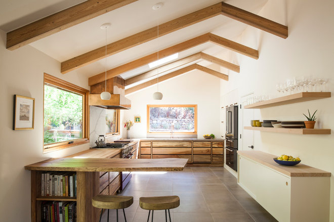
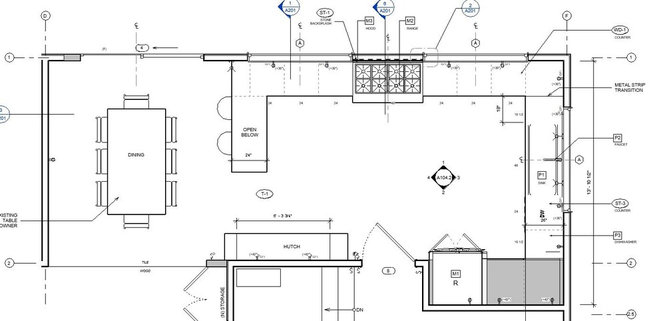
The project was a full renovation. O’Connell expanded the kitchen’s footprint by taking over an adjacent office space, removed an 8-foot drop ceiling to allow for a cathedral ceiling with reclaimed beams and installed three 6-foot-wide windows. The office wall O’Connell removed was to the right of the range. The existing roofline allowed for the new ceiling height.
Find an architect for your next project on Houzz
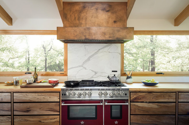
The two culinary professionals needed a serious range, and they chose a 48-inch red model from BlueStar that revs up the room with color. The countertops on either side of the range are cypress butcher block, providing plenty of room for chopping. A new solar-powered operable skylight by Velux is located close to the range. “While the vent hood works well, Arielle says the skylight really helps air things out when she’s got a lot cooking on the stove,” O’Connell says.
The couple knew they wanted copper on the vent hood, which the architect designed to fit the space. It brings in a rich patina that works beautifully with the wood and the Italian marble backsplash. The marble adds elegance and contrasts with the rustic elements.
“The Giustos knew they wanted Italian marble here, but Arielle warns that it is not easy to keep clean with cooking splatters,” O’Connell says. “But it was worth it to them.”
Local Flavor
It was important to the couple that the design be “of the place.” O’Connell used meaningful local materials and expert craftspeople. For example, the ceiling beams were milled from reclaimed old piers that had been buried in San Francisco Bay.
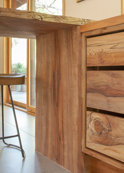
The reclaimed piers, the cypress countertops and shelves and the sycamore live-edge peninsula counter and cabinet wood came from local reclaimed-wood dealer Evan Shively of Arborica. “This was definitely a site to visit with the clients. We looked at all kinds of woods, and the homeowners found the ones that spoke to them,” O’Connell says.
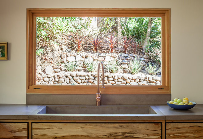
San Francisco company [RE] Union Creative fabricated the custom stained concrete countertop and integrated sink. Petaluma craftsman Cemil Hope made the custom sycamore cabinets.
Shop for a copper kitchen faucet on Houzz
The floors are large-format ceramic tiles that look like gray concrete. This contributes to the organic modern feel of the room. The new floors are also heated. The architect tucked custom CNC-routed grilles into the toe kicks for the home’s existing forced-air HVAC system.
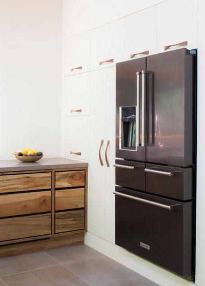
In the remodeled kitchen, O’Connell devoted this interior wall to cabinetry and the fridge. There’s an appliance garage for the coffeemaker and stand mixer next to the countertop. Arielle found the bow-shaped wood hardware.
One detail to note is how the fridge appears to float. O’Connell used 8-inch-high toe kicks (standard height is 4 inches) around the room to give everything a lighter, floating look. He warns that a high toe kick can cut into storage capacity but notes that here the copious amount of storage accommodated this choice.
Note: Hanging shelves and cabinets like this should be planned out during the framing phase of construction to handle the weight.
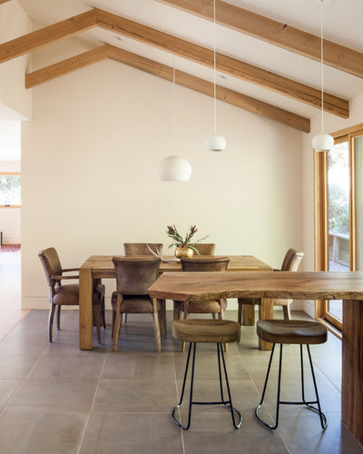
The renovation continued the cathedral ceiling and beams into the dining room. Sliding doors connect to the deck outside. O’Connell replaced the bulky old peninsula with an open one. The top is a live-edge piece of sycamore. Planning the structural support for cantilevering this piece occurred during the framing stage, in collaboration with the cabinetmaker and general contractor. Cantilevering the countertop maintains the open and minimalist look.
Browse backless counter stools in the Houzz Shop
Friends and family enjoy gathering for delicious meals at the Giustos’. These include O’Connell, who is not only their architect but also their neighbor. “It’s been really fun to be able to enjoy this space and see it in action after it was finished,” he says.
Takeaways
- Take inspiration from the views outside when choosing materials and colors.
- Accompany your designer to wood and stone showrooms to see what speaks to you.
- To maintain a minimalist look, you can forgo cabinet hardware with reveals, cutouts or touch-latch hardware.
- Plan room for favorite cookbooks.
- High toe kicks can give a lighter, floating look to cabinetry.
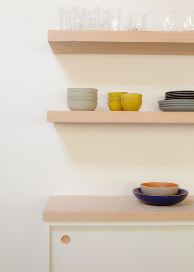
- The weight of open shelves that will be loaded with china, as well as wall-mounted cabinetry and cantilevered countertops, must be taken into account during the framing phase of construction.
