4 Kitchens With White Cabinets and a Wood Island
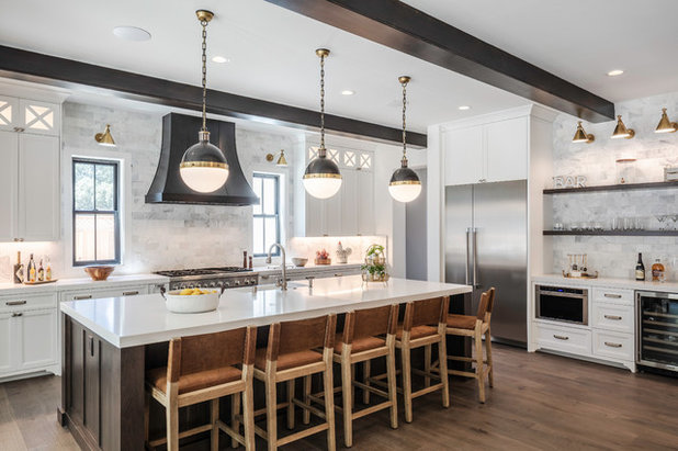
Designer: Shelby Fautt of Fautt Homes
Location: Alamo, California
Size: 224 square feet (21 square meters); 14 by 16 feet
Homeowners’ request. For this spec home, designer Shelby Fautt wasn’t sure who would be the buyer and needed to appeal to a large number of potential homeowners. “We wanted to stay conservative in some areas but add some wow elements as well,” she says.
White-and-wood combo. Slate-gray stained beechwood island. Perimeter cabinets painted in Super White by Benjamin Moore. “I am a fan of white cabinets, as they stand the test of time,” Fautt says. “Then I chose a stain instead of a painted island because I wanted to have a gray tone but without being a solid finish, and still have hints of warm tones.”
Other special features. Marble subway tile backsplash. Bronze vent hood. Ceiling beams stained to match the island.
Designer tip. “Bronze looks amazing in lights, hardware and plumbing fixtures but can be trendy,” Fautt says. “We selected bronze in the lighting because when you get tired of it, you can just replace the lights and try the next latest trend. This can add a lot of pop to the room with little commitment.”
“Uh-oh” moment. The first design “was lacking something,” Fautt says. “We changed the windows from white to black before we ordered them, and they really frame the kitchen.”
Find a kitchen designer near you
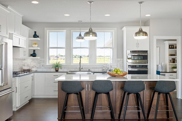
Designer: Janelle Rasmussen of the Interior Transitions Group, Robert Thomas Homes
Location: Spirit of Brandtjen Farm neighborhood of Lakeville, Minnesota
Homeowners’ request. For this model home, designer Janelle Rasmussen wanted to appeal to a broad audience with modern farmhouse style.
White-and-wood combo. Walnut island in desert sand stain. Perimeter cabinets painted in Dover White by Sherwin-Williams. “I chose the soft white paint for a bright, clean, classic look,” Rasmussen says. “Since the island is the workhorse in this kitchen, stain is a practical yet beautiful choice. With the trash pullout and counter stools, and with kicking feet and pots and pans being pulled out of the big drawers, the stain will take the abuse and can be easily touched up.”
Other special features. Calacatta marble subway tile backsplash. Gray wall paint (Repose Gray by Sherwin-Williams). Quartz countertops.
Designer tip. “Keep it simple,” Rasmussen says. “I considered other pendant styles for the kitchen sink light but ultimately decided to repeat the island pendants.”
Pendants: Cadence in polished nickel: Feiss; builder: Todd Stutz, Robert Thomas Homes; architect: Christine Albertsson, Albertsson Hansen Architecture; staging: Ambiance At Home
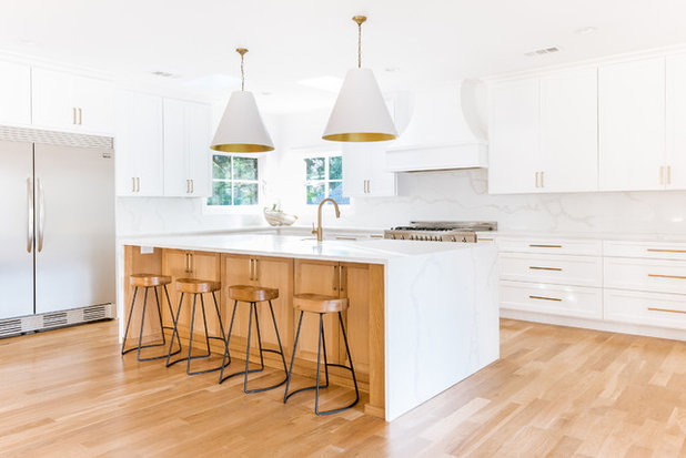
Design-build team: Preston Johns of Axiom Builders and Jen Egoavil Design
Location: Dallas
Size: 330 square feet (31 square meters); 15 by 22 feet
Homeowners’ request. This renovation included removing walls, changing the layout and creating an open floor plan.
White-and-wood combo. Rift-cut white oak island in a clear water-based finish. Perimeter cabinets painted in Chantilly Lace by Benjamin Moore. “This space is surrounded by massive windows and skylights that provide amazing natural light,” builder Preston Johns says. “We went with the all-white color scheme to create a nice clean and bright transitional space. We have been loving the all-white trend but wanted to add in some warmth since it’s such a large space. Also, the wood island base gives a soft contrast to feature the waterfall countertop.”
Other special features. Calacatta Verona quartz backsplash and countertops. White oak hardwood floors. Satin-brass hardware and other gold-tone accents.
Designer tip. “Designing a kitchen around a corner window can often feel challenging,” designer Jen Egoavil says. “We decided to keep the windows versus filling them in since we loved the natural light and had plenty of space to work with. But we had to consider different options with how to best continue the backsplash around the corner. We decided to run the quartz around the window at the same height of where the upper cabinets ended versus all the way up to the ceiling. This achieved a nice consistent look and helped save the expense of purchasing an additional slab.”
Faucet: Trinsic in champagne bronze, Delta
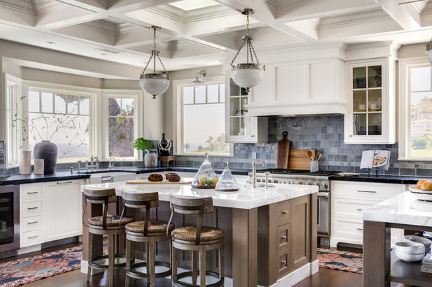
Designer: Denise Morrison and Liz Marchant Denise Morrison Interiors
Location: Santa Ana, California
Size: 375 square feet (35 square meters); 15 by 25 feet
Homeowners’ request. For this new-construction project, the homeowners wanted lots of natural light. “So you will notice lots of windows, skylights and no window coverings,” designer Denise Morrison says. “They have a very private setting, and they wanted to keep the view as open as possible. We were concerned about the number of windows’ taking away from upper-storage opportunities, but the homeowner was confident that she doesn’t need a lot of storage and is content with a minimalist approach to kitchen servingware.”
White-and-wood combo. White oak island in a soft finish with a marble baseboard. Perimeter cabinets painted in White Flour by Sherwin-Williams. “Because the kitchen is so large, we felt the addition of a second finish would offer warmth and break up all the white,” Morrison says. “We also like how stain finishes wear on an island.”
Other special features. Coffered ceiling. Handmade, hand-glazed backsplash tiles.
Designer tip. “I would recommend creating two islands when your single island exceeds 10 feet in length, so it is not such a monstrosity to get around within the workspace,” Morrison says. “Another tip would be to offset the sink on the island. Often we find people want to place their prep sinks on center with the island and range, but offsetting it allows for a much nicer prep-space surface.”


